Meet the lock screen
Widgets have been a great addition to our platform since iOS 14, bringing our apps to the home screen in a beautiful way. Now, our apps can break out of their container and sneak onto the lock screen with brand new widget types.
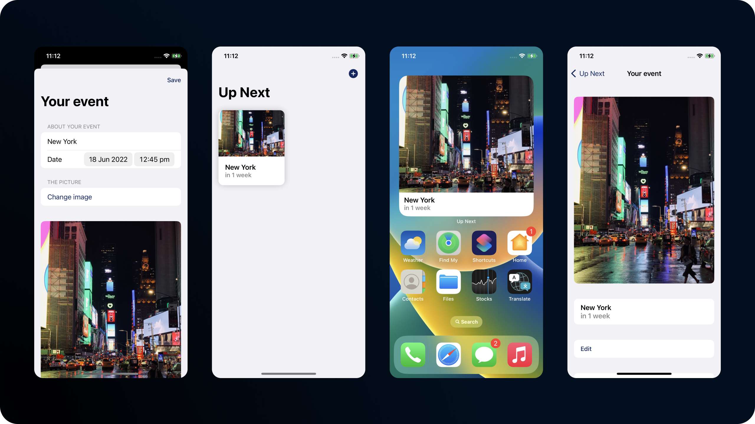
Today, we'll be taking my sample app "Up-next" which is a simple app to let you store upcoming events, and see how for away they are, and adding a lock screen widget to it. It has a configurable widget, supports deep links, siri shortcuts, and more.
The basics
In our app, we already have a widget. If you've never added a widget before, there's some great sample code to help you out.
The code for our widget is just about the same as you get with a default widget extension, except we've explicitly stated our supported families, and added a URL that deep links into our app.
@main
struct EventWidget: Widget {
    let kind: String = "widgets"

    var body: some WidgetConfiguration {
        IntentConfiguration(kind: kind, intent: WidgetEventIntent.self, provider: EventTimelineProvider()) { entry in
            EventWidgetEntryView(entry: entry)
                .widgetURL(URL(string: "up-next://home?eventId=\(entry.event?.id.uuidString ?? "")"))
        }
        .configurationDisplayName("My event")
        .description("See your event on the home screen.")
        .supportedFamilies([
            .systemSmall, .systemMedium, .systemLarge
        ])
    }
}
@main
struct EventWidget: Widget {
let kind: String = "widgets"
var body: some WidgetConfiguration {
IntentConfiguration(kind: kind, intent: WidgetEventIntent.self, provider: EventTimelineProvider()) { entry in
EventWidgetEntryView(entry: entry)
.widgetURL(URL(string: "up-next://home?eventId=\(entry.event?.id.uuidString ?? "")"))
}
.configurationDisplayName("My event")
.description("See your event on the home screen.")
.supportedFamilies([
.systemSmall, .systemMedium, .systemLarge
])
}
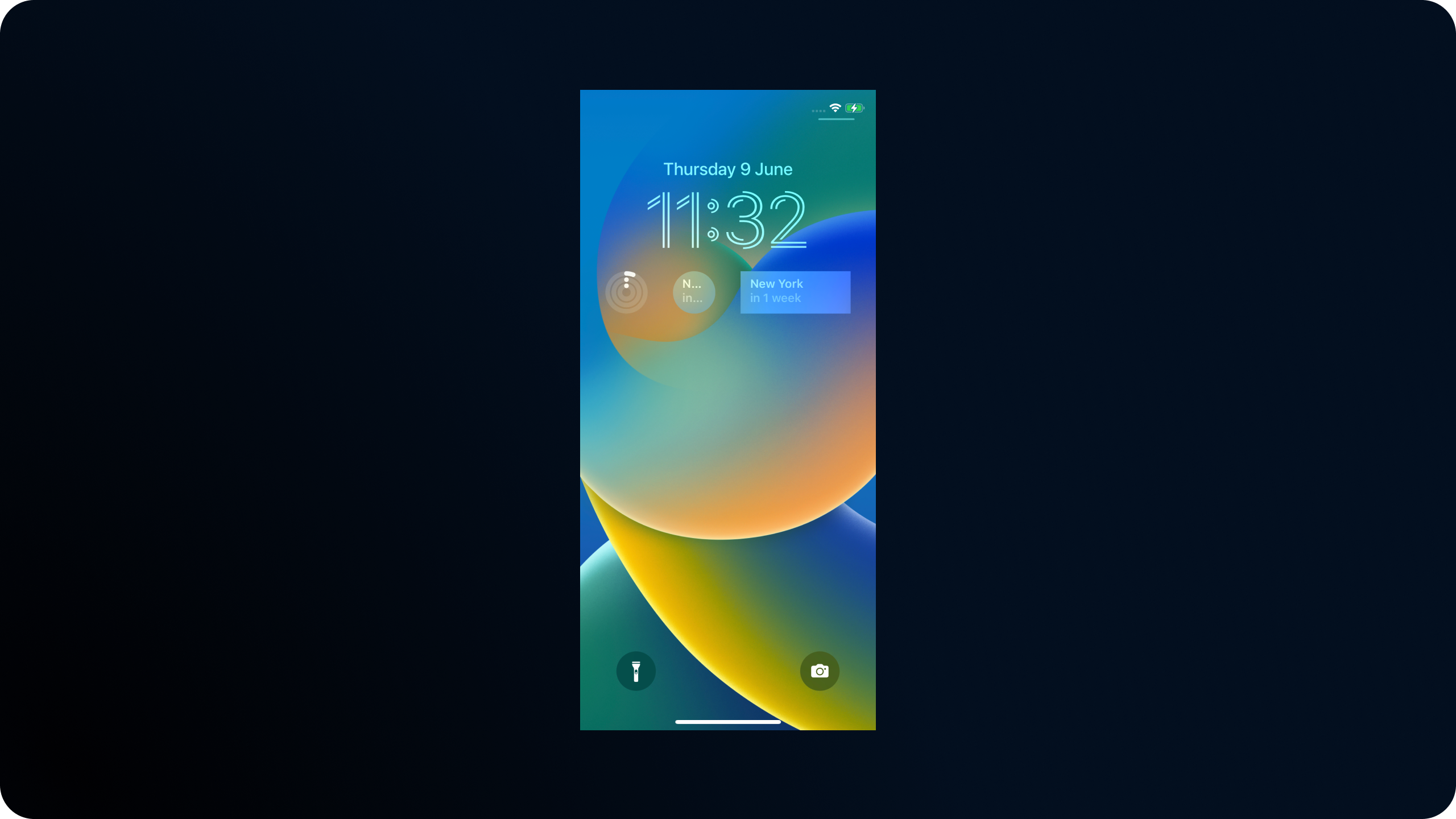
}Here's what the widget currently does. It lets you manually select an event, then tapping it brings you into the app.
To get started, lets extend our supported families to show the new families, which are all prefixed with accessory.
.supportedFamilies([
    .systemSmall, .systemMedium, .systemLarge,
    .accessoryInline, .accessoryRectangular, .accessoryCircular
]).supportedFamilies([
.systemSmall, .systemMedium, .systemLarge,
.accessoryInline, .accessoryRectangular, .accessoryCircular
])Our widget will now already show up as an option on the lock screen, but we should optimise it a little before we take a look at that - right now its a smidge hard to read!
We can see that our backgrounds look a little silly, and in the smaller configuration our widget just doesn't fit.
Lets get started by splitting our widget up into two seperate views, one for the home screen. and one for the lock screen.
This is possible using the environment value for \.widgetFamily which tells us which family is currently configured.
Here, we've got a family switch to decide which entry view to show, and we've added a new simpler entry view to get started with.
@main
struct EventWidget: Widget {
let kind: String = "widgets"
var body: some WidgetConfiguration {
IntentConfiguration(kind: kind, intent: WidgetEventIntent.self, provider: EventTimelineProvider()) { entry in
EventWidgetView(entry: entry)
.widgetURL(URL(string: "up-next://home?eventId=\(entry.event?.id.uuidString ?? "")"))
}
.configurationDisplayName("My event")
.description("See your event on the home screen.")
.supportedFamilies([
    .systemSmall, .systemMedium, .systemLarge,
    .accessoryInline, .accessoryRectangular, .accessoryCircular
])
}
}
// Convenient wrapper that reads the family and decides what view to show
struct EventWidgetView: View {
@Environment(\.widgetFamily) var family
var entry: EventTimelineProvider.Entry
var body: some View {
widgetView(entry: entry)
}
@ViewBuilder
func widgetView(entry: EventEntry) -> some View {
switch family {
case .accessoryInline, .accessoryRectangular, .accessoryCircular:
EventLockWidgetEntryView(entry: entry)
case .systemLarge, .systemMedium, .systemSmall:
EventWidgetEntryView(entry: entry)
default:
Text("Unknown family \(family.description)")
}
}
}
// Simplified version for the lock screen.
struct EventLockWidgetEntryView : View {
var entry: EventTimelineProvider.Entry
var body: some View {
VStack {
if let event = entry.event {
Text(event.name)
} else {
Image(systemName: "pencil.circle.fill")
.resizable()
.aspectRatio(contentMode: .fit)
}
}
}
}@main
struct EventWidget: Widget {
let kind: String = "widgets"
var body: some WidgetConfiguration {
IntentConfiguration(kind: kind, intent: WidgetEventIntent.self, provider: EventTimelineProvider()) { entry in
EventWidgetView(entry: entry)
.widgetURL(URL(string: "up-next://home?eventId=\(entry.event?.id.uuidString ?? "")"))
}
.configurationDisplayName("My event")
.description("See your event on the home screen.")
.supportedFamilies([
.systemSmall, .systemMedium, .systemLarge,
.accessoryInline, .accessoryRectangular, .accessoryCircular
])
}
}
// Convenient wrapper that reads the family and decides what view to show
struct EventWidgetView: View {
@Environment(\.widgetFamily) var family
var entry: EventTimelineProvider.Entry
var body: some View {
widgetView(entry: entry)
}
@ViewBuilder
func widgetView(entry: EventEntry) -> some View {
switch family {
case .accessoryInline, .accessoryRectangular, .accessoryCircular:
EventLockWidgetEntryView(entry: entry)
case .systemLarge, .systemMedium, .systemSmall:
EventWidgetEntryView(entry: entry)
default:
Text("Unknown family \(family.description)")
}
}
}
// Simplified version for the lock screen.
struct EventLockWidgetEntryView : View {
var entry: EventTimelineProvider.Entry
var body: some View {
VStack {
if let event = entry.event {
Text(event.name)
} else {
Image(systemName: "pencil.circle.fill")
.resizable()
.aspectRatio(contentMode: .fit)
}
}
}
}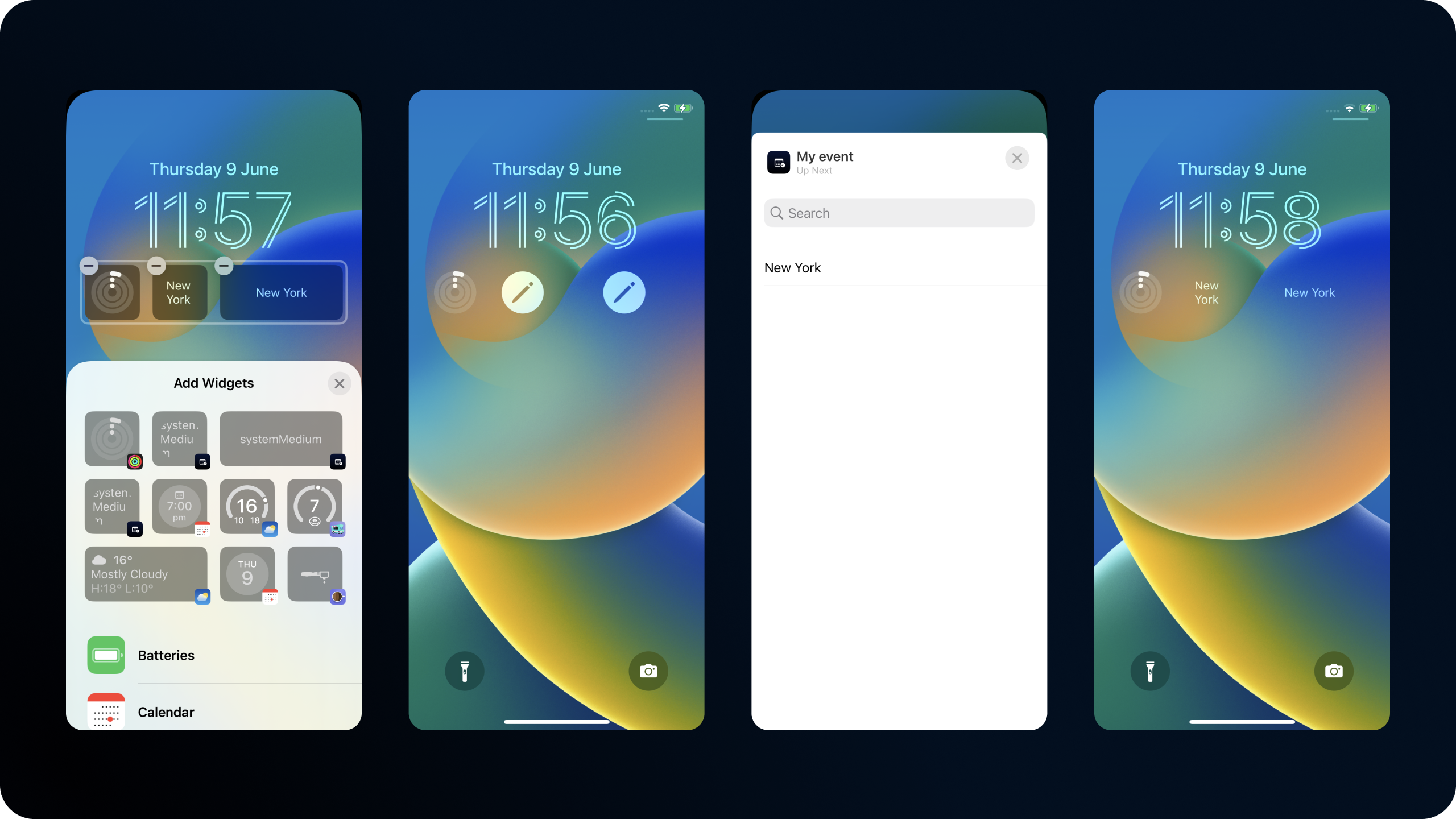
Thats better! We're not squeezing lots of information, and we have a customisable widget that shows an edit button when there's no selection.
Lets take it further, and look at optimising for both the lock screen widget types.
First up is accessoryRectangular. This is perfect for us as we already have some text that will fit nicely here.
Inside our lock widget we're going to switch on the widgetFamily again, except this time we're only going to observe accesorry styles, everything else just gets some text.
struct EventLockWidgetEntryView : View {
    @Environment(\.widgetFamily) var family
    var entry: EventTimelineProvider.Entry

    var body: some View {
        VStack {
            if let event = entry.event {
                widgetView(for: event)
            } else {
                Image(systemName: "pencil.circle.fill")
                    .resizable()
                    .aspectRatio(contentMode: .fit)
            }
        }
    }

    @ViewBuilder
    func widgetView(for event: Event) -> some View {
        switch family {
        case .accessoryRectangular:
           rectangularView(event: event)
        case .accessoryCircular:
            Text("TODO")
        default:
            Text("Unssuported family.")
        }
    }

    func rectangularView(event: Event) -> some View {
        ZStack {
            AccessoryWidgetBackground()
            VStack(alignment: .leading) {
                Text(event.name)
                    .font(.headline.weight(.semibold))
                    .foregroundColor(.primary)
                Text(event.date, style: .relative)
                    .font(.subheadline.weight(.semibold))
                    .foregroundColor(.secondary)
            }
            .padding(8)
            .widgetAccentable()
        }
        .frame(maxWidth: .infinity, maxHeight: .infinity, alignment: .leading)
        .clipShape(RoundedRectangle(cornerRadius: 8))
    }
}
struct EventLockWidgetEntryView : View {
@Environment(\.widgetFamily) var family
var entry: EventTimelineProvider.Entry
var body: some View {
VStack {
if let event = entry.event {
widgetView(for: event)
} else {
Image(systemName: "pencil.circle.fill")
.resizable()
.aspectRatio(contentMode: .fit)
}
}
}
@ViewBuilder
func widgetView(for event: Event) -> some View {
switch family {
case .accessoryRectangular:
rectangularView(event: event)
case .accessoryCircular:
Text("TODO")
default:
Text("Unssuported family.")
}
}
func rectangularView(event: Event) -> some View {
ZStack {
AccessoryWidgetBackground()
VStack(alignment: .leading) {
Text(event.name)
.font(.headline.weight(.semibold))
.foregroundColor(.primary)
Text(event.date, style: .relative)
.font(.subheadline.weight(.semibold))
.foregroundColor(.secondary)
}
.padding(8)
.widgetAccentable()
}
.frame(maxWidth: .infinity, maxHeight: .infinity, alignment: .leading)
.clipShape(RoundedRectangle(cornerRadius: 8))
}
}The code for this is very similar to before, but there's a couple stand out things.
We've used a new method, widgetAccentable to tell the system what parts we want to be accented. This lets the system know which parts you want to be tinted in contexts that support it, and you can see that in action when you setup a colorful lock screen.
There's a new view in the background too, AccessoryWidgetBackground, which gives us a pre-defined lovely background for our widget that makes it fit right in.
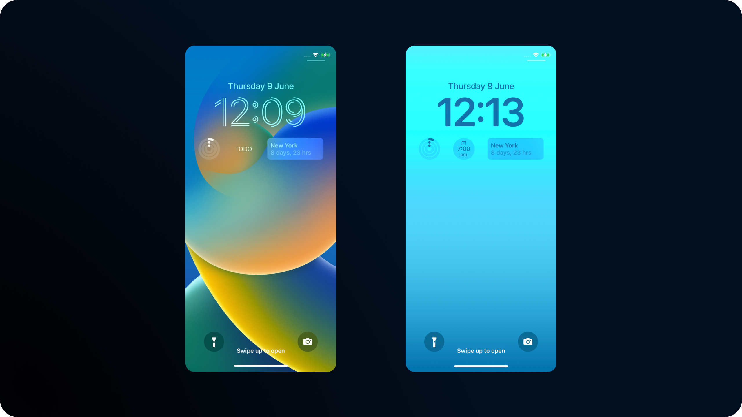
Here's what our new widget looks like - pretty good right?
Now let take a look at our smaller widget.
For our widget, we're just going to use simple views to show the amount of days left.
struct EventLockWidgetEntryView : View {
    ...

    @ViewBuilder
    func widgetView(for event: Event) -> some View {
        switch family {
        case .accessoryRectangular:
           rectangularView(event: event)
        case .accessoryCircular:
            smallView(event: event)
        default:
            Text("unsupported family.")
        }
    }

    func smallView(event: Event) -> some View {
        ZStack {
            AccessoryWidgetBackground()
            VStack(alignment: .center) {
                Text("\(Calendar.autoupdatingCurrent.numberOfDaysBetween(Date(), and: event.date))")
                .font(.headline.weight(.bold))
                    .foregroundStyle(.primary)
                    .widgetAccentable()
                Text("Days")
                    .font(.subheadline.weight(.regular))
                    .foregroundStyle(.secondary)
            }
        }
        .frame(maxWidth: .infinity, maxHeight: .infinity, alignment: .leading)
        .clipShape(RoundedRectangle(cornerRadius: 8))
    }
}
struct EventLockWidgetEntryView : View {
...
@ViewBuilder
func widgetView(for event: Event) -> some View {
switch family {
case .accessoryRectangular:
rectangularView(event: event)
case .accessoryCircular:
smallView(event: event)
default:
Text("unsupported family.")
}
}
func smallView(event: Event) -> some View {
ZStack {
AccessoryWidgetBackground()
VStack(alignment: .center) {
Text("\(Calendar.autoupdatingCurrent.numberOfDaysBetween(Date(), and: event.date))")
.font(.headline.weight(.bold))
.foregroundStyle(.primary)
.widgetAccentable()
Text("Days")
.font(.subheadline.weight(.regular))
.foregroundStyle(.secondary)
}
}
.frame(maxWidth: .infinity, maxHeight: .infinity, alignment: .leading)
.clipShape(RoundedRectangle(cornerRadius: 8))
}
}Here's the widget we get for that.
There's one last widget type thats great for our use case, and thats the accessoryInline.
These are really simple views that just contain text, so its trivial for us to use what we already have and throw it in the inline view.
We cant customise much, so lets stick to a simple "10 days until New York" format.
struct EventLockWidgetEntryView : View {
    ...

    @ViewBuilder
    func widgetView(for event: Event) -> some View {
        switch family {
        case .accessoryRectangular:
           rectangularView(event: event)
        case .accessoryCircular:
            smallView(event: event)
        case .accessoryInline:
            inlineView(event: event)
        default:
            Text("unsupported family.")
        }
    }

    func inlineView(event: Event) -> some View {
        Text("\(Calendar.autoupdatingCurrent.numberOfDaysBetween(Date(), and: event.date)) Days until \(event.name)")
    }
}
struct EventLockWidgetEntryView : View {
...
@ViewBuilder
func widgetView(for event: Event) -> some View {
switch family {
case .accessoryRectangular:
rectangularView(event: event)
case .accessoryCircular:
smallView(event: event)
case .accessoryInline:
inlineView(event: event)
default:
Text("unsupported family.")
}
}
func inlineView(event: Event) -> some View {
Text("\(Calendar.autoupdatingCurrent.numberOfDaysBetween(Date(), and: event.date)) Days until \(event.name)")
}
}There's something else with these - they arent customisable. This means that the widget will have to set itself up, the user can't customise it with their chosen event.
To handle this, you should support a sensible fallback for the inline entry inside your view. In our instance, we can just grab the closest event that they'll be waiting for.
struct EventLockWidgetEntryView : View {
    @Environment(\.widgetFamily) var family
    var entry: EventTimelineProvider.Entry

    var fallbackEvent: Event? {
        Storage.shared.events.sorted(by: { $0.date < $1.date }).first
    }

    var body: some View {
        VStack {
            if let event = entry.event ?? fallbackEvent {
                widgetView(for: event)
            } else {
                Image(systemName: "pencil.circle.fill")
                    .resizable()
                    .aspectRatio(contentMode: .fit)
            }
        }
    }
    ...
}
struct EventLockWidgetEntryView : View {
@Environment(\.widgetFamily) var family
var entry: EventTimelineProvider.Entry
var fallbackEvent: Event? {
Storage.shared.events.sorted(by: { $0.date < $1.date }).first
}
var body: some View {
VStack {
if let event = entry.event ?? fallbackEvent {
widgetView(for: event)
} else {
Image(systemName: "pencil.circle.fill")
.resizable()
.aspectRatio(contentMode: .fit)
}
}
}
...
}These widgets look great.

Finger tips
We've covered all our widgets, but there's a couple more features that you should get familiar with to make the most of your widgets.
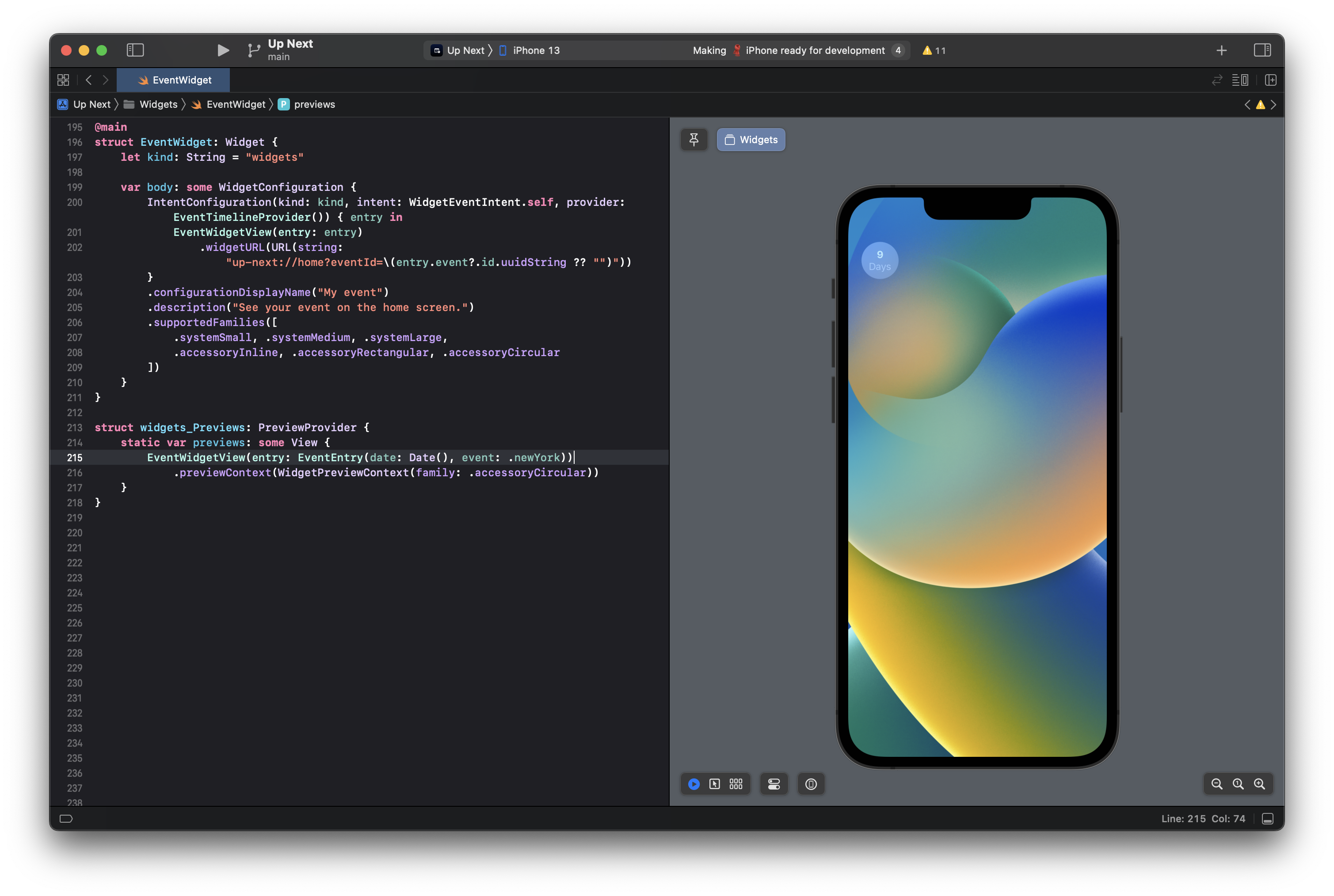
Previews now support emulating the lock screen, just provide the accessory type you want to preview.
struct widgets_Previews: PreviewProvider {
    static var previews: some View {
        EventWidgetEntryView(entry: EventEntry(date: Date(), event: .newYork))
            .previewContext(WidgetPreviewContext(family: .accessoryRectangular))
    }
}
struct widgets_Previews: PreviewProvider {
static var previews: some View {
EventWidgetEntryView(entry: EventEntry(date: Date(), event: .newYork))
.previewContext(WidgetPreviewContext(family: .accessoryRectangular))
}
}
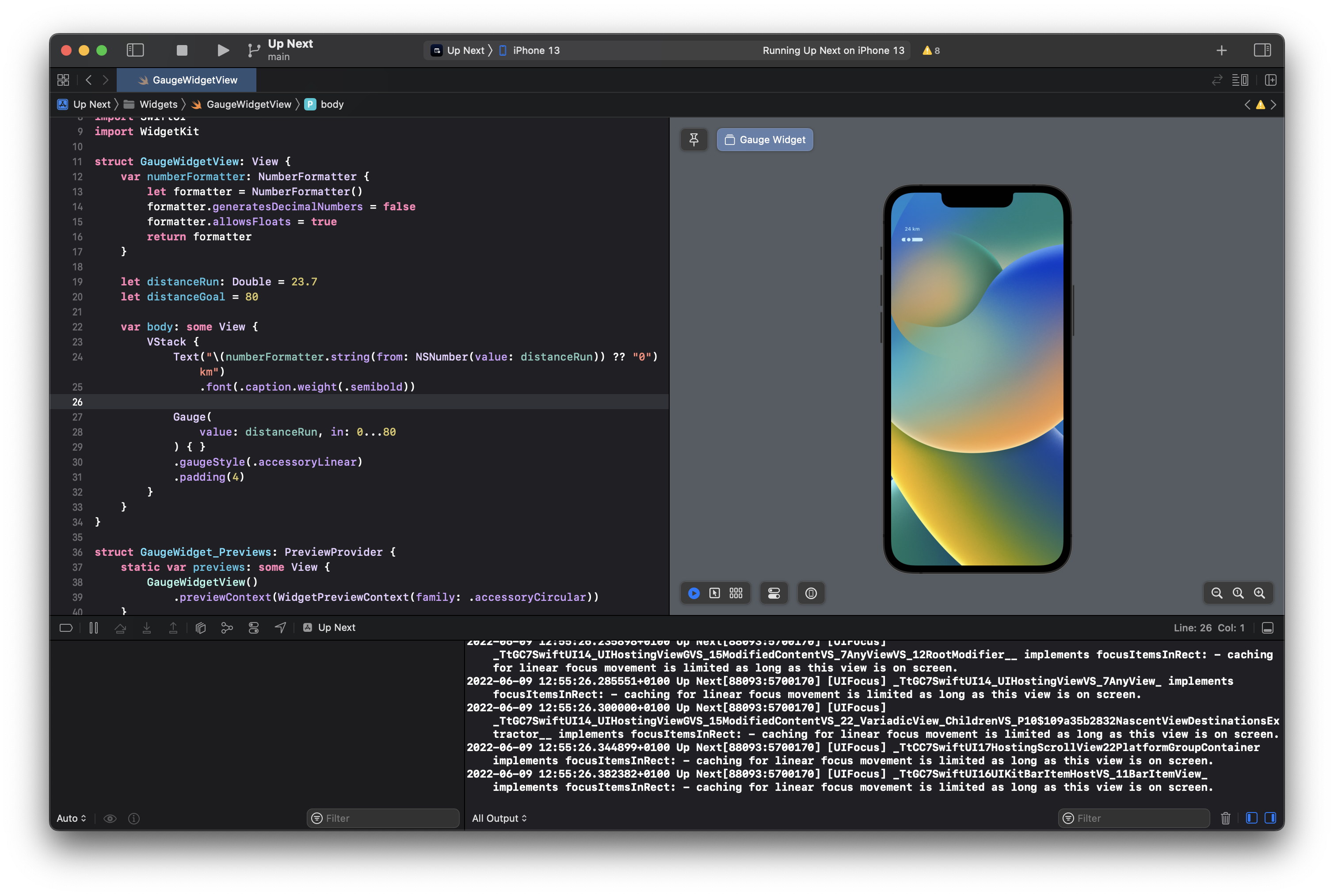
Next, we have the new gauge styles for accessories. These are specific to each accessory type, and provide lovely pre-styled views for you. There's styles for accessoryCircular and accessoryLinear.
struct GaugeWidgetView: View {
    var numberFormatter: NumberFormatter {
        let formatter = NumberFormatter()
        formatter.generatesDecimalNumbers = false
        formatter.allowsFloats = true
        return formatter
    }

    let distanceRun: Double = 23.7
    let distanceGoal = 80

    var body: some View {
        ZStack {
            Gauge(
                value: distanceRun, in: 0...80
            ) { }
            .gaugeStyle(.accessoryCircular)
            Text("\(numberFormatter.string(from: NSNumber(value: distanceRun)) ?? "0") km")
                .font(.caption.weight(.semibold))
        }
    }
}
struct GaugeWidgetView: View {
var numberFormatter: NumberFormatter {
let formatter = NumberFormatter()
formatter.generatesDecimalNumbers = false
formatter.allowsFloats = true
return formatter
}
let distanceRun: Double = 23.7
let distanceGoal = 80
var body: some View {
ZStack {
Gauge(
value: distanceRun, in: 0...80
) { }
.gaugeStyle(.accessoryCircular)
Text("\(numberFormatter.string(from: NSNumber(value: distanceRun)) ?? "0") km")
.font(.caption.weight(.semibold))
}
}
}This gives us a clean view with an indicator of our progress.

If we're not a fan of that, there'an alternative option, .accessoryCircularOpacity which uses a style like Apple Fitness to fill the circle.
.gaugeStyle(.accessoryCircularCapacity).gaugeStyle(.accessoryCircularCapacity)
If we adjust our view a little bit, we can use accessoryLinear to show a gauge instead.
struct GaugeWidgetView: View {
    var numberFormatter: NumberFormatter {
        let formatter = NumberFormatter()
        formatter.generatesDecimalNumbers = false
        formatter.allowsFloats = true
        return formatter
    }

    let distanceRun: Double = 23.7
    let distanceGoal = 80

    var body: some View {
        VStack {
            Text("\(numberFormatter.string(from: NSNumber(value: distanceRun)) ?? "0") km")
                .font(.caption.weight(.semibold))

            Gauge(
                value: distanceRun, in: 0...80
            ) { }
            .gaugeStyle(.accessoryLinear)
            .padding(4)
        }
    }
}
struct GaugeWidgetView: View {
var numberFormatter: NumberFormatter {
let formatter = NumberFormatter()
formatter.generatesDecimalNumbers = false
formatter.allowsFloats = true
return formatter
}
let distanceRun: Double = 23.7
let distanceGoal = 80
var body: some View {
VStack {
Text("\(numberFormatter.string(from: NSNumber(value: distanceRun)) ?? "0") km")
.font(.caption.weight(.semibold))
Gauge(
value: distanceRun, in: 0...80
) { }
.gaugeStyle(.accessoryLinear)
.padding(4)
}
}
}
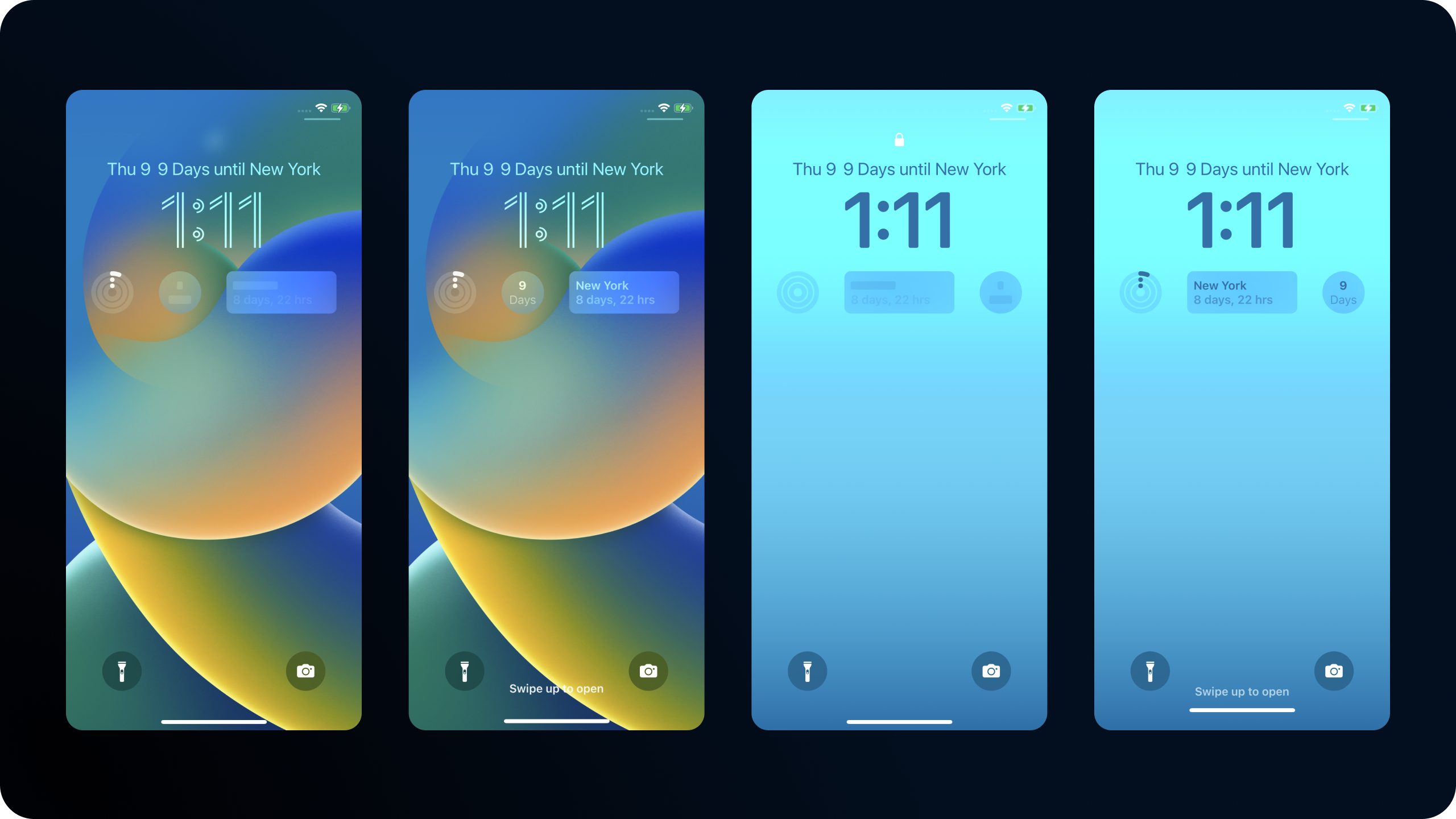
Finally, we can take advantage of some new modifiers to decide if we should redact our content or not. I don't think an event countdown is generally sensetive, but your content could be.
Simply adding the .privacySensitive() modifier to our views makes sure that our content isnt shown when the device is locked.
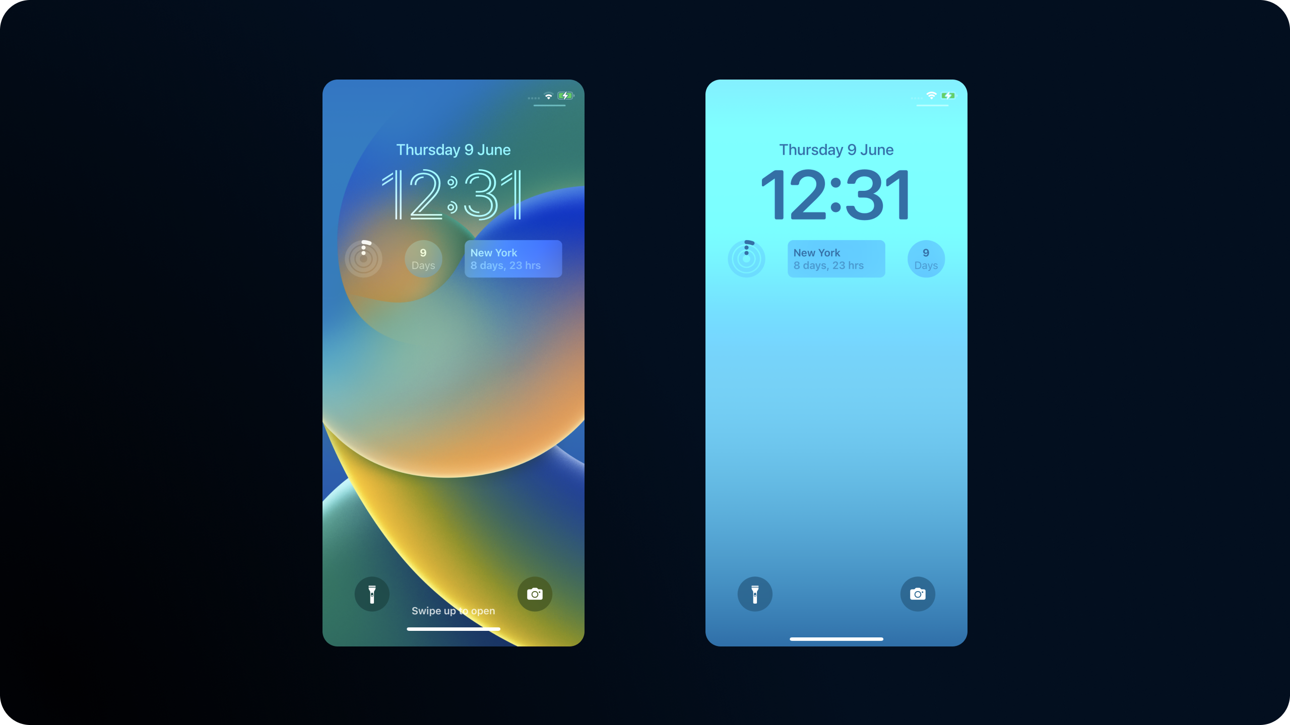
Here's what that looks like when the device is locked, and then unlocked. You can see we havent marked our inline view as sensetive, so it shows all the content all the time.
Thanks for reading!
You can find my code on github.