
Expandable Lists
When building apps you'll quite often find yourself building a simple list of content. Sometimes, this content grows to be so large its not practical for the user. When this happens, a good pattern to consider is the expandable list, with sections that are expandable and collapsible based on the users current needs.
SwiftUI has a couple of ways for us to achive this behaviour, and its just as simple as you'd expect. The best part? None of this is locked behind iOS 15, you can use it when you target 14 - so you might be able to use it this fall.
The basics
To get started with our list, we'll need a data source. For the examples today we're going to have three categories of SF Symbols, each with their own set of symbols.
// SFSymbol.swift
struct SFSymbol: Equatable, Hashable {
    let systemImageName: String
}

// ListElement.swift
enum ListElementType: Equatable, Hashable {
    case category(String)
    case sfSymbol(SFSymbol)
}

struct ListElement: Equatable, Hashable {
    let type: ListElementType
    let childElements: [ListElement]?
}


// Condensed code, view the sample repository for the full data
struct SampleData {
    static let mediaCategory = ListElement(type: .category("Media"), childElements: [
        ListElement(type: .sfSymbol(SFSymbol(systemImageName: "play.fill")), childElements: nil),
        ...
    ])
    static let transportCategory = ListElement(type: .category("Transport"), childElements: [
        ListElement(type: .sfSymbol(SFSymbol(systemImageName: "car.fill")), childElements: nil),
				...
    ])
    static let humanCategory = ListElement(type: .category("Human"), childElements: [
        ListElement(type: .sfSymbol(SFSymbol(systemImageName: "person.fill")), childElements: nil),
				...
    ])
}
// SFSymbol.swift
struct SFSymbol: Equatable, Hashable {
let systemImageName: String
}
// ListElement.swift
enum ListElementType: Equatable, Hashable {
case category(String)
case sfSymbol(SFSymbol)
}
struct ListElement: Equatable, Hashable {
let type: ListElementType
let childElements: [ListElement]?
}
// Condensed code, view the sample repository for the full data
struct SampleData {
static let mediaCategory = ListElement(type: .category("Media"), childElements: [
ListElement(type: .sfSymbol(SFSymbol(systemImageName: "play.fill")), childElements: nil),
...
])
static let transportCategory = ListElement(type: .category("Transport"), childElements: [
ListElement(type: .sfSymbol(SFSymbol(systemImageName: "car.fill")), childElements: nil),
...
])
static let humanCategory = ListElement(type: .category("Human"), childElements: [
ListElement(type: .sfSymbol(SFSymbol(systemImageName: "person.fill")), childElements: nil),
...
])
}There's a couple key things here:
- Theres one element model, which has a variable that defines what type of element it is ( category or symbol ).
- The ListElement has child elements of the same type, and this is optional.
- All the variables and models are Equatable&Hashable, so we can use them in Lists.
Now we can get started with a simple list. The first list will just show our data in sections.
The declaration for a list with expandible & collapsible sections is a little different to the usual, as it needs to be told where the child objects for each section lie. Here's what a full view looks like with a list.
struct SimpleList: View {
    let data = SampleData.allSamples

    var body: some View {
        List(data, id: \.self, children: \.childElements) { listElement in
            switch listElement.type {
            case .category(let title):
                makeCategoryView(categoryName: title)
            case .sfSymbol(let symbol):
                makeSfSymbolView(symbol: symbol)
            }
        }
        .listStyle(InsetGroupedListStyle())
        .navigationTitle("Simple List")
    }

    func makeCategoryView(categoryName: String) -> some View {
        Text(categoryName)
            .font(.headline)
            .bold()
    }

    func makeSfSymbolView(symbol: SFSymbol) -> some View {
        HStack {
            Image(systemName: symbol.systemImageName)
                .font(.subheadline)
            Text(symbol.systemImageName)
                .font(.subheadline)
        }
    }
}
struct SimpleList: View {
let data = SampleData.allSamples
var body: some View {
List(data, id: \.self, children: \.childElements) { listElement in
switch listElement.type {
case .category(let title):
makeCategoryView(categoryName: title)
case .sfSymbol(let symbol):
makeSfSymbolView(symbol: symbol)
}
}
.listStyle(InsetGroupedListStyle())
.navigationTitle("Simple List")
}
func makeCategoryView(categoryName: String) -> some View {
Text(categoryName)
.font(.headline)
.bold()
}
func makeSfSymbolView(symbol: SFSymbol) -> some View {
HStack {
Image(systemName: symbol.systemImageName)
.font(.subheadline)
Text(symbol.systemImageName)
.font(.subheadline)
}
}
}The first and second arguments to the list are the same as usual, but there's an extra parameter on the end, children. This accepts a keypath to the children, which in our case is childElements. This should be a keypath to an object which is an optional array of the same type as the parent.
I've set the list style at the end for a little bit of flair, but its entirely up to you if you like it or not. The result of the code above is the following:
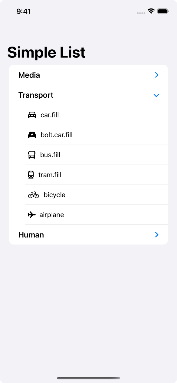
If you only want a simple list of data thats a little easier to read, you could stop here - but we're going to go further.
Taking it further
Next, we'll add selection & navigation to this list.
To add selection, we'll need a local property that maintains that selection for us. In this case, we'll be storing an optional reference to a ListElement. We'll also need to pass this to our list so it knows what to do.
    @State var selection: ListElement?

    var body: some View {
        List(data, id: \.self, children: \.childElements, selection: $selection) { listElement in
            switch listElement.type {
            case .category(let title):
                makeCategoryView(categoryName: title)
                    .tag(listElement)
            case .sfSymbol(let symbol):
                makeSfSymbolView(symbol: symbol)
                    .tag(listElement)
            }
        }
        .listStyle(InsetGroupedListStyle())
        .navigationTitle("Simple List")
    }
@State var selection: ListElement?
var body: some View {
List(data, id: \.self, children: \.childElements, selection: $selection) { listElement in
switch listElement.type {
case .category(let title):
makeCategoryView(categoryName: title)
.tag(listElement)
case .sfSymbol(let symbol):
makeSfSymbolView(symbol: symbol)
.tag(listElement)
}
}
.listStyle(InsetGroupedListStyle())
.navigationTitle("Simple List")
}The final (before content) parameter of a List is a selection property that accepts a binding, so we've used that here. There's also a tag on each of the views, to make sure SwiftUI knows what we mean by each selection.
By adding selection support like this, we can manually set the selection if we'd like, or clear it. Good practice is if you have a two column layout on an iPad, to pre-select the first item when the view appears.
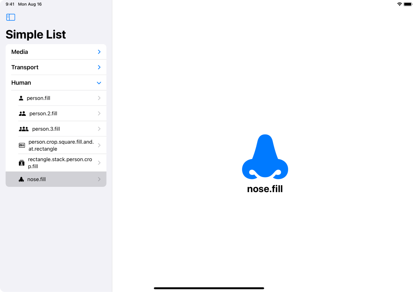
To add navigation, all we have to do is wrap our symbol view in a NavigationLink.
    func makeSfSymbolView(symbol: SFSymbol) -> some View {
        NavigationLink(
            destination: SFSymbolView(symbol:symbol),
            label: {
                HStack {
                    Image(systemName: symbol.systemImageName)
                        .font(.subheadline)
                    Text(symbol.systemImageName)
                        .font(.subheadline)
                }
            })
    }
func makeSfSymbolView(symbol: SFSymbol) -> some View {
NavigationLink(
destination: SFSymbolView(symbol:symbol),
label: {
HStack {
Image(systemName: symbol.systemImageName)
.font(.subheadline)
Text(symbol.systemImageName)
.font(.subheadline)
}
})
}When you do this, the list handles a lot of the work for you. A disclosure indicator will be shown at the end of the row so users know theres something there if they tap it.

There's even more magic going on here than first meets the eye. If you're on the iPhone, select an item, then go back, you'll notice that the selection clears. This is great platform-friendly behaviour. On the iPad, the selection is maintained, as the other element is shown on the side.
Another option
Sometimes you might want a little more control over your List, instead of having one long set of data, you might want multiple times or even completley seperate sections. SwiftUI gives us a tool to do just that - OutlineGroup.
To use OutlineGroup we only have to make tiny changes to our code, as the initialiser is very similar to a List.
    var body: some View {
        List {
            OutlineGroup(data, id: \.self, children: \.childElements) { listElement in
                switch listElement.type {
                case .category(let title):
                    makeCategoryView(categoryName: title)
                        .tag(listElement)
                case .sfSymbol(let symbol):
                    makeSfSymbolView(symbol: symbol)
                        .tag(listElement)
                }
            }
        }
        .listStyle(InsetGroupedListStyle())
        .navigationTitle("Custom List")
    }
var body: some View {
List {
OutlineGroup(data, id: \.self, children: \.childElements) { listElement in
switch listElement.type {
case .category(let title):
makeCategoryView(categoryName: title)
.tag(listElement)
case .sfSymbol(let symbol):
makeSfSymbolView(symbol: symbol)
.tag(listElement)
}
}
}
.listStyle(InsetGroupedListStyle())
.navigationTitle("Custom List")
}The changes are very small - the top level List is now using the empty initialiser, and then we have our OutlineGroup underneath. We pass in the same data, id, and children keypath. The behaviour of the outline group is the same as our list before, but we've lost the custom maintenance of the selection state.
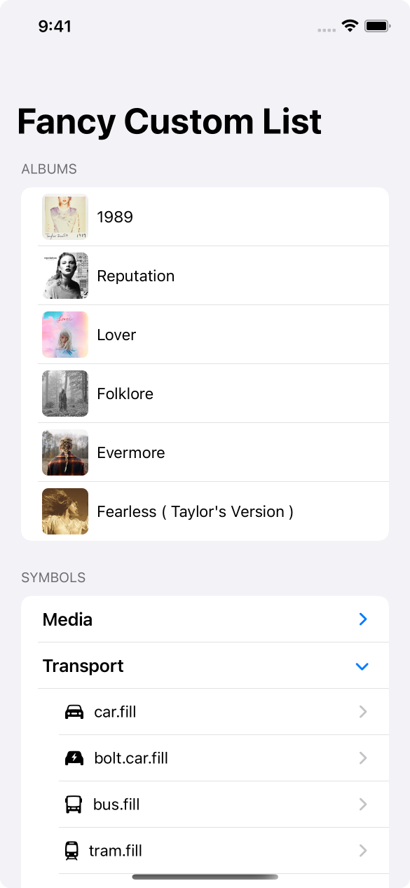
Whilst this seems like a downgrade - you can now do whatever you want with this list, and get really fancy with it, like in this example here.
    var body: some View {
        List {
            Section(header: Text("Albums")) {
                ForEach(Album.all, id: \.self) { album in
                    makeAlbumView(album: album)
                }
            }
            Section(header: Text("Symbols")) {
                OutlineGroup(data, id: \.self, children: \.childElements) { listElement in
                    switch listElement.type {
                    case .category(let title):
                        makeCategoryView(categoryName: title)
                            .tag(listElement)
                    case .sfSymbol(let symbol):
                        makeSfSymbolView(symbol: symbol)
                            .tag(listElement)
                    }
                }
            }
        }
        .listStyle(InsetGroupedListStyle())
        .navigationTitle("Fancy Custom List")
    }
var body: some View {
List {
Section(header: Text("Albums")) {
ForEach(Album.all, id: \.self) { album in
makeAlbumView(album: album)
}
}
Section(header: Text("Symbols")) {
OutlineGroup(data, id: \.self, children: \.childElements) { listElement in
switch listElement.type {
case .category(let title):
makeCategoryView(categoryName: title)
.tag(listElement)
case .sfSymbol(let symbol):
makeSfSymbolView(symbol: symbol)
.tag(listElement)
}
}
}
}
.listStyle(InsetGroupedListStyle())
.navigationTitle("Fancy Custom List")
}Theres two seperate sections, each with a list of completley seperate content, with an unrelated data source.
There's one last thing we can do with our lists, and thats to use DisclosureGroup. This lets us re-create the section header ui, but with a little more control over it. Lets use this to show and hide our albums.
    @State var showAlbums: Bool = false

    var body: some View {
        List {
            Section(header: Text("Albums")) {
                DisclosureGroup(
                    isExpanded: $showAlbums,
                    content: {
                        ForEach(Album.all, id: \.self) { album in
                            makeAlbumView(album: album)
                        }
                    },
                    label: { Text("Albums") }
                )
            }
@State var showAlbums: Bool = false
var body: some View {
List {
Section(header: Text("Albums")) {
DisclosureGroup(
isExpanded: $showAlbums,
content: {
ForEach(Album.all, id: \.self) { album in
makeAlbumView(album: album)
}
},
label: { Text("Albums") }
)
}The DisclosureGroup lets us control its expanded state with a binding to a boolean, set the content to whatever we want, and then give it a label.
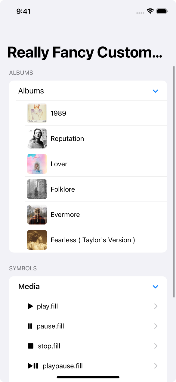
Notice that we get the exact same behaviour as the full list, with indenting content and nice animations.
Conclusion
There's a seemingly endless list of things to learn with List, and I wonder whats next.
You can find the code samples in my repo as always.
If you fancy reading a little more, or sharing your experiences, I’m @SwiftyAlex on twitter.