Materials
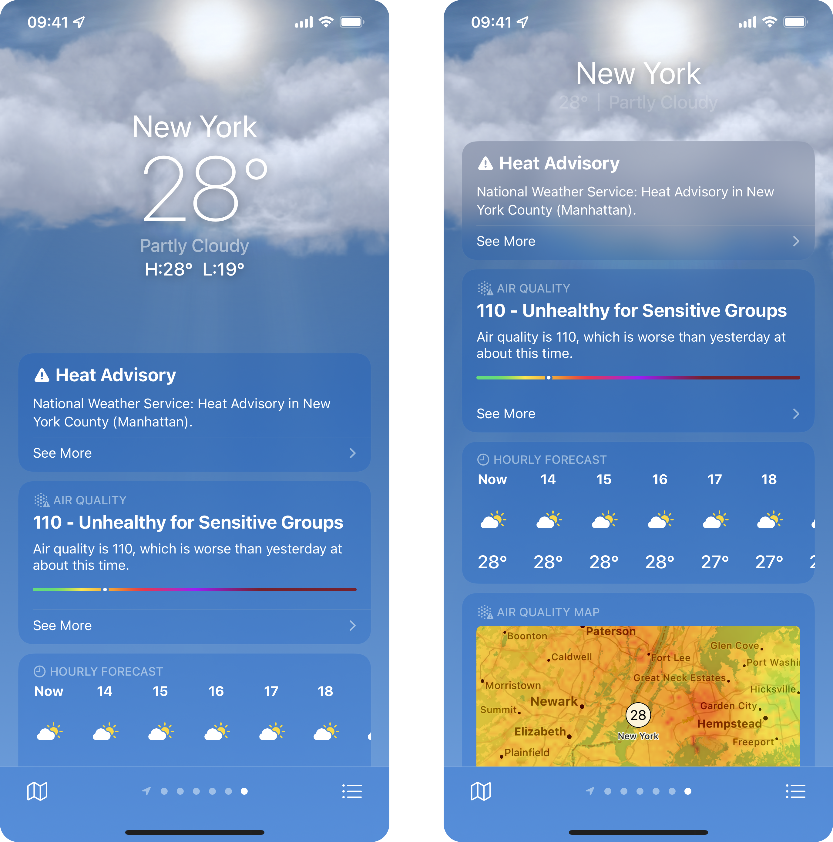
One of the stand out details in interfaces that push the limits of design are uses of materials. When you look at the new weather app in iOS 15, you can't help but be drawn to the way the interface just blends into the background. The way the clouds become part of the card makes such a huge difference.
How does it work?
SwiftUI now nativley supports adding material affects like this - so no more bridging across to UIVisualEffectView. This was the last piece of UIKit I used in my app, so it was great news to see it show up!
The key concept to grasp here is that the material needs something underneath it to have any effect. When you look at the screenshots above, the material provides two sepearate visual styles, that are ultimatley the same effect. When over a solid color, it simply darkens that color, making the content of each card more legible, and providing a visual hierarchy. When over something a little more dynamic like an image, it will go further and blur the content, like we can see with the clouds. This can be especially powerful with animated content underneath.
Lets look at an example of this, by placing some text over an image, and blurring the background.
struct MaterialItemView: View {
var body: some View {
ZStack {
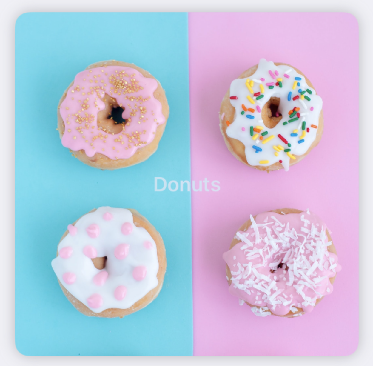
Image("donuts")
.resizable()
.aspectRatio(1.0, contentMode: .fit)
.overlay(.ultraThinMaterial)
Text("Donuts")
.font(.headline)
.foregroundStyle(.primary)
}
.clipShape(
RoundedRectangle(cornerRadius: 12, style: .continuous)
)
.shadow(color: .gray.opacity(0.5), radius: 6, x: 0, y: 0)
.padding()
}
}struct MaterialItemView: View {
var body: some View {
ZStack {
Image("donuts")
.resizable()
.aspectRatio(1.0, contentMode: .fit)
.overlay(.ultraThinMaterial)
Text("Donuts")
.font(.headline)
.foregroundStyle(.primary)
}
.clipShape(
RoundedRectangle(cornerRadius: 12, style: .continuous)
)
.shadow(color: .gray.opacity(0.5), radius: 6, x: 0, y: 0)
.padding()
}
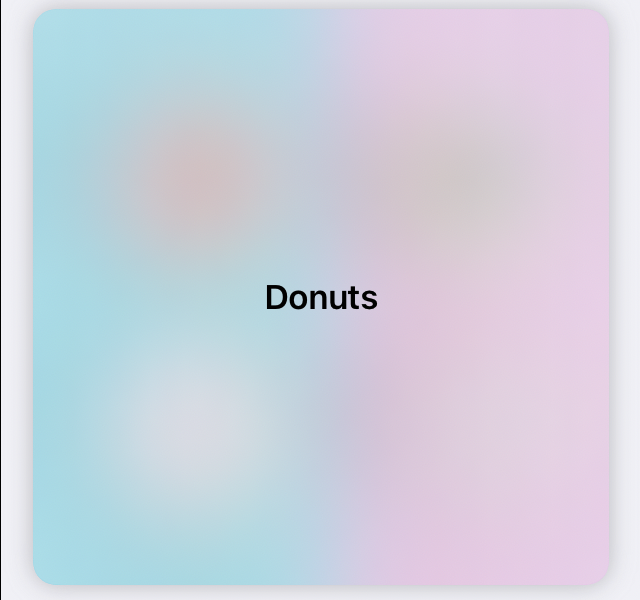
}The result of that code ( provided you have an appropriate image of donuts ) will look like this.
Lets break down that code and look at some of the new tools available to us.
First, we have the blur itself.
.overlay(.ultraThinMaterial)
// or
.overlay(Material.ultraThin).overlay(.ultraThinMaterial)
// or
.overlay(Material.ultraThin)Overlay is really helpful here, as we can just pass in the material we'd like. There's a lot of options for us, ranging from ultra thin right through to ultra thick. As you go through the options you'll notice more and more of the background being obscured. With ultra thick, the background will become more of a slight hint as to the color of the contents underneath, rather than actually showing it a little.
Next, there's foreground styles.
.foregroundStyle(.primary).foregroundStyle(.primary)These work very nicely in combination with our materials, as going down the styles will decrease the opacity of the content. The foreground styles we have range from primary to quaternary.
If you want to go for a really fancy effect, you can actually set the foreground style of some text to a material, to have the text blur the background.
.foregroundStyle(.thinMaterial)
Does this look different than you expected? This is a thin material text over the image we've allready seen.
struct MaterialItemView: View {
    var body: some View {
        ZStack {
            Image("donuts")
                .resizable()
                .aspectRatio(1.0, contentMode: .fit)
            Text("Donuts")
                .font(.headline)
                .foregroundStyle(.thinMaterial)
        }
        .clipShape(
            RoundedRectangle(cornerRadius: 12, style: .continuous)
        )
        .shadow(color: .gray.opacity(0.5), radius: 6, x: 0, y: 0)
        .padding()
    }
}
struct MaterialItemView: View {
var body: some View {
ZStack {
Image("donuts")
.resizable()
.aspectRatio(1.0, contentMode: .fit)
Text("Donuts")
.font(.headline)
.foregroundStyle(.thinMaterial)
}
.clipShape(
RoundedRectangle(cornerRadius: 12, style: .continuous)
)
.shadow(color: .gray.opacity(0.5), radius: 6, x: 0, y: 0)
.padding()
}
}
If you get out a color picker, you'll see that the colors arent that diffferent when the text crosses the boundary. This is because SwiftUI is making sure the text is legible.
If we apply the same exact look, but over an image with a stronger color, you'll see it bleed through more.
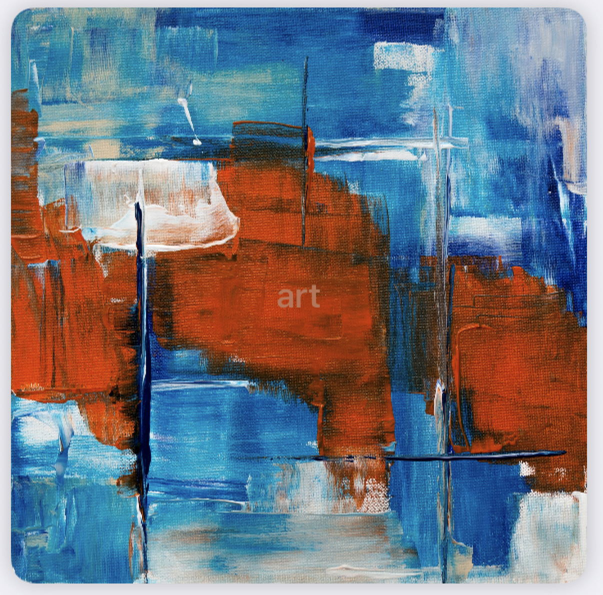
The code here hasn't changed - just the image. I wouldn't personally ship something with such a low contrast, but with some tweaks there's potential for something quite lovely.
There's one last modifier you might find useful:
.background(.thinMaterial, in: RoundedRectangle(cornerRadius: 12)).background(.thinMaterial, in: RoundedRectangle(cornerRadius: 12))This will apply the blur within the confines of the shape for you, so you don't have to clip it manually.
Will you be using materials in your apps? I'd love to see what you come up with.
You can find the code samples in my repo as always.
If you fancy reading a little more, or sharing your experiences, I’m @SwiftyAlex on twitter.