
Charts with Canvas in SwiftUI
SwiftUI is a powerful tool for quickly building beautiful, user-friendly apps, but it's always had a little bit of a weakness - custom graphics. There was an API for it, but it required a lot of hand holding to work nicely, including GeometryReaders to handle size, which can easily lead to crashes in its current state.
With the introduction of Canvas, we can drop GeometryReaders, and draw with the same customisation we used to get drawing everything manually with CGPath.
The boring bit
Drawing charts is a flashy, and kinda fun, task, but we've got to get some boring bits out of the way first. Once we've got through this, its going to be relativley simple to build some charts.
( If you really don't care about the math and just want to skip to the end and use what i've done, I don't blame you. )
Ok, lets get to it.
We'll need a model that can provide us with a set of points, each of which will need its underlying value, and its value to the chart ( the decimal representation of its percentage of the max ). We're also going to need the unit for any labels and a title.
struct ChartValue {
    // The value for our graphics, i.e 0.4
    let value: Double
    // The value a user would see, i.e 50
    let underlyingValue: Double
}

class ChartModel {
    let values: [ChartValue]
    let unit: String
    let title: String

    init(
        values: [ChartValue],
        unit: String,
        title: String
    ) {
        self.values = values
        self.unit = unit
        self.title = title
    }
}
struct ChartValue {
// The value for our graphics, i.e 0.4
let value: Double
// The value a user would see, i.e 50
let underlyingValue: Double
}
class ChartModel {
let values: [ChartValue]
let unit: String
let title: String
init(
values: [ChartValue],
unit: String,
title: String
) {
self.values = values
self.unit = unit
self.title = title
}
}ChartValue does most of the heavy lifting, with the unit just being passed in. In order to make this a little more usable, we can make a helper function that takes some Doubles and turns them into ChartValues.
All the examples today are going to be Caffeine related, as this code is lifted straight out of the next update for Coffee Book.
We want a model for the total caffeine consumed each day for a week. Lets write a quick function to handle this translation.
extension ChartModel {
    static func from(rawValues: [Double], unit: String, title: String) -> ChartModel? {
        // We can't have a chart with only one value, and we need the biggest to build a proper chart.
        guard rawValues.count > 1, let largestValue = rawValues.sorted(by: >).first else {
            return nil
        }
        // Get the decimal percentage of the maximum
        let chartValues = rawValues.map { rawValue -> ChartValue in
            let value = rawValue / largestValue
            return ChartValue(value: max(0, value), underlyingValue: rawValue)
        }
        return ChartModel(values: chartValues, unit: unit, title: title)
    }
}
extension ChartModel {
static func from(rawValues: [Double], unit: String, title: String) -> ChartModel? {
// We can't have a chart with only one value, and we need the biggest to build a proper chart.
guard rawValues.count > 1, let largestValue = rawValues.sorted(by: >).first else {
return nil
}
// Get the decimal percentage of the maximum
let chartValues = rawValues.map { rawValue -> ChartValue in
let value = rawValue / largestValue
return ChartValue(value: max(0, value), underlyingValue: rawValue)
}
return ChartModel(values: chartValues, unit: unit, title: title)
}
}Not too scary! We just double check that we have enough values, at least two, and then translate those into decimals of the max. In this example the largest value will be at the very top of the chart.
Usage of this is nice and easy.
ChartModel.from(rawValues: [4,2,3,4,5], unit: "mg", title: "Caffeine(mg)")!ChartModel.from(rawValues: [4,2,3,4,5], unit: "mg", title: "Caffeine(mg)")!Making a base chart
We've got the basic math out of the way and now we can get to the view. We'll make a base view that handles working with the data, then build some charts from that. Lets get started with a protocol that defines some building blocks, like the color of the chart.
protocol ChartView: View {
    var insets: CGFloat { get }
    var strokeWidth: CGFloat { get }
    var color: Color { get }
    var model: ChartModel { get }
}
protocol ChartView: View {
var insets: CGFloat { get }
var strokeWidth: CGFloat { get }
var color: Color { get }
var model: ChartModel { get }
}Next, lets add an extension to this that can handle taking our data from doubles into graphic values.
extension ChartView {
    /// Given a set of data points, where 0 is minimum and 1 is maximum, returns a set of ChartPoints containing CGPoints for a given size
    /// Insets are used to inset the bounding box so that the edges of the shape are visible. To opt-out of this behaviour, set the insets to 0.
    func makeChartPoints(from dataPoints: [ChartValue], size: CGSize, unit: String) -> [ChartPoint] {
        var currentX: CGFloat = insets

        var size = size
        size.height = size.height - insets * 2
        size.width = size.width - insets * 2

        return dataPoints.map { dataPoint in
            let point = CGPoint(x: currentX, y: yValueForPoint(dataPoint: dataPoint.value, size: size))
            currentX += xValuePerPoint(size: size)
            return ChartPoint(point: point, value: "\(dataPoint.underlyingValue) \(unit)")
        }
    }

    /// The maximumY, or the bottom, of the chart.
    /// 0 is the top, and the value returned here is the bottom.
    func maxY(size: CGSize) -> CGFloat {
        return size.height
    }

    /// How far we need to move per value.
    /// If theres 5 values, and we have 100 pixels, they should start at 0 and add 20 per value, so the last point is at 100.
    func xValuePerPoint(size: CGSize) -> CGFloat {
        return ((size.width) / CGFloat(model.values.count-1))
    }

    /// Calculate the y value based on the size, and the data point being a decimal between 0 and 1.
    /// Calculated by taking the insets, and then taking away the points height ( the decimal multiplied by the maximum value ) from the maximum value
    func yValueForPoint(dataPoint: Double, size: CGSize) -> CGFloat {
        let maxHeight = maxY(size: size)
        let pointHeight = (dataPoint * maxHeight)
        return insets + (maxHeight - pointHeight)
    }
}
extension ChartView {
/// Given a set of data points, where 0 is minimum and 1 is maximum, returns a set of ChartPoints containing CGPoints for a given size
/// Insets are used to inset the bounding box so that the edges of the shape are visible. To opt-out of this behaviour, set the insets to 0.
func makeChartPoints(from dataPoints: [ChartValue], size: CGSize, unit: String) -> [ChartPoint] {
var currentX: CGFloat = insets
var size = size
size.height = size.height - insets * 2
size.width = size.width - insets * 2
return dataPoints.map { dataPoint in
let point = CGPoint(x: currentX, y: yValueForPoint(dataPoint: dataPoint.value, size: size))
currentX += xValuePerPoint(size: size)
return ChartPoint(point: point, value: "\(dataPoint.underlyingValue) \(unit)")
}
}
/// The maximumY, or the bottom, of the chart.
/// 0 is the top, and the value returned here is the bottom.
func maxY(size: CGSize) -> CGFloat {
return size.height
}
/// How far we need to move per value.
/// If theres 5 values, and we have 100 pixels, they should start at 0 and add 20 per value, so the last point is at 100.
func xValuePerPoint(size: CGSize) -> CGFloat {
return ((size.width) / CGFloat(model.values.count-1))
}
/// Calculate the y value based on the size, and the data point being a decimal between 0 and 1.
/// Calculated by taking the insets, and then taking away the points height ( the decimal multiplied by the maximum value ) from the maximum value
func yValueForPoint(dataPoint: Double, size: CGSize) -> CGFloat {
let maxHeight = maxY(size: size)
let pointHeight = (dataPoint * maxHeight)
return insets + (maxHeight - pointHeight)
}
}There's a good block of code here, so lets quickly break it down.
- maxY(size:) is just a helper to grab our largest Y value. Remember in iOS graphics go from top to bottom, so the top of the screen is 0, and the bottom is the largest value.
- xValuePerPoint(size:) makes sure that we work out how much to move along the chart for each given point, ignoring the first one as that will be placed at zero.
- yValueForPoint(dataPoint:,size:) takes the value we calculated earlier on and uses that to give us a y value. We grab the maximum height ( the bottom of our chart ) and take away the height of the point, meaning larger values will be taking more away and ending up further up the chart. For an example, if max was 10, and our value was 2, then the result would be 8, which puts it really close to the bottom. A value of 9 would leave 1 which puts it just about at the top. You'll notice that there's usage of insets here, and thats just to make sure the chart isnt touching the edges. If it was, then we wouldn't see any line caps.
- makeChartPoints(dataPoints:,size:) puts it all together. and makes sure that we inset the size by our insets.
A quick note on the models here. You might think its a little redundant to have two ways to represent a chart point, but it's done intentionally. This way, the data source doesn't know anything about the size of the view it will be shown in, and the view only knows about the string representation and the graphic point.
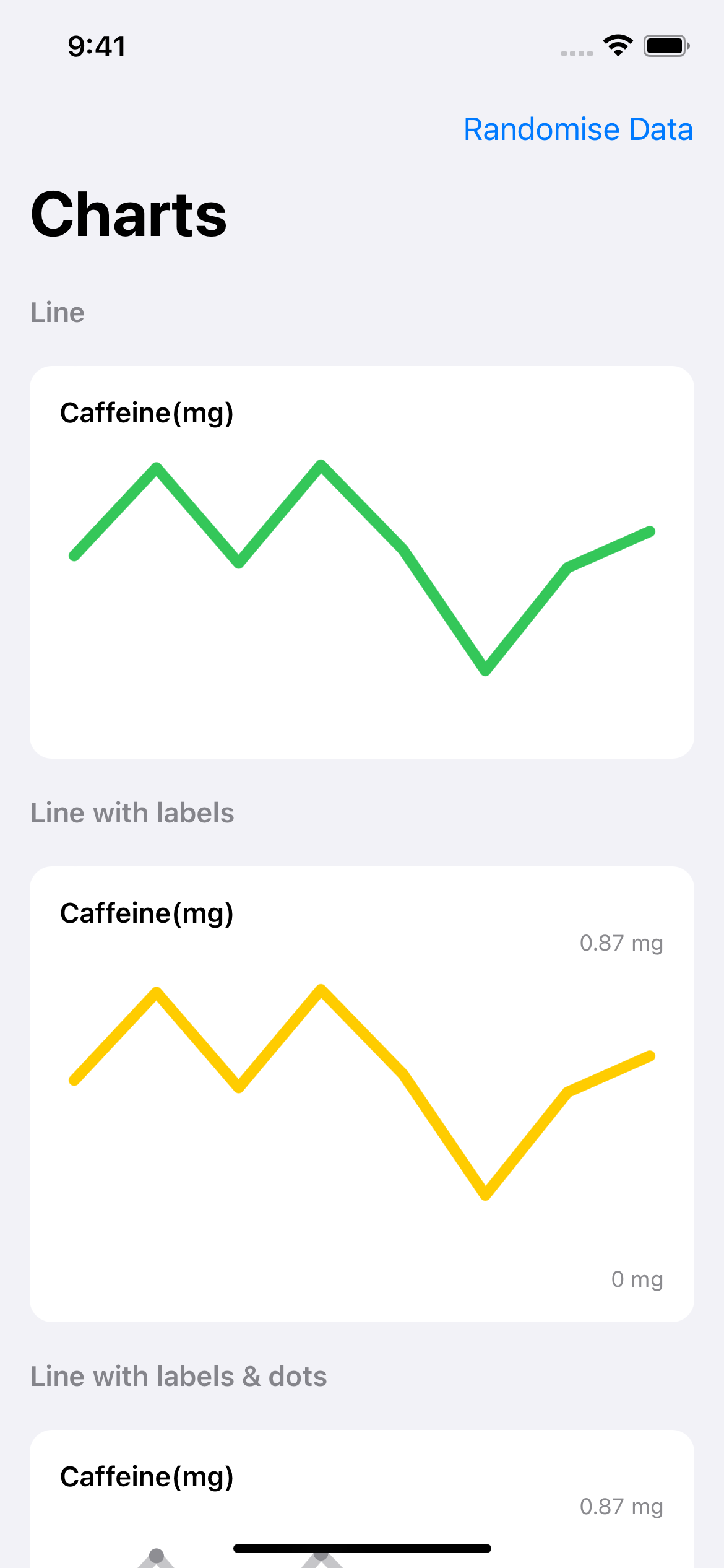
Line Chart
It's time to draw something. Thanks to our base view, this is going to be shockingly easy. First, we'll make a quick wrapper with a title that our chart can live in.
struct LineChart: ChartView {
    let insets: CGFloat = 8
    let strokeWidth: CGFloat = 6
    var color: Color = .teal
    let graphHeight: CGFloat

    var model: ChartModel

    var body: some View {
        VStack(alignment: .leading) {
            Text(model.title)
                .font(.subheadline)
                .fontWeight(.semibold)
        }
    }
}
struct LineChart: ChartView {
let insets: CGFloat = 8
let strokeWidth: CGFloat = 6
var color: Color = .teal
let graphHeight: CGFloat
var model: ChartModel
var body: some View {
VStack(alignment: .leading) {
Text(model.title)
.font(.subheadline)
.fontWeight(.semibold)
}
}
}Now, we'll add our first canvas. The block for a canvas accepts a closure with two parameters, the context and the size. The context is what we use to draw with, and the size is a pre-calculated size. No need to add your own GeometryReader here! 🎉. You'll spot the hard set size here, and thats just so we can make sure the chart is a specific height even if the labels around it are scaled for accessibility purposes.
Lets get the canvas into our hierarchy.
var body: some View {
    VStack(alignment: .leading) {
        Text(model.title)
            .font(.subheadline)
            .fontWeight(.semibold)
        Canvas { context, size in
           // TODO
        }
        .frame(height: graphHeight)
    }
    .padding()
    .background(
        RoundedRectangle(cornerRadius: 12)
            .foregroundColor(Color(UIColor.systemBackground))
    )
}
var body: some View {
VStack(alignment: .leading) {
Text(model.title)
.font(.subheadline)
.fontWeight(.semibold)
Canvas { context, size in
// TODO
}
.frame(height: graphHeight)
}
.padding()
.background(
RoundedRectangle(cornerRadius: 12)
.foregroundColor(Color(UIColor.systemBackground))
)
}Now, lets get to know Canvas. we're going to lean on the models we've built allready so that we can focus on the graphics rather than the math. The simplest building blocks are a path, which contains some lines, which we then tell the context to stroke. A lot of the methods on context are written so nicely you'd actually be able to guess them, for example, addLine(to:).|
Creating a path is simply:
var path = Path()var path = Path()Then we'll need to add our lines. To do this we use the output from our makeChartPoints function earlier, then grab the CGPoints from those.
let chartPoints = makeChartPoints(from: model.values, size: size, unit: model.unit)let chartPoints = makeChartPoints(from: model.values, size: size, unit: model.unit)Next, we can iterate over these and draw lines to them. For the first point, where the path is empty, we'll just move the context to that point. Think of this like moving your pencil to the point you want to start your drawing, before putting it to the paper and going to the next point.
for pathPoint in chartPoints {
    if path.isEmpty {
        path.move(to: pathPoint.point)
    } else {
        path.addLine(to: pathPoint.point)
    }
}
for pathPoint in chartPoints {
if path.isEmpty {
path.move(to: pathPoint.point)
} else {
path.addLine(to: pathPoint.point)
}
}Finally, we can stroke the path. Without this, the context won't actualy draw anything. We use context.stroke() to do this, and we can configure it to make the line look exactly how we want. We tell it the path, the color we want to use, and the StrokeStyle. The StrokeStyle allows us to say how wide the stroke is, and things such as the line caps and the dash pattern to use. In our examples here we're just going to round the edges, but there's more you could do if you'd like.
context.stroke(
path,
with: .color(color),
style: StrokeStyle(lineWidth: strokeWidth, lineCap: .round, lineJoin: .round)
)context.stroke(
path,
with: .color(color),
style: StrokeStyle(lineWidth: strokeWidth, lineCap: .round, lineJoin: .round)
)Here's all that wrapped up together.
Canvas { context, size in
var path = Path()
let chartPoints = makeChartPoints(from: model.values, size: size, unit: model.unit)
for pathPoint in chartPoints {
    if path.isEmpty {
        path.move(to: pathPoint.point)
    } else {
        path.addLine(to: pathPoint.point)
    }
}
context.stroke(
    path,
    with: .color(color),
    style: StrokeStyle(lineWidth: strokeWidth, lineCap: .round, lineJoin: .round)
)
}Canvas { context, size in
var path = Path()
let chartPoints = makeChartPoints(from: model.values, size: size, unit: model.unit)
for pathPoint in chartPoints {
if path.isEmpty {
path.move(to: pathPoint.point)
} else {
path.addLine(to: pathPoint.point)
}
}
context.stroke(
    path,
    with: .color(color),
    style: StrokeStyle(lineWidth: strokeWidth, lineCap: .round, lineJoin: .round)
)
}Place this below the text in your view body, and then you have your first chart!
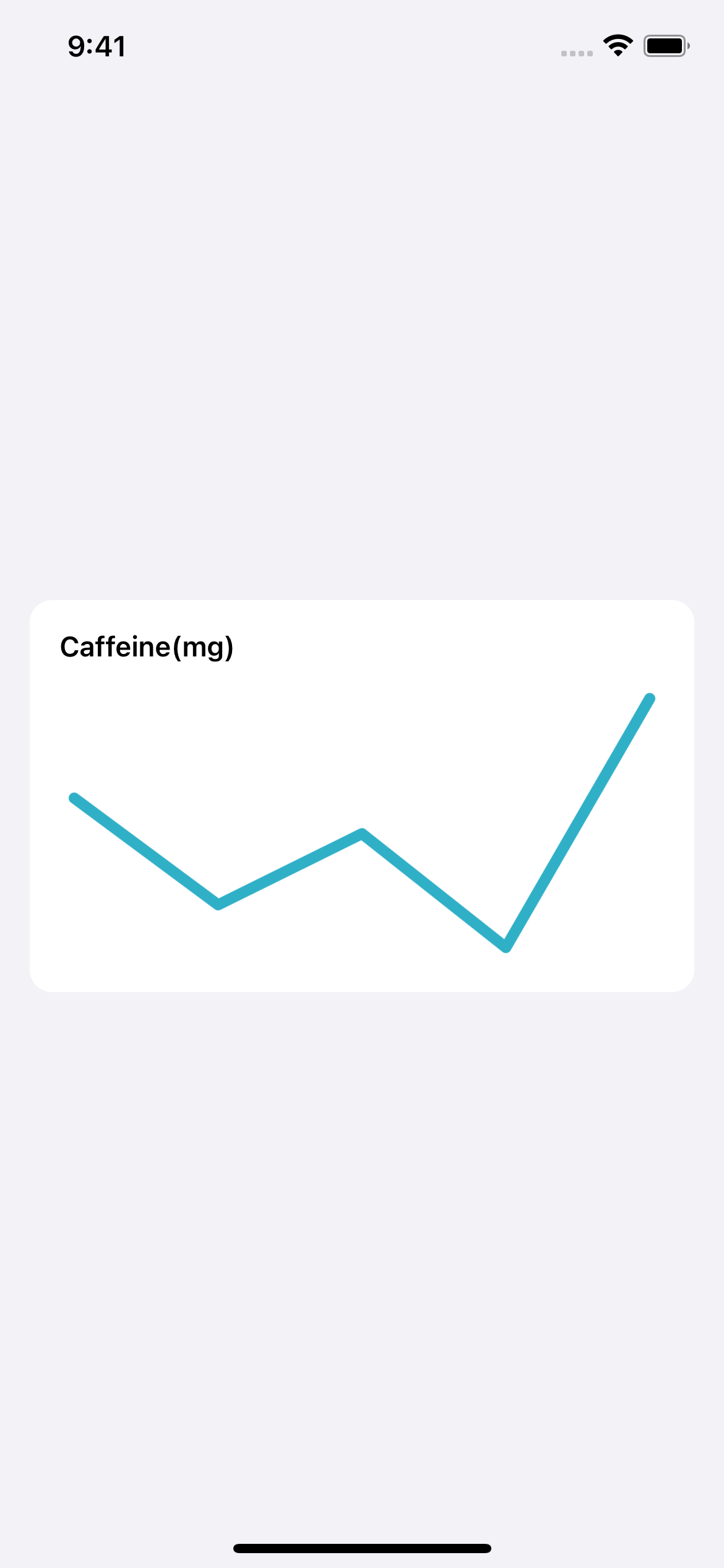
With a simple preview, here's how it came out.
Here's the preview code, too.
struct LineChart_Previews: PreviewProvider {
    static var previews: some View {
        ZStack {
            Color(uiColor: .systemGroupedBackground).edgesIgnoringSafeArea(.all)
            LineChart(
                graphHeight: 150,
                model: .from(rawValues: [42,12,32,0,70], unit: "mg", title: "Caffeine(mg)")!
            )
            .padding()
        }
    }
}
struct LineChart_Previews: PreviewProvider {
static var previews: some View {
ZStack {
Color(uiColor: .systemGroupedBackground).edgesIgnoringSafeArea(.all)
LineChart(
graphHeight: 150,
model: .from(rawValues: [42,12,32,0,70], unit: "mg", title: "Caffeine(mg)")!
)
.padding()
}
}
}Labels
We have a model, a data source and a base view, forming a framework we can use to build whatever graphs we want.
The next thing we'll do is involve some text. Whislt our chart is great and shows a trend, it would be great to see what the maximum and lowest values are. Canvas does have some great helpers we can use, where you can actually ask it to draw text directly at a certain point, but we're going to lean more into traditional SwiftUI here.
In a new LineChartWithLabel, we're going to copy everything we've just made in LineChart and add a NumberFormatter to display our values nicely, then tidy up our hierarchy so we can show some labels. We'll put the chart in its own seperate variable so things are a little easier to read.
static var numberFormatter: NumberFormatter = {
    let formatter = NumberFormatter()
    formatter.generatesDecimalNumbers = true
    formatter.maximumFractionDigits = 2
    return formatter
}()

var body: some View {
    VStack {
        ...
        chart
    }
}

var chart: some View {
    Canvas {
        ...
    }
    .frame(height: graphHeight)
}
static var numberFormatter: NumberFormatter = {
let formatter = NumberFormatter()
formatter.generatesDecimalNumbers = true
formatter.maximumFractionDigits = 2
return formatter
}()
var body: some View {
VStack {
...
chart
}
}
var chart: some View {
Canvas {
...
}
.frame(height: graphHeight)
}The number formatter is static as every instance of this view will use it, so its best to have the one lazily initialised value that they can all share.
For our labels we're going to have to be pragmatic. Whilst it would be pretty to have a perfectly aligned label to the top and bottom points, we can't then account for things like accessibility text. The best solution is to leave our graph with its fixed height, then make sure the labels are above and below, free to scale as they need for the user.
Our labels are going to be nice and easy, just wrapped in HStacks so they get pushed to the end of the available space.
var highestLabel: some View {
    HStack(alignment: .top) {
        Spacer()
        if let biggestValue = model.values.sorted(by: { $0.underlyingValue > $1.underlyingValue }).first {
            labelText(underlyingValue: biggestValue.underlyingValue)
        }
    }
}

var lowestLabel: some View {
    HStack(alignment: .bottom) {
        Spacer()
        labelText(underlyingValue: 0)
    }
}

func labelText(underlyingValue: Double) -> some View {
    Text("\(Self.numberFormatter.string(from: NSNumber(value: underlyingValue)) ?? "") \(model.unit)")
        .font(.caption)
        .foregroundColor(.secondary)
}
var highestLabel: some View {
HStack(alignment: .top) {
Spacer()
if let biggestValue = model.values.sorted(by: { $0.underlyingValue > $1.underlyingValue }).first {
labelText(underlyingValue: biggestValue.underlyingValue)
}
}
}
var lowestLabel: some View {
HStack(alignment: .bottom) {
Spacer()
labelText(underlyingValue: 0)
}
}
func labelText(underlyingValue: Double) -> some View {
Text("\(Self.numberFormatter.string(from: NSNumber(value: underlyingValue)) ?? "") \(model.unit)")
.font(.caption)
.foregroundColor(.secondary)
}To use these, we just have to add them above and below our chart in the view body.
var body: some View {
    VStack(alignment: .leading) {
        Text(model.title)
            .font(.subheadline)
            .fontWeight(.semibold)
        highestLabel
        chart
            .frame(height: graphHeight)
        lowestLabel

    }
    .padding()
    .background(
        RoundedRectangle(cornerRadius: 12)
            .foregroundColor(Color(UIColor.systemBackground))
    )
}
var body: some View {
VStack(alignment: .leading) {
Text(model.title)
.font(.subheadline)
.fontWeight(.semibold)
highestLabel
chart
.frame(height: graphHeight)
lowestLabel
}
.padding()
.background(
RoundedRectangle(cornerRadius: 12)
.foregroundColor(Color(UIColor.systemBackground))
)
}Here's what it looks like with and without accessibility text enabled. A visually impaired user can still see the trend and labels, and a user witohut any visual impairment doesn't have to lose anything.
Taking it further
In this section, i'm going to show a couple variations you could do using very similar code to what we've allready used. Take this as inspiration, and go wild with it.
Each example takes LineChartWithLabel as a starting point and goes from there. If you're just after the sample code, you can download it from the repo at the end.
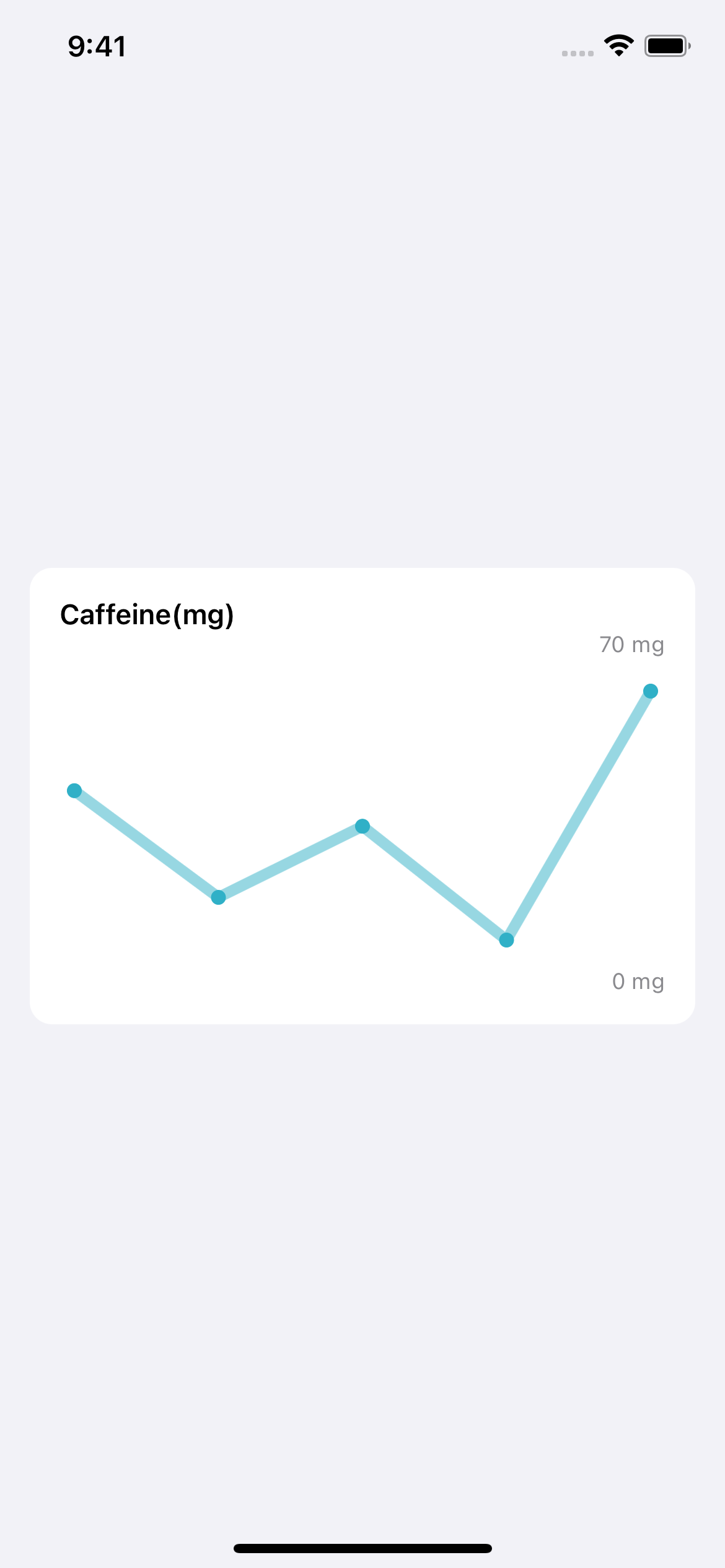
Adding points
Sometimes its nice to see the points exxaggerated a little more, rather than just having a line cap. to do this, simply iterate over the points a second time and draw some points. Under our if statement inside the pathPoints loop, we can just draw something extra. Context.fill() will fill in whatever path we pass to it. When drawing like this I prefer to work out the bounding box for a shape and then use that to define the shape itself.
We'll need an extra variable, dotWidth. I'd reccomend starting with the same as the strokeWidth and making it bigger from there.
let dotWidth: CGFloat = 8let dotWidth: CGFloat = 8for pathPoint in chartPoints {
if path.isEmpty {
path.move(to: pathPoint.point)
} else {
path.addLine(to: pathPoint.point)
}
let circleBox = CGRect(x: pathPoint.point.x - (dotWidth/2), y: pathPoint.point.y - (dotWidth/2), width: dotWidth, height: dotWidth)
context.fill(Circle().path(in: circleBox), with: .color(color))
}
context.stroke(
path,
with: .color(color.opacity(0.5)),
style: StrokeStyle(lineWidth: strokeWidth, lineCap: .round, lineJoin: .round)
)for pathPoint in chartPoints {
if path.isEmpty {
path.move(to: pathPoint.point)
} else {
path.addLine(to: pathPoint.point)
}
let circleBox = CGRect(x: pathPoint.point.x - (dotWidth/2), y: pathPoint.point.y - (dotWidth/2), width: dotWidth, height: dotWidth)
context.fill(Circle().path(in: circleBox), with: .color(color))
}
context.stroke(
path,
with: .color(color.opacity(0.5)),
style: StrokeStyle(lineWidth: strokeWidth, lineCap: .round, lineJoin: .round)
)For a little extra visual flair the color of the line stroke has been set to 0.5 opacity, this exxaggerates our dots and lets us play with the background color a little more.
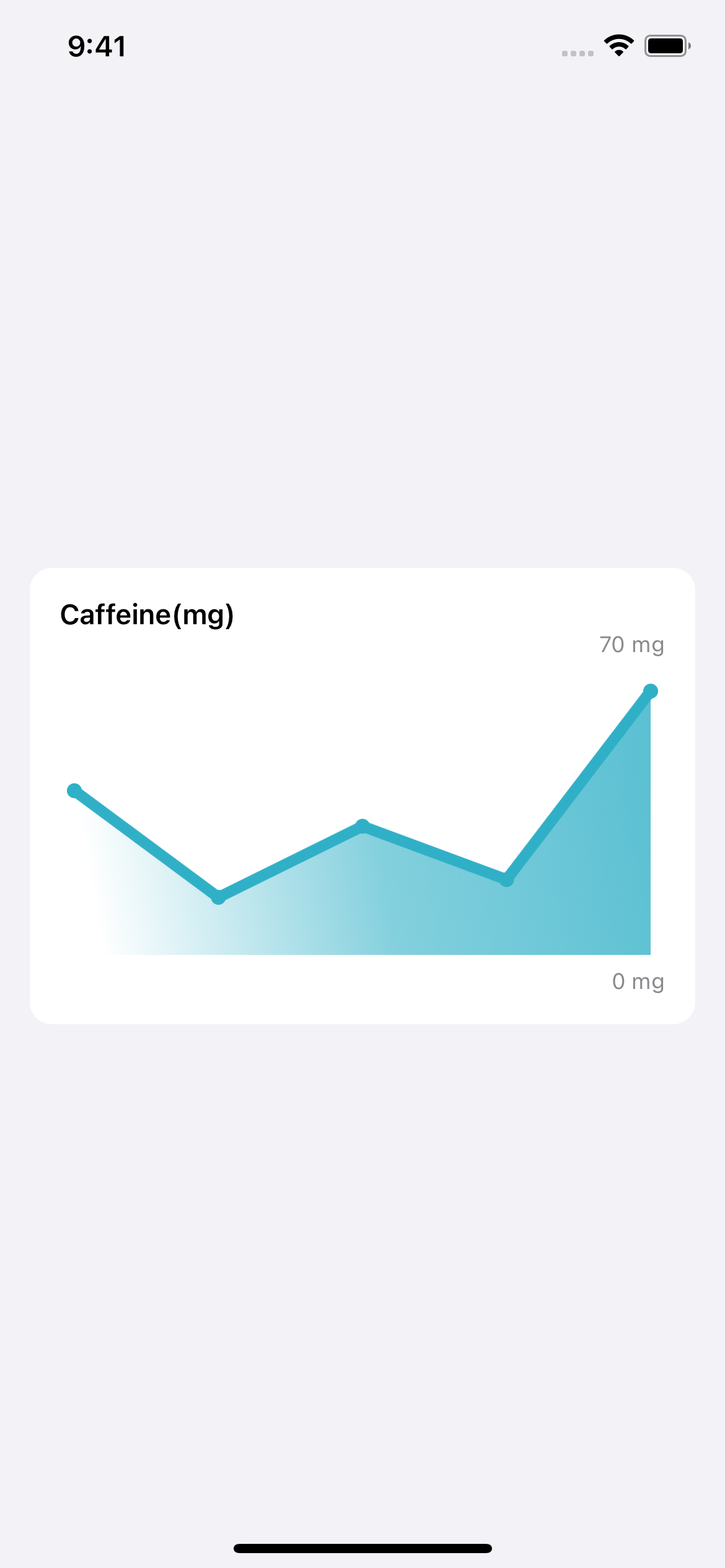
Filling the background
Lines are great, but what if we could fill the background so we ended up with a big shape instead of just a line? Canvas lets us do this by cloning our original path, closing it by drawing lines to the bottom of the canvas, then filling it. Lets take a look at how we do that.
for pathPoint in pathPoints {
    ...
}
// Check we actually have points and draw this first
if let lastPoint = chartPoints.last, let firstPoint = chartPoints.first {
    var backgroundPath = path
    // Go to the bottom right
    backgroundPath.addLine(to: CGPoint(x: lastPoint.point.x, y: maxY(size: size)))
    // Go to the bottom left
    backgroundPath.addLine(to: CGPoint(x: insets, y: maxY(size: size)))
    // Back to the first point
    backgroundPath.addLine(to: firstPoint.point)
    // Fill with a semi-opaque color
    context.fill(backgroundPath, with: .color(.teal.opacity(0.5)))
}

// Stroke with an opaque color to get nice seperation between this and the color
context.stroke(
    path,
    with: .color(color.opacity(1.0)),
    style: StrokeStyle(lineWidth: strokeWidth, lineCap: .round, lineJoin: .round)
)
for pathPoint in pathPoints {
...
}
// Check we actually have points and draw this first
if let lastPoint = chartPoints.last, let firstPoint = chartPoints.first {
var backgroundPath = path
// Go to the bottom right
backgroundPath.addLine(to: CGPoint(x: lastPoint.point.x, y: maxY(size: size)))
// Go to the bottom left
backgroundPath.addLine(to: CGPoint(x: insets, y: maxY(size: size)))
// Back to the first point
backgroundPath.addLine(to: firstPoint.point)
// Fill with a semi-opaque color
context.fill(backgroundPath, with: .color(.teal.opacity(0.5)))
}
// Stroke with an opaque color to get nice seperation between this and the color
context.stroke(
path,
with: .color(color.opacity(1.0)),
style: StrokeStyle(lineWidth: strokeWidth, lineCap: .round, lineJoin: .round)
)Thanks to SwiftUI's value types, to copy the path we just make a new variable and copy the old path. We then just fill the rest of the line, and tell the canvas to fill it.

I've gone for a simple fill here, but you can take it futher, filling with gradients or even other shapes.
To get a gradient, simply replace the context.fill line with this:
context.fill(
    backgroundPath,
    with: .linearGradient(
        Gradient(
            colors: [Color.clear, color.opacity(0.6), color.opacity(0.8)]
        ),
        startPoint: firstPoint.point,
        endPoint: lastPoint.point
    )
)
Which gives you a lovely graident from left to right.
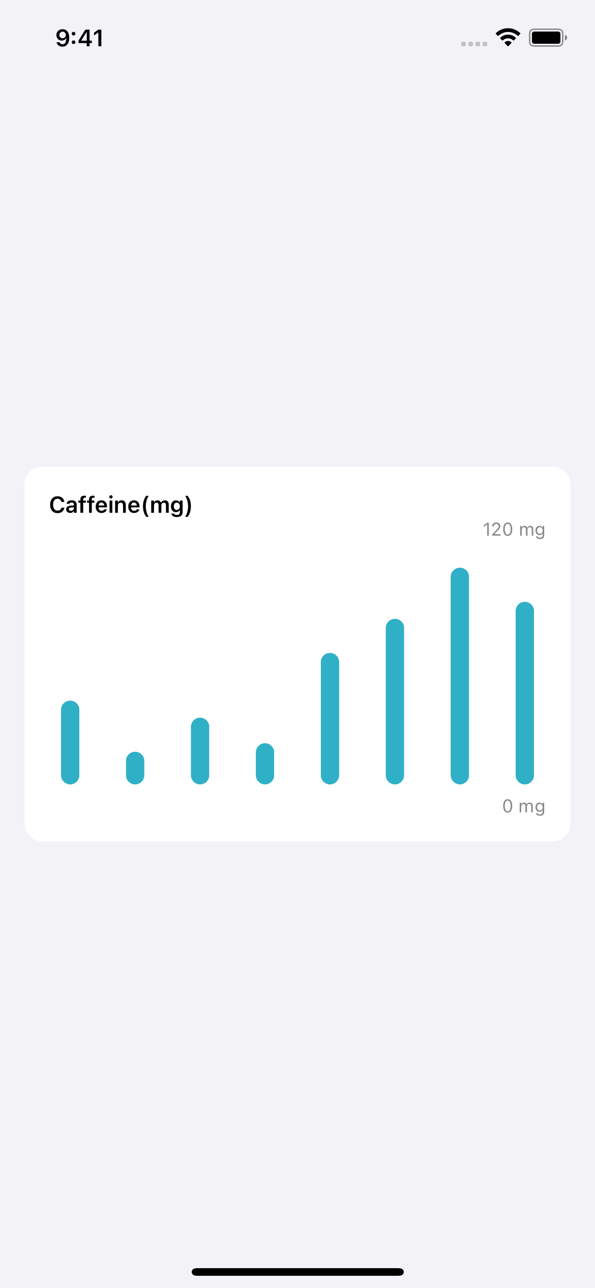
Bar chart
With just a few slight tweaks, we can extend our data source to also make bar charts. Open up the extension in ChartView, and add these two new functions.
// Helpers for when we're not just drawing a single point

/// Given a set of data points, where 0 is minimum and 1 is maximum, returns a set of ChartPoints containing CGPoints for a given size
/// Insets are used to inset the bounding box so that the edges of the shape are visible. To opt-out of this behaviour, set the insets to 0.
func makeChartPoints(from dataPoints: [ChartValue], size: CGSize, unit: String, itemWidth: CGFloat) -> [ChartPoint] {
    let halfItemWidth = itemWidth
    var currentX: CGFloat = insets + halfItemWidth

    var size = size
    size.height = size.height - insets * 2
    size.width = size.width - insets * 2

    return dataPoints.map { dataPoint in
        let point = CGPoint(x: currentX, y: yValueForPoint(dataPoint: dataPoint.value, size: size))
        // We need to increment by half the bar width, too
        currentX += xValuePerPoint(size: size, withItemWidth: itemWidth)
        return ChartPoint(point: point, value: "\(dataPoint.underlyingValue) \(unit)")
    }
}


/// How far we need to move per value.
/// If theres 5 values, and we have 100 pixels, they should start at 0 and add 20 per value, so the last point is at 100.
func xValuePerPoint(size: CGSize, withItemWidth width: CGFloat) -> CGFloat {
    let widthWithoutItems = size.width - width
    return widthWithoutItems / CGFloat(model.values.count-1)
}
// Helpers for when we're not just drawing a single point
/// Given a set of data points, where 0 is minimum and 1 is maximum, returns a set of ChartPoints containing CGPoints for a given size
/// Insets are used to inset the bounding box so that the edges of the shape are visible. To opt-out of this behaviour, set the insets to 0.
func makeChartPoints(from dataPoints: [ChartValue], size: CGSize, unit: String, itemWidth: CGFloat) -> [ChartPoint] {
let halfItemWidth = itemWidth
var currentX: CGFloat = insets + halfItemWidth
var size = size
size.height = size.height - insets * 2
size.width = size.width - insets * 2
return dataPoints.map { dataPoint in
let point = CGPoint(x: currentX, y: yValueForPoint(dataPoint: dataPoint.value, size: size))
// We need to increment by half the bar width, too
currentX += xValuePerPoint(size: size, withItemWidth: itemWidth)
return ChartPoint(point: point, value: "\(dataPoint.underlyingValue) \(unit)")
}
}
/// How far we need to move per value.
/// If theres 5 values, and we have 100 pixels, they should start at 0 and add 20 per value, so the last point is at 100.
func xValuePerPoint(size: CGSize, withItemWidth width: CGFloat) -> CGFloat {
let widthWithoutItems = size.width - width
return widthWithoutItems / CGFloat(model.values.count-1)
}These helpers very slightly change the algorithm to make sure we account for the fact our items have an actual width now. This means we can no longer ignore the width of the first point, and we also have to shift our x values by half the width of the bar.
To actually make use of these, make a new BarChart based on your existing LineChartWithFill, and empty out the canvas body. The canvas for a bar chart is actually a little simpler, so lets take a look at it.
Canvas { context, size in
    let barWidth: CGFloat = 20
    let halfBarWidth: CGFloat = barWidth / 2
    let chartPoints = makeChartPoints(from: model.values, size: size, unit: model.unit, itemWidth: barWidth)
    for pathPoint in chartPoints {
        let cgPoint = pathPoint.point
        let barX = cgPoint.x
        let barY = cgPoint.y
        let barHeight = maxY(size: size) - cgPoint.y

        let capsulePath = CGRect(x: barX-halfBarWidth, y: barY, width: 12, height: barHeight)
        context.fill(
            Capsule().path(in: capsulePath),
            with: .color(color)
        )
    }
}
.frame(height: graphHeight)
Canvas { context, size in
let barWidth: CGFloat = 20
let halfBarWidth: CGFloat = barWidth / 2
let chartPoints = makeChartPoints(from: model.values, size: size, unit: model.unit, itemWidth: barWidth)
for pathPoint in chartPoints {
let cgPoint = pathPoint.point
let barX = cgPoint.x
let barY = cgPoint.y
let barHeight = maxY(size: size) - cgPoint.y
let capsulePath = CGRect(x: barX-halfBarWidth, y: barY, width: 12, height: barHeight)
context.fill(
Capsule().path(in: capsulePath),
with: .color(color)
)
}
}
.frame(height: graphHeight)First up, we've used our new makeChartPoints to grab the points with their adjustments. Where we used to iterate over the points and add lines between each, we now make a box for the bar to go in.
To calculate the bar box, we take the point we get provided and shift to the left by half the bar width. The Y value is ok as we want to draw the bar from that point. The height is calculated similarly to how we actually calculate the y for a given point, we take the y value and subtract it from the maximum value, to give us the amount we need to draw.
Actually adding our shape is exactly how we did our Circles earlier - just this time with a Capsule.
Here's the end result, it looks great!
Thanks for reading!
I normally just link the repo, but this time, I'd like to point out the sample app thats included. It'll randomise some colors and throw in a data set to the charts. It's important to double check your charts with various dat sets to make sure that it actually works for any set of data, rather than coincidentally working for the data you provide. There's some force unwrapping for the data models, but thats because its impossible for it to fail with these examples.
The special part of this is that the graphs are all inside a LazyVStack, and just rendered as they are. I don't do anything fancy with re-use, I just let the VStack draw them as it needs to. This helps to highlight the powers of the Canvas, including things like its drawingGroup usage under the hood, and how lightweight it is.
Today, we've barely scratched the surface of canvas, but its enough to get started.
You can find the code sample in my repo as always.
If you fancy reading a little more, or sharing your experiences, I’m @SwiftyAlex on twitter.