Mirror - Apple Settings
Welcome to the first piece in my Mirror series. The goal for mirror is to take an app, break it down into some components, and try to re-create those in SwiftUI. By the end of each piece you should have some easy to use components you could put in your apps. With each component we'll consider accessibility, making sure that dynamic type is supported as a bare minimum.
These will be a little longer than you'd expect for simple views, but I believe its important to understand whats going on instead of just throwing code at someone.
In this first piece, we'll take a look at the classic Apple iOS settings screen.
Breaking it down
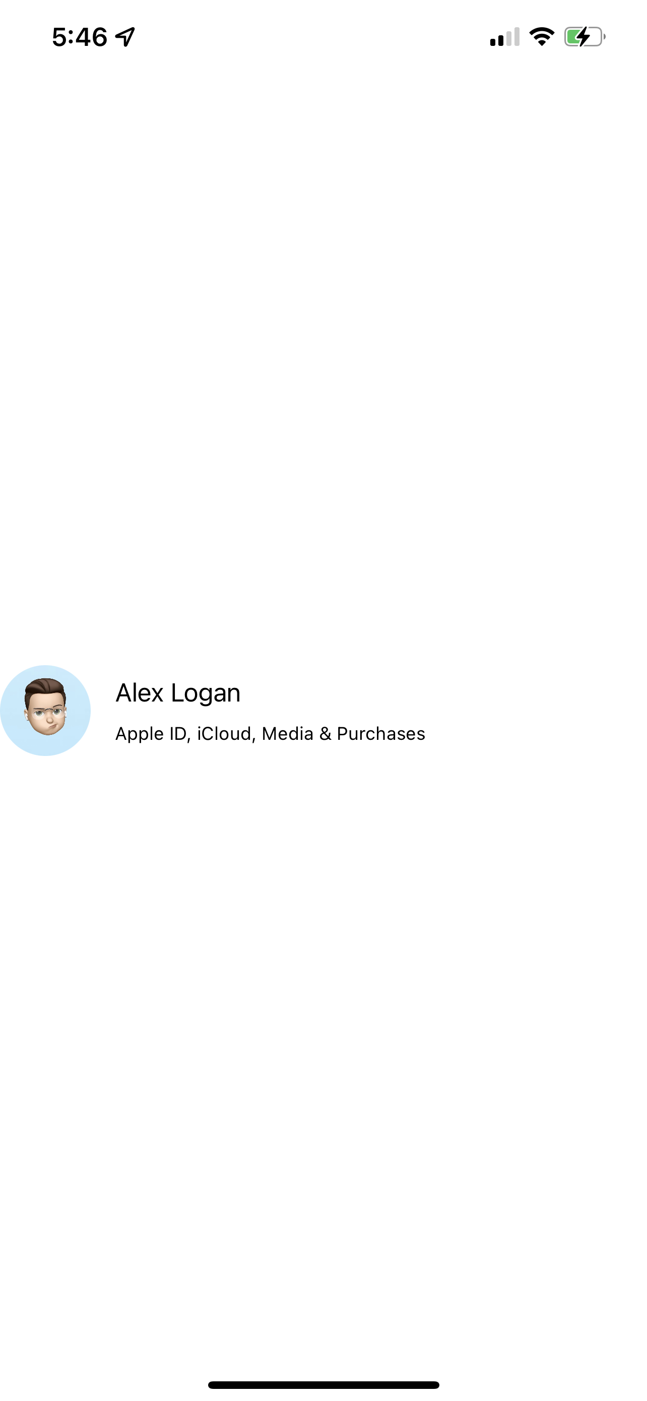
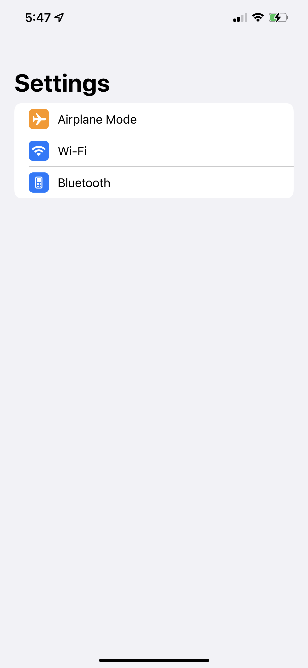
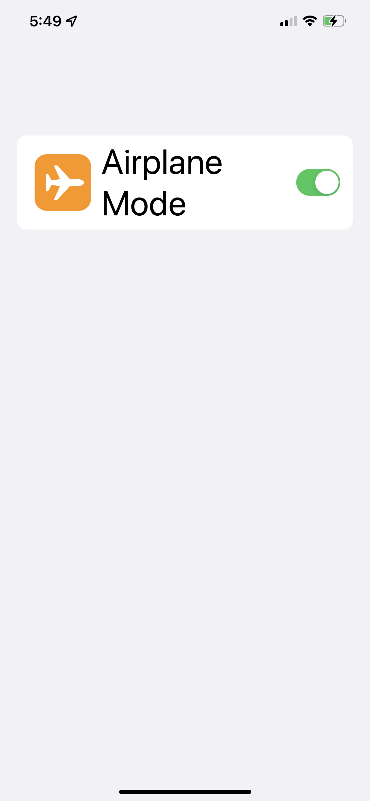
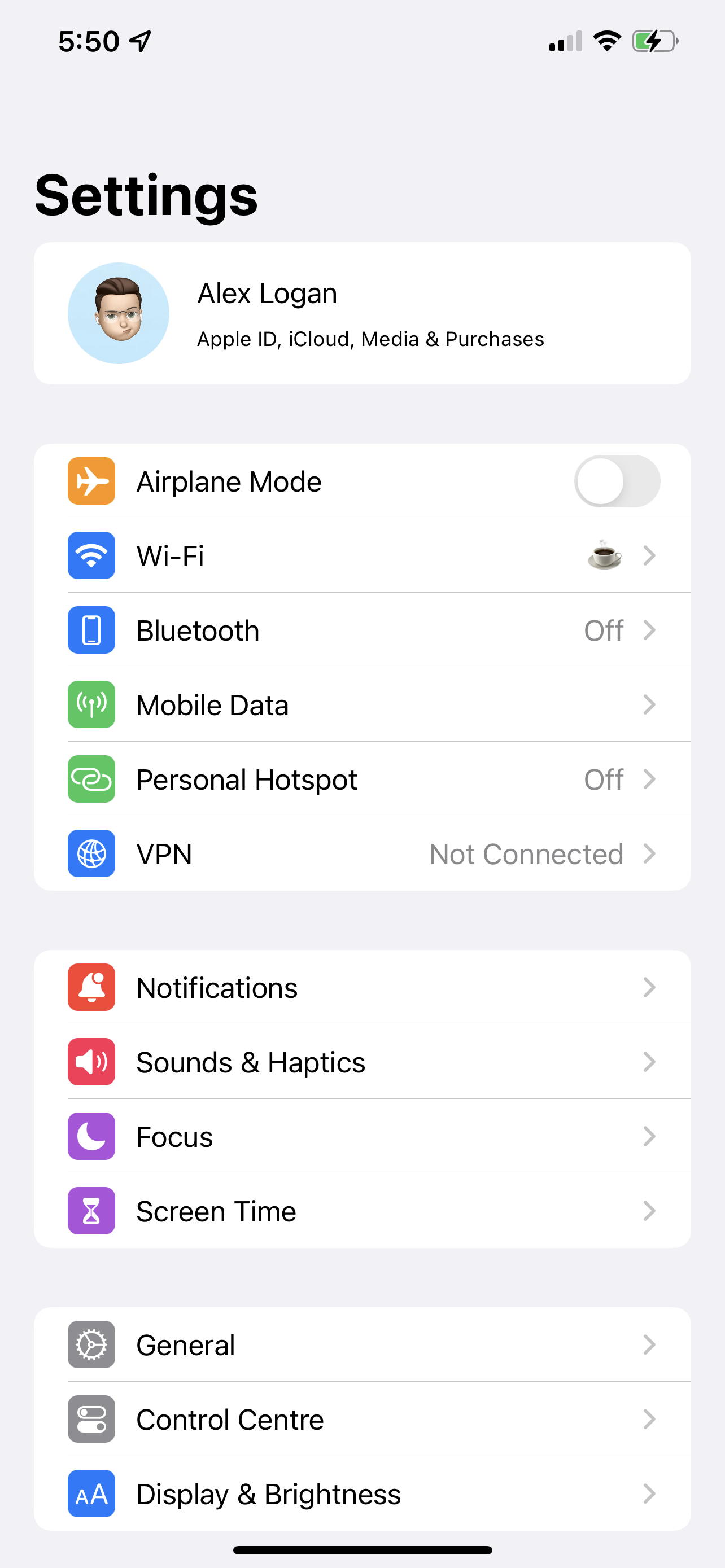
Here's the settings screen from iOS 15.
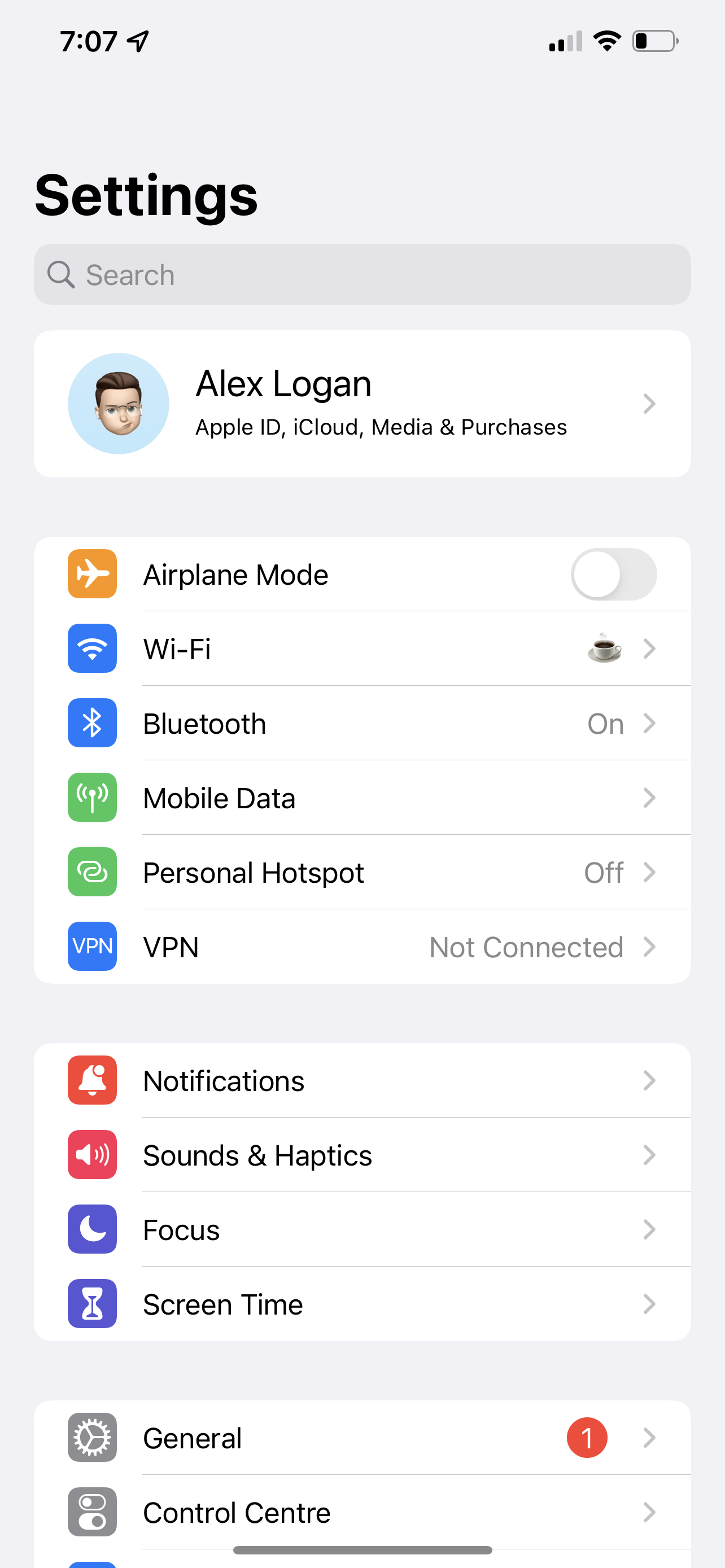
There's very few different components here, so its a perfect place to get started with trying to replicate another app. Lets pick those out.
The header is a static component that always has an image, some text, and a disclosure indicator.
The line items all follow a formula. The first part is an icon with a colored background and a label that says what the item is. Next up is a slot for a control or secondary label, for example, Airplane mode is a toggle, but Wi-Fi has a second label and a disclosure indicator.
I've not picked out the navigation bar and search bar, because they're built in components that we get completley for free.
Building the header
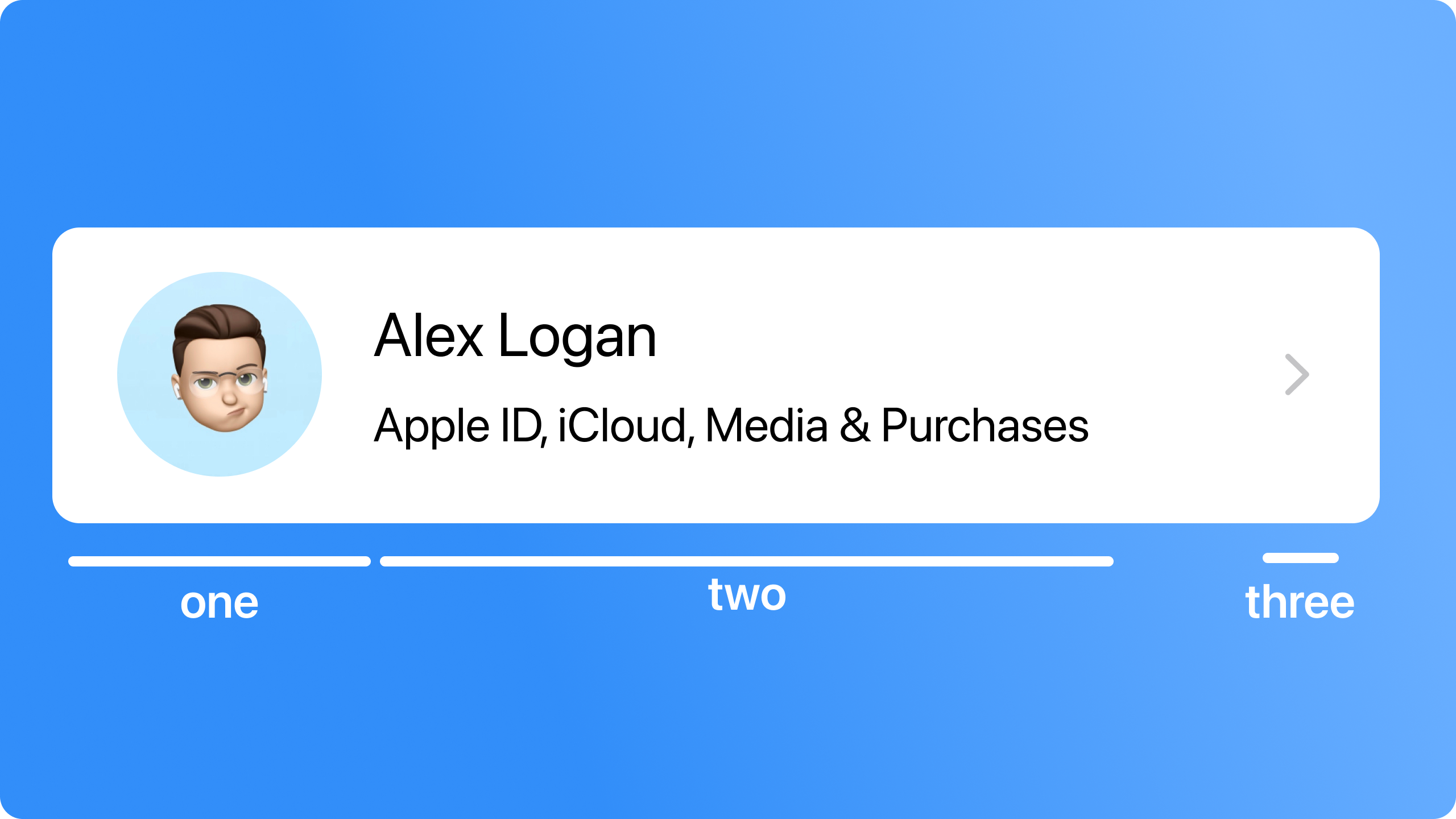
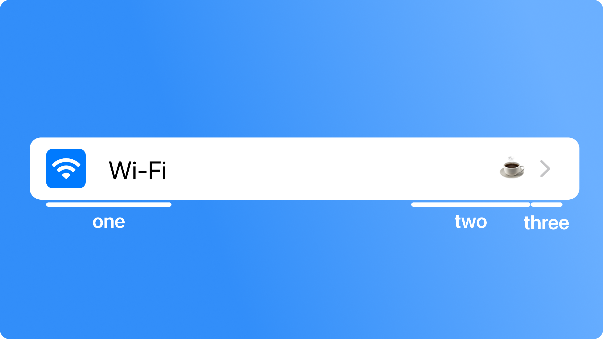
Lets start with the simplest component, the header. In the image above there's a label for the first, second and third sections. This wasn't just to break it down visually, this is also how we'll build it.
Part one is nice and easy, just an image with a specific size, that we clip with a circle.
    var userAvatar: some View {
        Image(avatarName)
            .resizable()
            .aspectRatio(contentMode: .fill)
            .frame(width: 60, height: 60, alignment: .center)
            .clipShape(Circle())
    }
var userAvatar: some View {
Image(avatarName)
.resizable()
.aspectRatio(contentMode: .fill)
.frame(width: 60, height: 60, alignment: .center)
.clipShape(Circle())
}The second is just some text, but we'll have to follow some strict rules. We want this view to be accessible, and the easiest way to do that is to use Apple's built in text styles. This means the view might be slightly off our source material, but it'll be close enough for a standard user, and brilliant for someone who needs to turn the text size all the way up.
var text: some View {
VStack(alignment: .leading, spacing: 10) {
Text(name)
.lineLimit(nil)
.font(.body)
Text("Apple ID, iCloud, Media & Purchases")
.lineLimit(nil)
.font(.caption)
}
} var text: some View {
VStack(alignment: .leading, spacing: 10) {
Text(name)
.lineLimit(nil)
.font(.body)
Text("Apple ID, iCloud, Media & Purchases")
.lineLimit(nil)
.font(.caption)
}
}The fonts here look just about right, so we'll go with those. The line limit has been set to nil to allow the contents to wrap if they need to. Remember - just because your name fits nicely on one line with default fonts, doesn't mean someone else's will.
If you're new to accessible text, checkout the human interface guidelines.
The final thing to do is tie this all together, which we can do nice and easily with a HStack.
var body: some View {
HStack(alignment: .center, spacing: 16){
userAvatar
text
}
.padding(.vertical, 6)
.frame(maxWidth: .infinity, alignment: .leading)
} var body: some View {
HStack(alignment: .center, spacing: 16){
userAvatar
text
}
.padding(.vertical, 6)
.frame(maxWidth: .infinity, alignment: .leading)
}Your whole code will look a little like this.
struct SettingsHeaderView: View {
let name: String
let avatarName: String
var body: some View {
HStack(alignment: .center, spacing: 16){
userAvatar
text
}
.padding(.vertical, 6)
.frame(maxWidth: .infinity, alignment: .leading)
}
    var userAvatar: some View {
        Image(avatarName)
            .resizable()
            .aspectRatio(contentMode: .fill)
            .frame(width: 60, height: 60, alignment: .center)
            .clipShape(Circle())
    }
    var text: some View {
        VStack(alignment: .leading, spacing: 10) {
            Text(name)
                .lineLimit(nil)
                .font(.body)
            Text("Apple ID, iCloud, Media & Purchases")
                .lineLimit(nil)
                .font(.caption)
        }
    }
}struct SettingsHeaderView: View {
let name: String
let avatarName: String
var body: some View {
HStack(alignment: .center, spacing: 16){
userAvatar
text
}
.padding(.vertical, 6)
.frame(maxWidth: .infinity, alignment: .leading)
}
var userAvatar: some View {
Image(avatarName)
.resizable()
.aspectRatio(contentMode: .fill)
.frame(width: 60, height: 60, alignment: .center)
.clipShape(Circle())
}
    var text: some View {
        VStack(alignment: .leading, spacing: 10) {
            Text(name)
                .lineLimit(nil)
                .font(.body)
            Text("Apple ID, iCloud, Media & Purchases")
                .lineLimit(nil)
                .font(.caption)
        }
    }
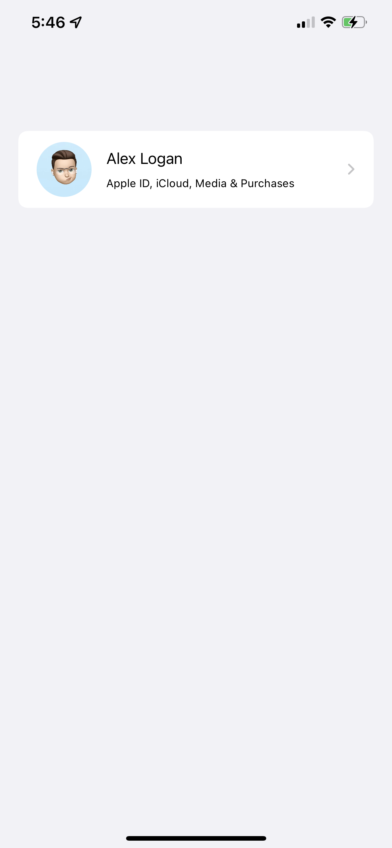
}Here's what the view looks like in the previews at the moment.
Not bad at all!
The finishing touches to this view won't be done by us, they'll be done by SwiftUI, and some of the magic built into a list. Because we know this view is only going to be used in a List, we can actually change the preview to show it in one, like so.
You'll notice that the SettingsHeaderView has been wrapped in a NavigationLink - this is just so we can get our disclosure indicator for free. In a real app, you'd want to give this a real destination, not just some empty text.
struct SettingsHeaderView_Previews: PreviewProvider {
    static var previews: some View {
        NavigationView {
            List {
                NavigationLink(destination: { Text("") }) {
                    SettingsHeaderView(name: "Alex Logan", avatarName: "memoji")
                }
            }
        }
    }
}
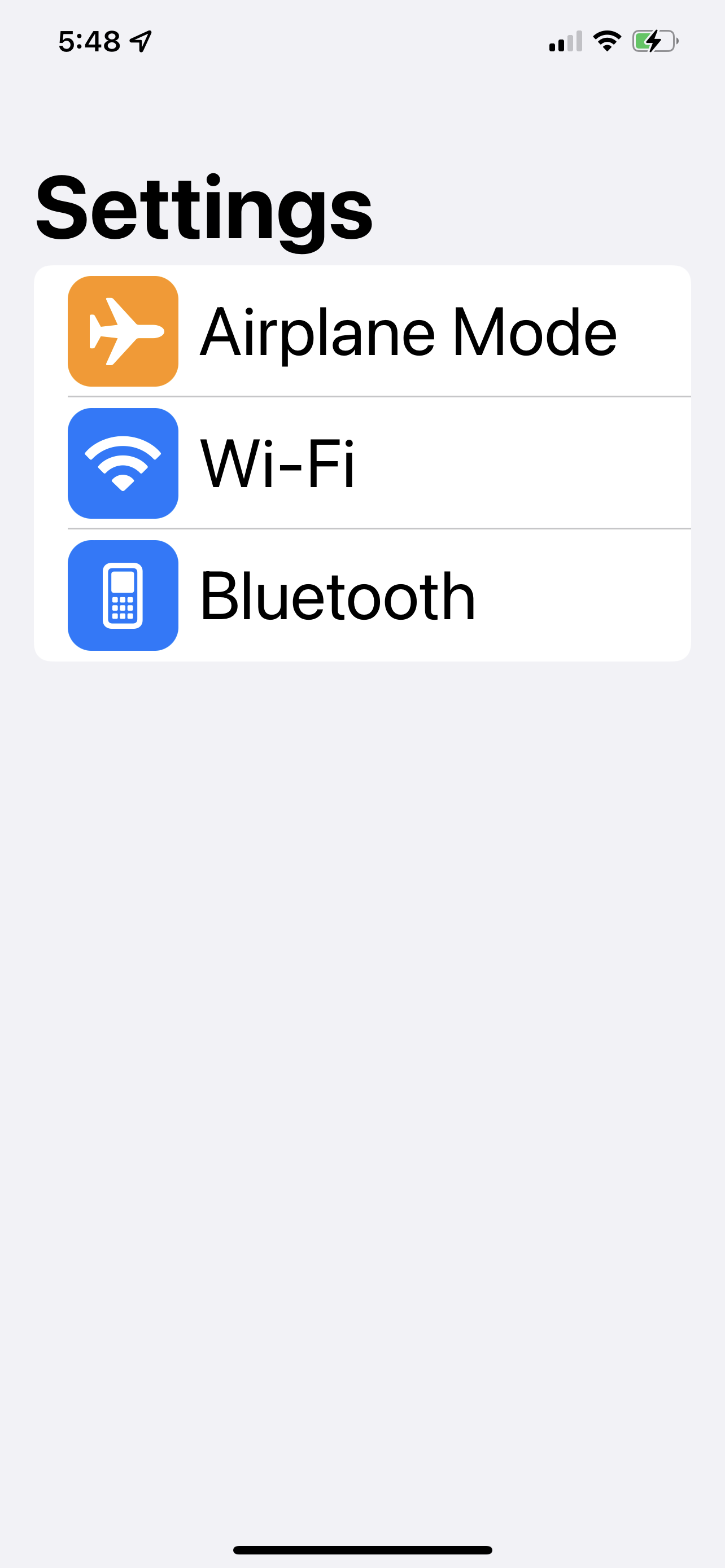
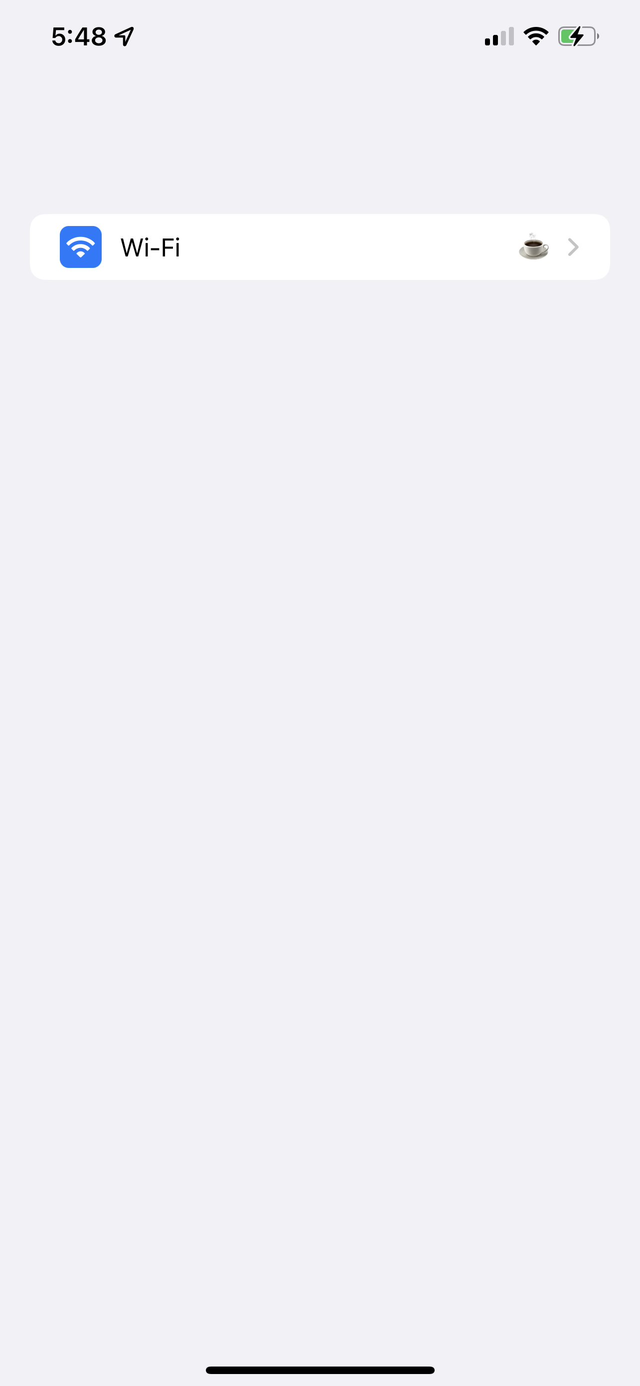
The preview is now pretty much perfect, but what about our dynamic text?
You can actually test this without getting out a device or simulator. Select the button shown below and set the text size to the biggest you can.
The image won't scale, but thats intentional. The priority should be given to the text in this case, and we don't really know what quality that image will be, so making it huge isn't the best idea.
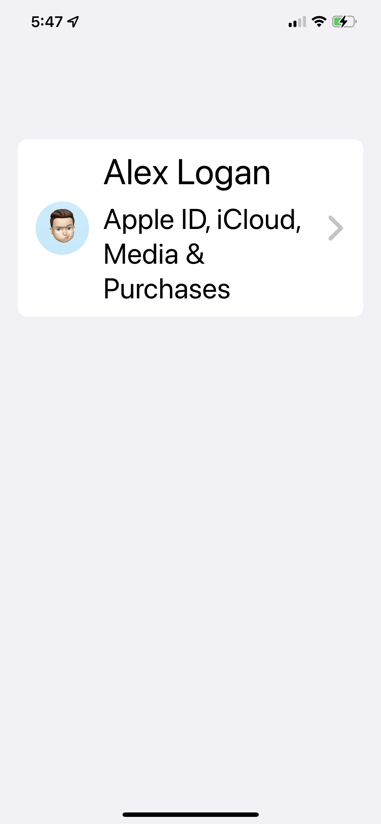
There we go! Now, lets move onto the line items.
Building the line items
Lets get started with the individual rows. For a quick refresher, this is what we're going for.
The first part is a label, the second is an optional control/label, and then theres a disclosure indicator.
To build the labels, we can make use of the LabelStyle API provided by SwiftUI that we can use to turn any Label into exactly what we're looking for.
For our custom LabelStyle, we're going to need something that can take a color that gets passed to it, and set that as the background for the icon. The rest of the label we can just use the built in variables.
struct SettingsLabelStyle: LabelStyle {
    @ScaledMetric var accessibilityScale: CGFloat = 1
    var cornerRadius: CGFloat {
        6 * accessibilityScale
    }
    var iconFrameSize: CGFloat {
        28 * accessibilityScale
    }

    let backgroundColor: Color

    func makeBody(configuration: Configuration) -> some View {
        HStack(spacing: 12) {
            RoundedRectangle(cornerRadius: cornerRadius)
                .frame(width: iconFrameSize, height: iconFrameSize, alignment: .center)
                .foregroundColor(backgroundColor)
                .overlay(
                    configuration.icon
                        .imageScale(.medium)
                        .foregroundColor(.white)
                )
            configuration.title
                .font(.body)
                .foregroundColor(.primary)
								.frame(maxWidth: .infinity,alignment: .leading)
            Spacer()
        }
    }
}
struct SettingsLabelStyle: LabelStyle {
@ScaledMetric var accessibilityScale: CGFloat = 1
var cornerRadius: CGFloat {
6 * accessibilityScale
}
var iconFrameSize: CGFloat {
28 * accessibilityScale
}
let backgroundColor: Color
func makeBody(configuration: Configuration) -> some View {
HStack(spacing: 12) {
RoundedRectangle(cornerRadius: cornerRadius)
.frame(width: iconFrameSize, height: iconFrameSize, alignment: .center)
.foregroundColor(backgroundColor)
.overlay(
configuration.icon
.imageScale(.medium)
.foregroundColor(.white)
)
configuration.title
.font(.body)
.foregroundColor(.primary)
.frame(maxWidth: .infinity,alignment: .leading)
Spacer()
}
}
}There's a little more going on here than you might expect, so lets break it down.
-
ScaledMetric - This incredible property wraper will take the number provided and scale it based on the users dynamic size settings ( it will get bigger if they turn up the text size, and smaller if they make it smaller). Here we're just using one as the baseline, which we multiply our sizes with. If we didn't do this, things wouldnt scale alongside our text, and they could look a little weird.
-
The icon might look like its the wrong way around, as we've got a shape with an overlay of an image. This isn't a mistake, this is to take advantage of the sizing. We have a specific size we want the square to be, and all we care about for the image is that it fits within that space. If we had the image and set its background, we might end up with variable sizes and have to do some awkward work with aspect ratios.
A label style isnt typically something you would get a preview for,but thanks to the way previews work, we can add a special one. Similar to what we did before, we'll make a preview that puts things in a List.
To apply our label style to a label, we just use the .labelStyle() modifier.
struct SettingsLabelStyle_Previews: PreviewProvider {
    static var previews: some View {
        NavigationView {
            List {
                Label("Airplane Mode", systemImage: "airplane")
                    .labelStyle(SettingsLabelStyle(backgroundColor: .orange))
                Label("Wi-Fi", systemImage: "wifi")
                    .labelStyle(SettingsLabelStyle(backgroundColor: .blue))
                Label("Bluetooth", systemImage: "candybarphone")
                    .labelStyle(SettingsLabelStyle(backgroundColor: .blue))
            }
            .navigationTitle(Text("Settings"))
        }
    }
}
struct SettingsLabelStyle_Previews: PreviewProvider {
static var previews: some View {
NavigationView {
List {
Label("Airplane Mode", systemImage: "airplane")
.labelStyle(SettingsLabelStyle(backgroundColor: .orange))
Label("Wi-Fi", systemImage: "wifi")
.labelStyle(SettingsLabelStyle(backgroundColor: .blue))
Label("Bluetooth", systemImage: "candybarphone")
.labelStyle(SettingsLabelStyle(backgroundColor: .blue))
}
.navigationTitle(Text("Settings"))
}
}
}
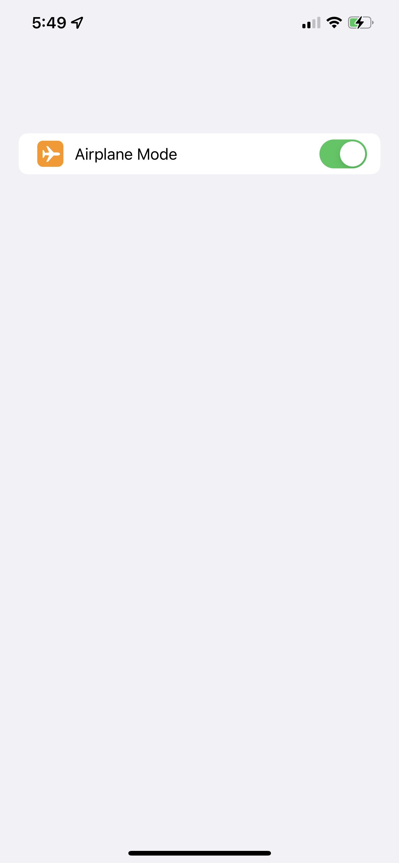
Lets double check our dynamic text again.
It looks great, and importantly, you can see that the "roundedness" stays the same as the text scales up. If you don't like how big the icon gets, just wrap the 28 * accessibilityScale in min() and set a number you want it to be no bigger than. I.e, min(28 * accessibilityScale, 60).
The last detail for these labels is to add the controls and secondary labels. To do this, we'll make two seperate views that contain labels, and then the associated secondary view.
Lets build the simple one first, that just has a secondary label. We'll use our existing label, and add a second piece of text.
struct SimpleSettingsRow: View {
    let title: String
    let systemImage: String
    let color: Color
    let secondaryText: String?

    var body: some View {
        HStack {
            Label(title, systemImage: systemImage)
                .labelStyle(SettingsLabelStyle(backgroundColor: color))
            Spacer()
            Text(secondaryText ?? "")
                .font(.body)
                .foregroundColor(.secondary)
        }
    }
}
struct SimpleSettingsRow: View {
let title: String
let systemImage: String
let color: Color
let secondaryText: String?
var body: some View {
HStack {
Label(title, systemImage: systemImage)
.labelStyle(SettingsLabelStyle(backgroundColor: color))
Spacer()
Text(secondaryText ?? "")
.font(.body)
.foregroundColor(.secondary)
}
}
}When wrapped in a list preview, we get exactly what we were looking for.
Next up is a slightly more complex version of this view, that can support a secondary control. What we'll build will actually support anything at all being put in as that secondary item, so you could always just pass text to it, but I personally find it can be nicer to have the simple version available.
For this one we'll use a custom initialiser that takes a ViewBuilder as an argument so that we can pass in our content the same way we're used to with something built in, like a VStack.
struct SettingsRow<Content: View>: View {
    let title: String
    let systemImage: String
    let color: Color

    let secondaryContent: () -> Content

    init(
        title: String,
        systemImage: String,
        color: Color,
        @ViewBuilder secondaryContent: @escaping () -> Content
    ) {
        self.secondaryContent = secondaryContent
        self.title = title
        self.systemImage = systemImage
        self.color = color
    }


    var body: some View {
        HStack {
            Label(title, systemImage: systemImage)
                .labelStyle(SettingsLabelStyle(backgroundColor: color))
                .layoutPriority(1)
            secondaryContent()
        }
    }
}
struct SettingsRow<Content: View>: View {
let title: String
let systemImage: String
let color: Color
let secondaryContent: () -> Content
init(
title: String,
systemImage: String,
color: Color,
@ViewBuilder secondaryContent: @escaping () -> Content
) {
self.secondaryContent = secondaryContent
self.title = title
self.systemImage = systemImage
self.color = color
}
var body: some View {
HStack {
Label(title, systemImage: systemImage)
.labelStyle(SettingsLabelStyle(backgroundColor: color))
.layoutPriority(1)
secondaryContent()
}
}
}There's a decent amount going on here again, so lets break it down.
- The view has a generic parameter for
Content, so we can tell SwiftUI what type the secondary item is. We store the function that gets passed to us, and then call that in the body. This will ensure that the code is only evaluated when it needs to be, instead of on init. - Our body is identical to before, except we call
secondaryContentinstead of showing some text. - We've set layout priority to allow our text to grow first.
When we use the following preview code, we get a familiar looking result.
struct SettingsRow_Previews: PreviewProvider {
    static var previews: some View {
        NavigationView {
            List {
                SettingsRow(
                    title: "Airplane Mode",
                    systemImage: "airplane",
                    color: .orange,
                    secondaryContent: {
                        Toggle(isOn: .constant(true), label: {})
                            .frame(maxWidth: 50)
                    }
                )
            }
        }
    }
}
struct SettingsRow_Previews: PreviewProvider {
static var previews: some View {
NavigationView {
List {
SettingsRow(
title: "Airplane Mode",
systemImage: "airplane",
color: .orange,
secondaryContent: {
Toggle(isOn: .constant(true), label: {})
.frame(maxWidth: 50)
}
)
}
}
}
}
Lets double check our extra large text size again.
We've now got everything we need to build a full copy of the settings page, so lets do just that.
Putting it all together
All our components are ready to go, we just have to use them. We'll make a list, throw in a couple of sections, and then add our rows.
Our first section is the easiest as its just one component, so lets start with that and our container.
    var body: some View {
        List {
            Section {
                SettingsHeaderView(name: "Alex Logan", avatarName: "memoji")
            }
        }
        .navigationTitle("Settings")
    }
var body: some View {
List {
Section {
SettingsHeaderView(name: "Alex Logan", avatarName: "memoji")
}
}
.navigationTitle("Settings")
}Next, we'll make the first section from the settings page. We'll declare a seperate variable for it to help keep our code cleaner.
    var primarySection: some View {
        Section {
            SettingsRow(title: "Airplane Mode", systemImage: "airplane", color: .orange, secondaryContent: {
                Toggle(isOn: $airplaneModeEnabled, label: {})
            })
            NavigationLink(destination: { Text("Wi-Fi") }) {
                SimpleSettingsRow(title: "Wi-Fi", systemImage: "wifi", color: .blue, secondaryText: networkName)
            }
            NavigationLink(destination: { Text("Bluetooth") }) {
                SimpleSettingsRow(title: "Bluetooth", systemImage: "iphone", color: .blue, secondaryText: bluetoothEnabled ? "On" : "Off")
            }
            NavigationLink(destination: { Text("Mobile Data") }) {
                SimpleSettingsRow(title: "Mobile Data", systemImage: "antenna.radiowaves.left.and.right", color: .green, secondaryText: nil)
            }
            NavigationLink(destination: { Text("Hotspot") }) {
                SimpleSettingsRow(title: "Personal Hotspot", systemImage: "personalhotspot", color: .green, secondaryText: hotspotEnabled ? "On" : "Off")
            }
            NavigationLink(destination: { Text("VPN") }) {
                SimpleSettingsRow(title: "VPN", systemImage: "network", color: .blue, secondaryText: vpnEnabled ? "Connected" : "Not Connected")
            }
        }
    }

// Then in our body..
    var body: some View {
        List {
            Section {
                SettingsHeaderView(name: "Alex Logan", avatarName: "memoji")
            }
            primarySection
        }
        .navigationTitle("Settings")
    }
var primarySection: some View {
Section {
SettingsRow(title: "Airplane Mode", systemImage: "airplane", color: .orange, secondaryContent: {
Toggle(isOn: $airplaneModeEnabled, label: {})
})
NavigationLink(destination: { Text("Wi-Fi") }) {
SimpleSettingsRow(title: "Wi-Fi", systemImage: "wifi", color: .blue, secondaryText: networkName)
}
NavigationLink(destination: { Text("Bluetooth") }) {
SimpleSettingsRow(title: "Bluetooth", systemImage: "iphone", color: .blue, secondaryText: bluetoothEnabled ? "On" : "Off")
}
NavigationLink(destination: { Text("Mobile Data") }) {
SimpleSettingsRow(title: "Mobile Data", systemImage: "antenna.radiowaves.left.and.right", color: .green, secondaryText: nil)
}
NavigationLink(destination: { Text("Hotspot") }) {
SimpleSettingsRow(title: "Personal Hotspot", systemImage: "personalhotspot", color: .green, secondaryText: hotspotEnabled ? "On" : "Off")
}
NavigationLink(destination: { Text("VPN") }) {
SimpleSettingsRow(title: "VPN", systemImage: "network", color: .blue, secondaryText: vpnEnabled ? "Connected" : "Not Connected")
}
}
}
// Then in our body..
var body: some View {
List {
Section {
SettingsHeaderView(name: "Alex Logan", avatarName: "memoji")
}
primarySection
}
.navigationTitle("Settings")
}You might be able to see where we're going with this. The rest of the code is just a copy paste of what we've allready got, with some different strings. I'll save you going through that section by section, you can checkout the full sample in the repo at the end.
Lets take a look at the end result.
Pretty close! With some color tweaks it would be dead on, but I've tried to stick to system colors here.
You'll notice the lack of search bar - this is because of how searchable works in the current xcode beta. When you add the searchable modifier, all your sections will start to show expand/collapse indicators, and that ruins the look. When/If that gets fixed, I'll re-visit this and add the search bar.
Wrap up
Thanks for reading the first piece in the mirror series.
Next up will be Apple's reminders app, where we'll get to grips with more complex layouts and making use of the toolbar & navigation bar for controls.
The code can be found in the Mirror respository on Github.
Got any apps you'd like to see? Feel free to throw me a DM, i'm @SwiftyAlex on Twitter.