Dynamic Island
The launch of the iPhone 14 brought with it a lovely surprise - the dynamic island. Apple found a way to take the hole punch and turn it into something we can actually have fun with.
In Xcode 14.1, we get access to the dynamic island to show our own content. Its an extension of the live activity API, and so today we'll take an existing live activity and bring it to the island. You can make your first activity using the article here, and we'll be using that sample to build todays code.
A quick note: These are only supported on iOS 16.1 for clarity of code, I've made the sample presume its only inside a 16.1 context, but you'll likely need some #if available inside your own code. If you've not used these before, there's a great article by SwiftLee that shows you how to do a widget limited to just one version of iOS.
Its worth taking a little time to get to know the concept behind the island.
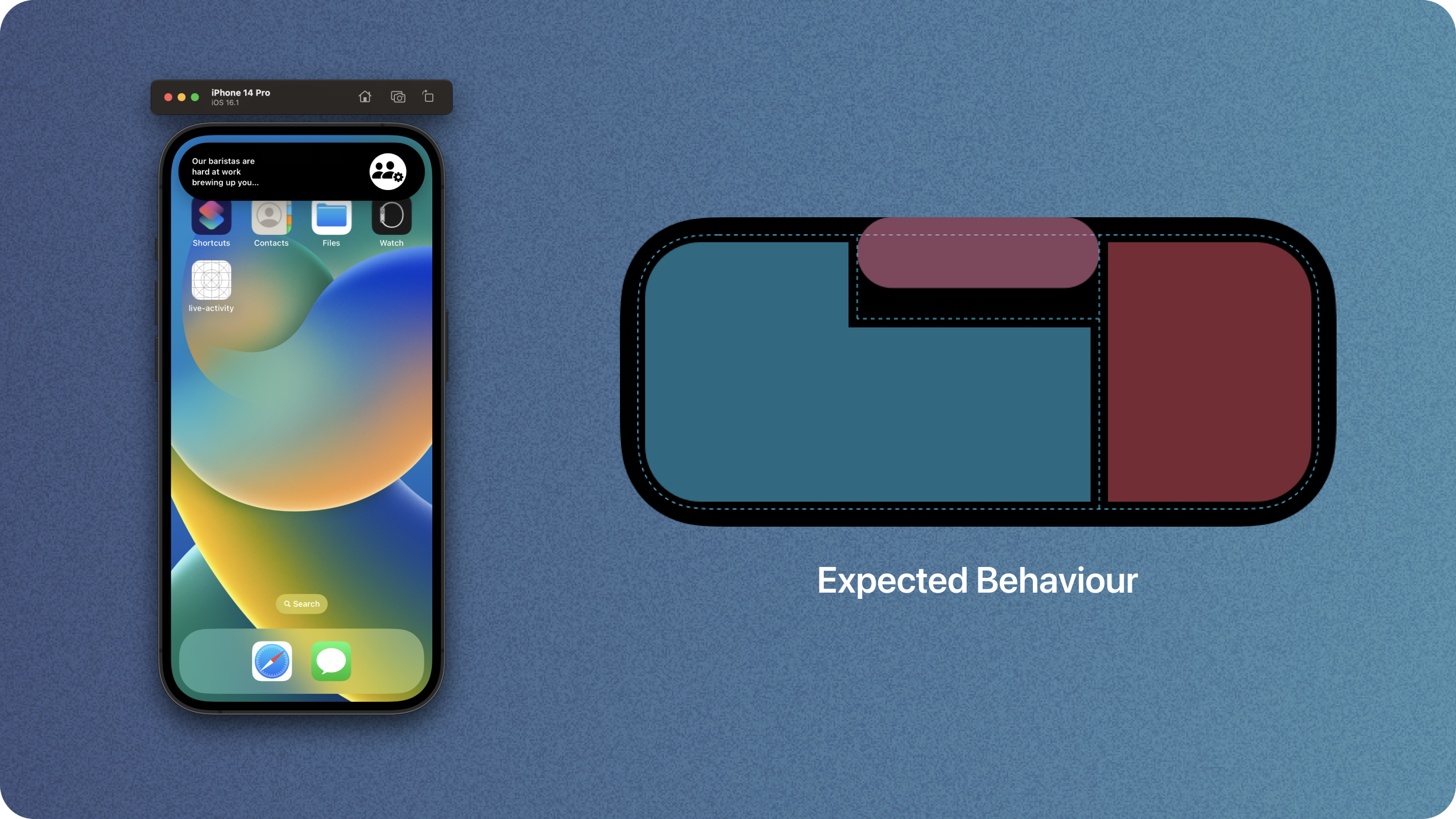
We have a couple of different sizes we have to manage, and theyre called minimal, compact and expanded.
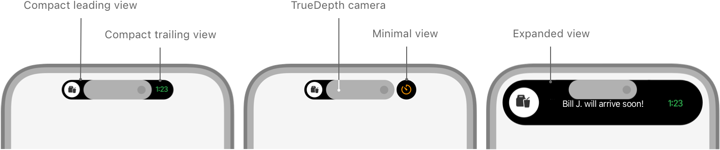
Inside the expanded shape, we also have a couple of zones to be familiar with. We get leading and trailing with "L" shapes, then bottom and centre. We can alter the priorities on these to change their shapes, but this is the baseline.

For more, see the Apple docs.
Lets get started making an existing activity into one that supports the island.
Supporting Dynamic Island
Supporting the dynamic island is a shockingly minimal change for those of us that already have live activities. You probably already have a compiler warning, so lets fix that.
Head to where you have ActivityConfiguration and change the function to match this new signature.
struct CoffeeDeliveryActivityWidget: Widget {
    var body: some WidgetConfiguration {
        return ActivityConfiguration(for: CoffeeDeliveryAttributes.self) { context in
            CoffeeDeliveryActivityWidgetView(
                attributes: context.attributes,
                state: context.state
            )
        } dynamicIsland: { context in

        }
    }
}
struct CoffeeDeliveryActivityWidget: Widget {
var body: some WidgetConfiguration {
return ActivityConfiguration(for: CoffeeDeliveryAttributes.self) { context in
CoffeeDeliveryActivityWidgetView(
attributes: context.attributes,
state: context.state
)
} dynamicIsland: { context in
}
}
}The first change is that now the argument is labeled "for", and we have a new closure for dynamic island, which isn't optional, and gets provided with the same context as your live activity.
The dynamic island closure is nice and easy to implement, and is all based around a new object DynamicIsland.
The object has four closures, one for each of our views that we learned about earlier.
    DynamicIsland { in

    } compactLeading: {

    } compactTrailing: {

    } minimal: {

    }
DynamicIsland { in
} compactLeading: {
} compactTrailing: {
} minimal: {
}For now, lets just paste that into our dynamic island closure.
struct CoffeeDeliveryActivityWidget: Widget {
    var body: some WidgetConfiguration {
        return ActivityConfiguration(for: CoffeeDeliveryAttributes.self) { context in
            CoffeeDeliveryActivityWidgetView(
                attributes: context.attributes,
                state: context.state
            )
        } dynamicIsland: {
            DynamicIsland {

            } compactLeading: {

            } compactTrailing: {

            } minimal: {

            }
        }
    }
}
struct CoffeeDeliveryActivityWidget: Widget {
var body: some WidgetConfiguration {
return ActivityConfiguration(for: CoffeeDeliveryAttributes.self) { context in
CoffeeDeliveryActivityWidgetView(
attributes: context.attributes,
state: context.state
)
} dynamicIsland: {
DynamicIsland {
} compactLeading: {
} compactTrailing: {
} minimal: {
}
}
}
}Lets start filling this out.
The decisions here are mostly aesthetic. Given the limited space, you need to make sure you get across the most important information, and don't fill it with fluff.
Given the size, I believe the best examples will simply use icons on both compact views, then provide extra text when you expand them. This is what we'll add now.
The first views we'll add are our compact ones. These will just show icons for now, and they'll look something like this.
We'll make a re-usable view that we can show on both sides. If you don't like the overlay, simply remove it and use the padded image instead. The vertical padding makes quite a nice look as you get some intrinsic padding on the horizontal edges.
func makeView(for imageName: String) -> some View {
    ZStack {
        Circle()
            .foregroundColor(.white)
        Image(systemName: imageName)
            .resizable()
            .aspectRatio(contentMode: .fit)
            .foregroundColor(.black)
            .padding(6)
    }
    .padding(.vertical, 6)
}
func makeView(for imageName: String) -> some View {
ZStack {
Circle()
.foregroundColor(.white)
Image(systemName: imageName)
.resizable()
.aspectRatio(contentMode: .fit)
.foregroundColor(.black)
.padding(6)
}
.padding(.vertical, 6)
}This example just uses white and black for now, but you can also use gradients in the circle background for a lovely effect.
To make the same as the image above, we'll have the leading edge show a static symbol, and then our trailing and minimal views show the image for the current stage of delivery.
var body: some WidgetConfiguration {
    return ActivityConfiguration(for: CoffeeDeliveryAttributes.self) { context in
        CoffeeDeliveryActivityWidgetView(
            attributes: context.attributes,
            state: context.state
        )
    } dynamicIsland: { context in
        DynamicIsland {

        } compactLeading: {
            makeView(for: "figure.run")
        } compactTrailing: {
            makeView(for: context.state.stateImageName)
        } minimal: {
            makeView(for: context.state.stateImageName)
        }
    }
}
var body: some WidgetConfiguration {
return ActivityConfiguration(for: CoffeeDeliveryAttributes.self) { context in
CoffeeDeliveryActivityWidgetView(
attributes: context.attributes,
state: context.state
)
} dynamicIsland: { context in
DynamicIsland {
} compactLeading: {
makeView(for: "figure.run")
} compactTrailing: {
makeView(for: context.state.stateImageName)
} minimal: {
makeView(for: context.state.stateImageName)
}
}
}Now, lets get started with our main body.
Our expanded view is going to show the current delivery state symbol inside a nice circle, then show in text some more info about the order. We're just simulating this so we'll show only a little text, but you could certainly add more information about an order.
The main body of the island is a specific builder, DynamicIslandExpandedContentBuilder so we can't just throw any view in it, we have to use specific types.
The zones inside the expanded view we look at in the introduction are the same zones we'll have to add here. We'll fill them out using a new object DynamicIslandExpandedRegion, which is provided a location, optional priority, and a body.
Lets start with the trailing element, which is the same as our circle icons, but a little bigger.
We won't re-use the view, as we'd like to have more flexibilty in this mode.
DynamicIslandExpandedRegion(.trailing, prority: 0, content: {
    ZStack {
        Circle()
            .foregroundColor(.white)
        Image(systemName: context.state.stateImageName)
            .resizable()
            .aspectRatio(contentMode: .fit)
            .foregroundColor(.black)
            .padding(12)
    }
    .frame(maxWidth: .infinity, maxHeight: .infinity, alignment: .trailing)
})DynamicIslandExpandedRegion(.trailing, prority: 0, content: {
ZStack {
Circle()
.foregroundColor(.white)
Image(systemName: context.state.stateImageName)
.resizable()
.aspectRatio(contentMode: .fit)
.foregroundColor(.black)
.padding(12)
}
.frame(maxWidth: .infinity, maxHeight: .infinity, alignment: .trailing)
})We set a priority as zero because we'll give our next one a higher value.
Next, lets add our central element, which will simply be some text. Because we only have two elements, our central element will actually be a leading element with a high priority.
DynamicIslandExpandedRegion(.leading, priority: .greatestFiniteMagnitude, content: {
    Text(context.state.currentStatus.longText)
        .font(.caption.weight(.semibold))
        .lineLimit(nil)
        .multilineTextAlignment(.leading)
        .frame(maxWidth: .infinity, maxHeight: .infinity, alignment: .leading)
})DynamicIslandExpandedRegion(.leading, priority: .greatestFiniteMagnitude, content: {
Text(context.state.currentStatus.longText)
.font(.caption.weight(.semibold))
.lineLimit(nil)
.multilineTextAlignment(.leading)
.frame(maxWidth: .infinity, maxHeight: .infinity, alignment: .leading)
})This will give us a view that looks like our small view, but a little bigger. We've kept the content on one edge the same as it looks lovely as it animates.
Our final code looks like this.
var body: some WidgetConfiguration {
return ActivityConfiguration(for: CoffeeDeliveryAttributes.self) { context in
CoffeeDeliveryActivityWidgetView(
attributes: context.attributes,
state: context.state
)
} dynamicIsland: { context in
DynamicIsland {
DynamicIslandExpandedRegion(.trailing, content: {
ZStack {
Circle()
.foregroundColor(.white)
Image(systemName: context.state.stateImageName)
.resizable()
.aspectRatio(contentMode: .fit)
.foregroundColor(.black)
.padding(12)
}
.frame(maxWidth: .infinity, maxHeight: .infinity, alignment: .trailing)
})
DynamicIslandExpandedRegion(.leading, priority: .greatestFiniteMagnitude, content: {
    Text(context.state.currentStatus.longText)
        .font(.caption.weight(.semibold))
        .lineLimit(nil)
        .multilineTextAlignment(.leading)
        .frame(maxWidth: .infinity, maxHeight: .infinity, alignment: .leading)
})
} compactLeading: {
makeView(for: "figure.run")
} compactTrailing: {
makeView(for: context.state.stateImageName)
} minimal: {
makeView(for: context.state.stateImageName)
}
}
}var body: some WidgetConfiguration {
return ActivityConfiguration(for: CoffeeDeliveryAttributes.self) { context in
CoffeeDeliveryActivityWidgetView(
attributes: context.attributes,
state: context.state
)
} dynamicIsland: { context in
DynamicIsland {
DynamicIslandExpandedRegion(.trailing, content: {
ZStack {
Circle()
.foregroundColor(.white)
Image(systemName: context.state.stateImageName)
.resizable()
.aspectRatio(contentMode: .fit)
.foregroundColor(.black)
.padding(12)
}
.frame(maxWidth: .infinity, maxHeight: .infinity, alignment: .trailing)
})
DynamicIslandExpandedRegion(.leading, priority: .greatestFiniteMagnitude, content: {
Text(context.state.currentStatus.longText)
.font(.caption.weight(.semibold))
.lineLimit(nil)
.multilineTextAlignment(.leading)
.frame(maxWidth: .infinity, maxHeight: .infinity, alignment: .leading)
})
} compactLeading: {
makeView(for: "figure.run")
} compactTrailing: {
makeView(for: context.state.stateImageName)
} minimal: {
makeView(for: context.state.stateImageName)
}
}
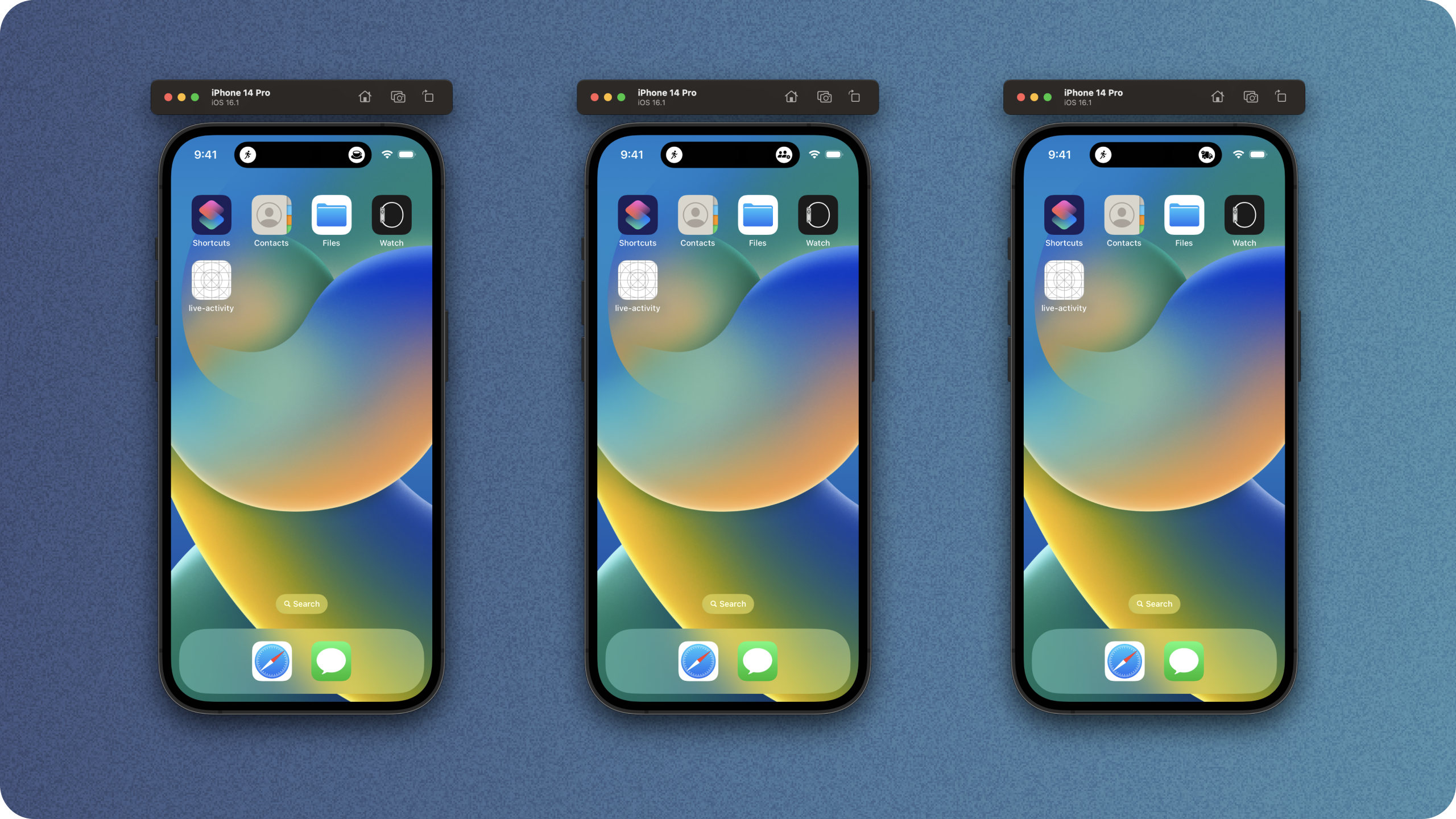
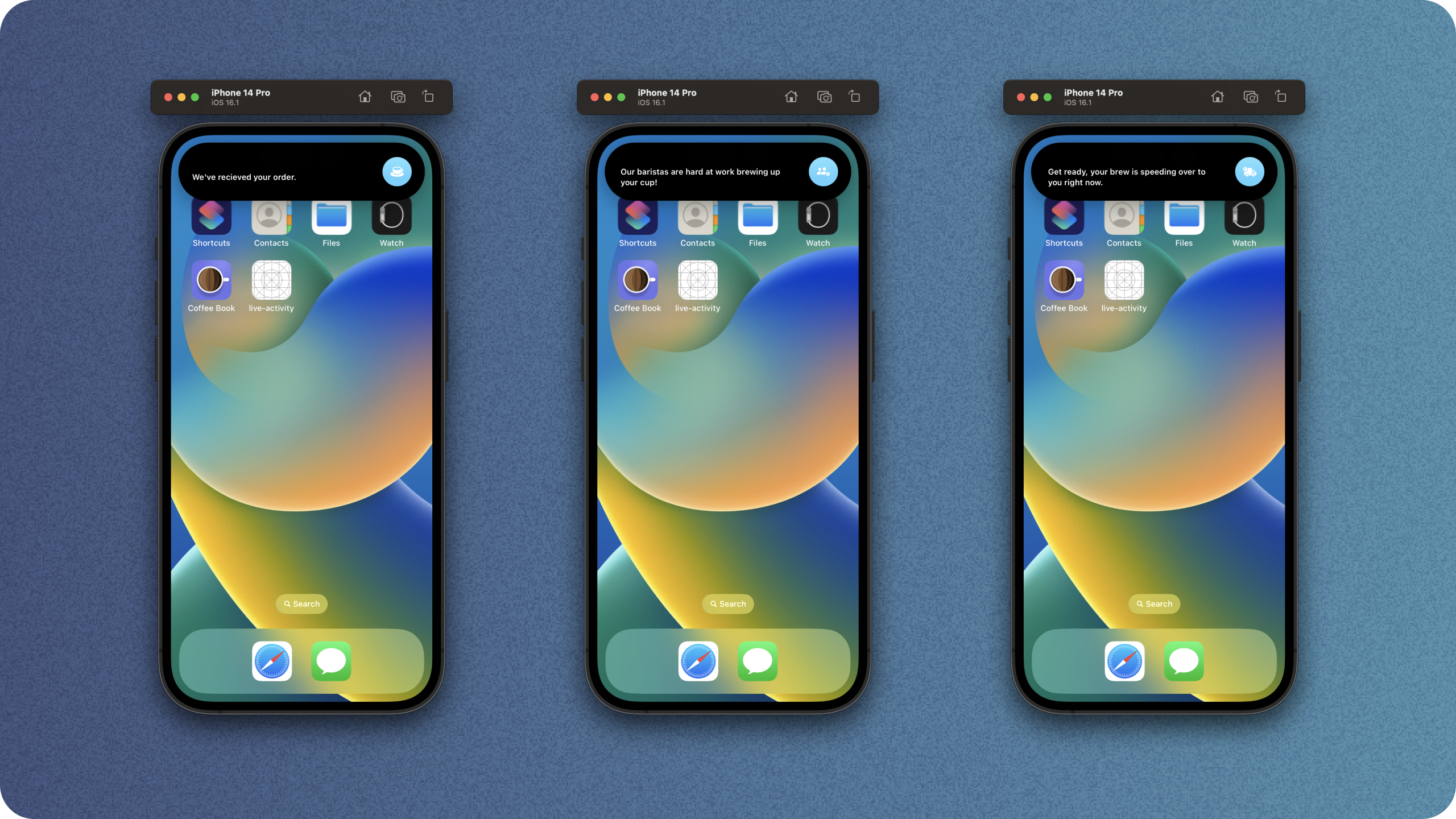
}When we run this, and expand the view, we get this lovely looking island.

There's a little bug here - we expect the leading element to expand, but it currently doesn't behave as expected.
This is what it looks like in action if we run it now.

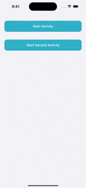
To see what our minimal view looks like, we can use the start second activity button in the demo app to start a second one.
A temporary work around for the text issue, is to utilise the fixedSize() modifier, and play around with some fixed widths. We have to add a fixed width too as otherwise the leading element would just expand to fill the entire thing instead of expanding over to two lines.
Lets head back to our view body and make a couple of changes. We'll add a frame with a max width, a specific line minit, and then a little bit of padidng to avoid the pill.
DynamicIslandExpandedRegion(.leading, priority: .greatestFiniteMagnitude, content: {
    VStack(alignment: .leading) {
        Text(context.state.currentStatus.longText)
            .frame(maxWidth: 250, maxHeight: .infinity, alignment: .center) // Given such limited sizes, we're safe to do this
            .lineLimit(2, reservesSpace: false) // Don't reserve space to maintain centre alignment
            .font(.caption.weight(.semibold))
            .padding(.top, 16) // Top pad slightly to avoid the pill shape ( the modifier below doens't appear to work just yet )
    }
    .fixedSize(horizontal: true, vertical: false)
    .foregroundColor(.white)
    .dynamicIsland(verticalPlacement: .belowIfTooWide) // Doesn't appear to work just yet.
})DynamicIslandExpandedRegion(.leading, priority: .greatestFiniteMagnitude, content: {
VStack(alignment: .leading) {
Text(context.state.currentStatus.longText)
.frame(maxWidth: 250, maxHeight: .infinity, alignment: .center) // Given such limited sizes, we're safe to do this
.lineLimit(2, reservesSpace: false) // Don't reserve space to maintain centre alignment
.font(.caption.weight(.semibold))
.padding(.top, 16) // Top pad slightly to avoid the pill shape ( the modifier below doens't appear to work just yet )
}
.fixedSize(horizontal: true, vertical: false)
.foregroundColor(.white)
.dynamicIsland(verticalPlacement: .belowIfTooWide) // Doesn't appear to work just yet.
})We've also added the new .dynamicIsland(verticalPlacement: .belowIfTooWide) modifier which should help our wide content avoid the pill, but it doesn't appear to be working just yet.
Next, we'll make our trailing element have a specific size. We won't use fixed size here as we don't need to work around the growing behaviour, we can simply tell it how we want it to look.
DynamicIslandExpandedRegion(.trailing, content: {
    HStack(alignment: .center) {
        ZStack {
            Circle()
                .foregroundStyle(Color.cyan.gradient)
            Image(systemName: context.state.stateImageName)
                .resizable()
                .aspectRatio(contentMode: .fit)
                .foregroundColor(.white)
                .padding(12)
        }
    }
    .frame(width: 44)
    .frame(maxHeight: .infinity, alignment: .center)
})DynamicIslandExpandedRegion(.trailing, content: {
HStack(alignment: .center) {
ZStack {
Circle()
.foregroundStyle(Color.cyan.gradient)
Image(systemName: context.state.stateImageName)
.resizable()
.aspectRatio(contentMode: .fit)
.foregroundColor(.white)
.padding(12)
}
}
.frame(width: 44)
.frame(maxHeight: .infinity, alignment: .center)
})Just for fun, I've added a gradient so the icon pops a little more.
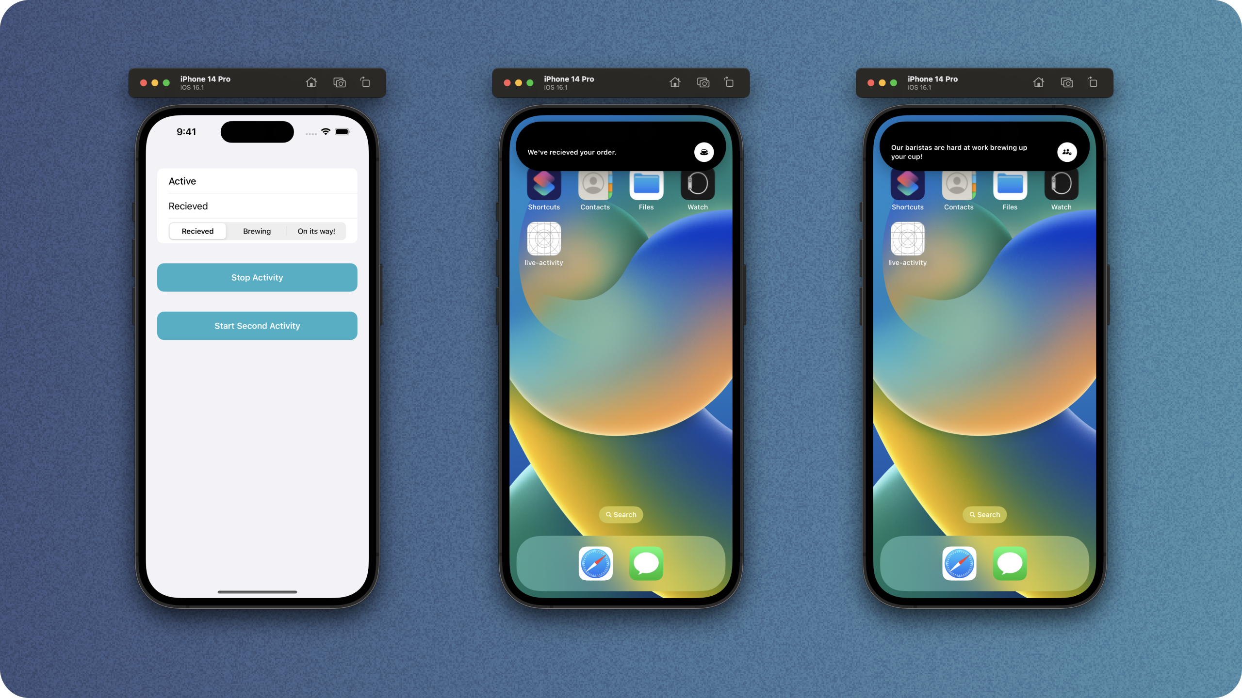
If we look at how our widget behaves now, we get a much prettier look without text clipping. All credit to @jordibruin for discovering this fix.
Thats our island ready to go!
Lets have a look at it in action with the fixes.

For an alternate solution that gets around the text issue, without using fixed sizes, you could consider just having a centre element thats really big.
DynamicIslandExpandedRegion(.center, priority: .greatestFiniteMagnitude) {
    HStack(alignment: .center) {
        Text(context.state.currentStatus.longText)
            .font(.caption.weight(.semibold))
            .lineLimit(nil)
            .multilineTextAlignment(.leading)
            .frame(maxWidth: .infinity, maxHeight: .infinity, alignment: .leading)
        ZStack {
            Circle()
                .foregroundColor(.white)
            Image(systemName: context.state.stateImageName)
                .resizable()
                .aspectRatio(contentMode: .fit)
                .foregroundColor(.black)
                .padding(12)
        }
    }.frame(maxWidth: .infinity)

}DynamicIslandExpandedRegion(.center, priority: .greatestFiniteMagnitude) {
HStack(alignment: .center) {
Text(context.state.currentStatus.longText)
.font(.caption.weight(.semibold))
.lineLimit(nil)
.multilineTextAlignment(.leading)
.frame(maxWidth: .infinity, maxHeight: .infinity, alignment: .leading)
ZStack {
Circle()
.foregroundColor(.white)
Image(systemName: context.state.stateImageName)
.resizable()
.aspectRatio(contentMode: .fit)
.foregroundColor(.black)
.padding(12)
}
}.frame(maxWidth: .infinity)
}This looks a little better, especially with large text, and gives us a similar result to our fixed size approach.
Thanks for reading!
You can find my code on github.