Stage Manager
When iPadOS 16 launches ( October 24th ), users are going to get a powerful new tool to multi task on their iPads. They'll be able to move multiple windows around with nearly free forming shapes, then connect to an external display to get a mac-like experience.
To make sure your app is ready, we'll walk through contextually switching between a tab bar and split view, then finally look at techniques to optimise content using grids for the size you actually have.
Switching navigation
Our optimisations start with getting the behaviour just described, having a split view with a sidebar that switches to a tab bar when there's not much space. SwiftUI lets us do this easily, so lets get right in.
We're going to start from an empty view, lets call it Navigation.
The first step is to make sure we have enough information about our container to enable the behaviour we talked about. The easiest way to do this, is using the environment property horizontalSizeClass.
struct Navigation: View {
    @Environment(\.horizontalSizeClass) var horizontalSizeClass

    var body: some View {
        Text("Hello, World!")
    }
}

struct Navigation_Previews: PreviewProvider {
    static var previews: some View {
        Navigation()
    }
}
struct Navigation: View {
@Environment(\.horizontalSizeClass) var horizontalSizeClass
var body: some View {
Text("Hello, World!")
}
}
struct Navigation_Previews: PreviewProvider {
static var previews: some View {
Navigation()
}
}Next, lets add our screens as seperate variables ( you'll see why in just a sec. ).
var pageOne: some View {
    Image(systemName: "basketball.fill")
        .font(.headline)
}

var pageTwo: some View {
    Image(systemName: "soccerball")
        .font(.headline)
}

var pageThree: some View {
    Image(systemName: "car.fill")
        .font(.subheadline)
}
var pageOne: some View {
Image(systemName: "basketball.fill")
.font(.headline)
}
var pageTwo: some View {
Image(systemName: "soccerball")
.font(.headline)
}
var pageThree: some View {
Image(systemName: "car.fill")
.font(.subheadline)
}Adding a tab bar is simple, and we simply need to provide tab bar items for each of our views using tabItem, then wrap them in a TabView.
The nicest way to provide a tab item is using the Label view, which allows you to provide both a string and an image name.
struct Navigation: View {
    @Environment(\.horizontalSizeClass) var horizontalSizeClass

    var body: some View {
        TabView {
            pageOne
            pageTwo
            pageThree
        }
    }

    var pageOne: some View {
        Image(systemName: "basketball.fill")
            .font(.headline)
            .tabItem({
                Label("Basketball", systemImage:  "basketball.fill")
            })
    }

    var pageTwo: some View {
        Image(systemName: "soccerball")
            .font(.headline)
            .tabItem({
                Label("Soccer", systemImage:  "soccerball")
            })
    }

    var pageThree: some View {
        Image(systemName: "car.fill")
            .font(.subheadline)
            .tabItem({
                Label("Car", systemImage:  "car.fill")
            })

    }
}
struct Navigation: View {
@Environment(\.horizontalSizeClass) var horizontalSizeClass
var body: some View {
TabView {
pageOne
pageTwo
pageThree
}
}
var pageOne: some View {
Image(systemName: "basketball.fill")
.font(.headline)
.tabItem({
Label("Basketball", systemImage: "basketball.fill")
})
}
var pageTwo: some View {
Image(systemName: "soccerball")
.font(.headline)
.tabItem({
Label("Soccer", systemImage: "soccerball")
})
}
var pageThree: some View {
Image(systemName: "car.fill")
.font(.subheadline)
.tabItem({
Label("Car", systemImage: "car.fill")
})
}
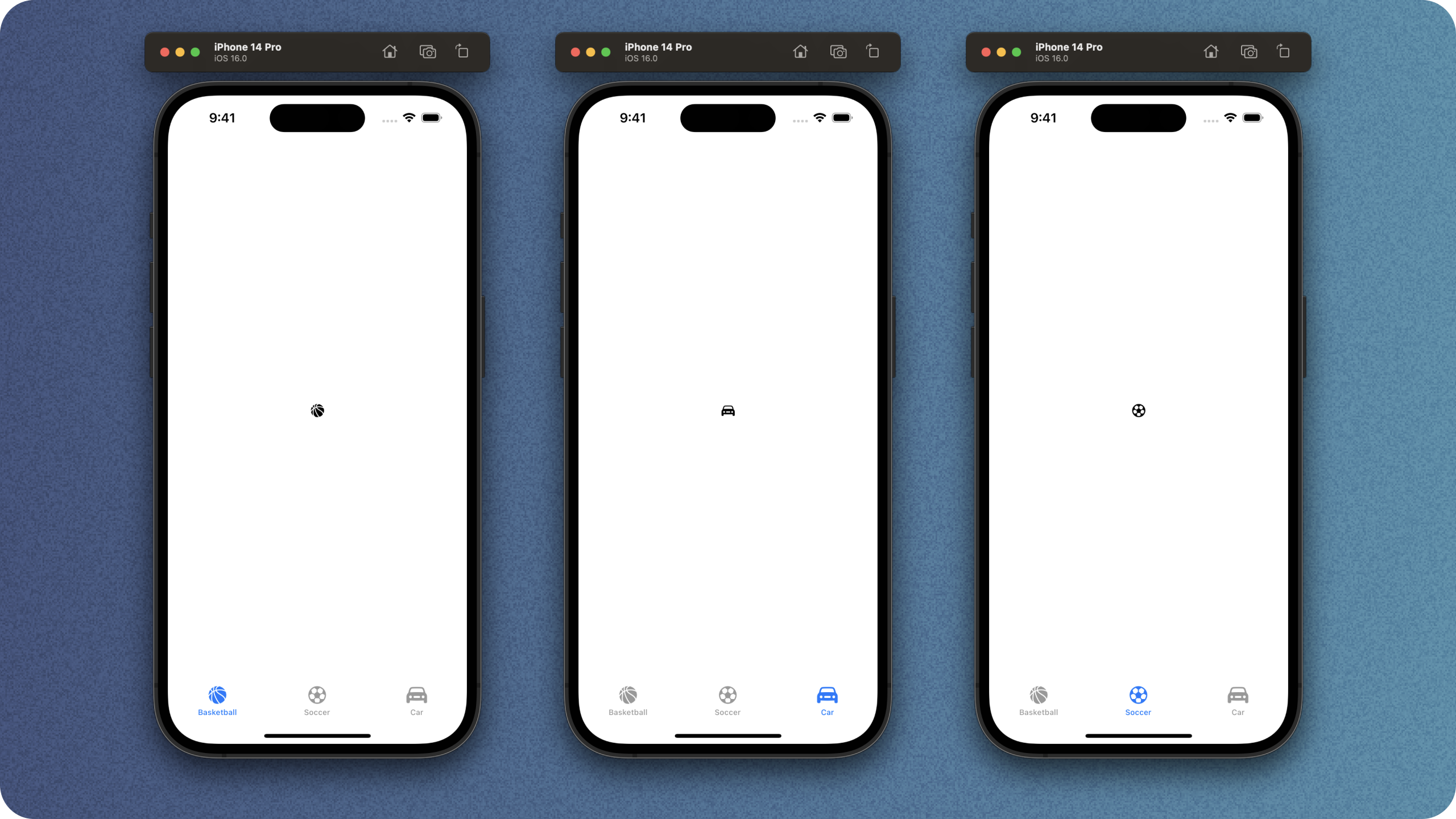
}If we make sure this is the root view of our app and run it, we'll get a lovely tab bar with an active state that lets us switch between items.
Before we move on, we'll need to do a quick change to our view to be able to know which tab we're on. To do this, we can use the TabView(selection) initialiser.
Add an @State variable to the top of the file, called selectedTab.
@State var selectedTab: Int = 0@State var selectedTab: Int = 0Next, add an explicit tag to each of your views.
    var pageOne: some View {
        Image(systemName: "basketball.fill")
            .font(.headline)
            .tabItem({
                Label("Basketball", systemImage:  "basketball.fill")
            })
            .tag(0)
    }

    var pageTwo: some View {
        Image(systemName: "soccerball")
            .font(.headline)
            .tabItem({
                Label("Soccer", systemImage:  "soccerball")
            })
            .tag(1)
    }

    var pageThree: some View {
        Image(systemName: "car.fill")
            .font(.subheadline)
            .tabItem({
                Label("Car", systemImage:  "car.fill")
            })
            .tag(2)
    }
var pageOne: some View {
Image(systemName: "basketball.fill")
.font(.headline)
.tabItem({
Label("Basketball", systemImage: "basketball.fill")
})
.tag(0)
}
var pageTwo: some View {
Image(systemName: "soccerball")
.font(.headline)
.tabItem({
Label("Soccer", systemImage: "soccerball")
})
.tag(1)
}
var pageThree: some View {
Image(systemName: "car.fill")
.font(.subheadline)
.tabItem({
Label("Car", systemImage: "car.fill")
})
.tag(2)
}Visually nothing has changed, but by doing this we unlock the ability to share the selection state between both our split view and tab view.
In order to make things easier, we can wrap up the information about our screens in a nice enum.
We'll call this "Screen" and let it hold the minimal information it needs.
enum Screen: Int, Hashable, CaseIterable {
    case basketball = 0, soccer, racing

    var iconName: String {
        switch self {
        case .basketball:
            return "basketball.fill"
        case .soccer:
            return "soccerball"
        case .racing:
            return "car.fill"
        }
    }

    var displayText: String {
        switch self {
        case .basketball:
            return "Basketball"
        case .soccer:
            return "Soccer"
        case .racing:
            return "Racing"
        }
    }
}
enum Screen: Int, Hashable, CaseIterable {
case basketball = 0, soccer, racing
var iconName: String {
switch self {
case .basketball:
return "basketball.fill"
case .soccer:
return "soccerball"
case .racing:
return "car.fill"
}
}
var displayText: String {
switch self {
case .basketball:
return "Basketball"
case .soccer:
return "Soccer"
case .racing:
return "Racing"
}
}
}Head back to Navigation and switch up the content to use this new enum by making a few quick changes.
- Change the
selectedTab: Int = 0property intoselectedScreen: Screen = .basketball - Change
TabViewto useTabView(selection: $selectedScreen) - Change each of the pages to use a Screen for its tag
struct Navigation: View {
    @Environment(\.horizontalSizeClass) var horizontalSizeClass
    @State var selectedScreen: Screen = .basketball

    var body: some View {
        TabView(selection: $selectedScreen) {
            pageOne
            pageTwo
            pageThree
        }
    }

    var pageOne: some View {
        Image(systemName: Screen.basketball.iconName)
            .font(.headline)
            .tabItem({
                Label(
                    Screen.basketball.displayText,
                    systemImage:  Screen.basketball.iconName
                )
            })
            .tag(Screen.basketball)
    }

    var pageTwo: some View {
        Image(systemName: Screen.soccer.iconName)
            .font(.headline)
            .tabItem({
                Label(
                    Screen.soccer.displayText,
                    systemImage:  Screen.soccer.iconName
                )
            })
            .tag(Screen.soccer)
    }

    var pageThree: some View {
        Image(systemName: Screen.racing.iconName)
            .font(.headline)
            .tabItem({
                Label(
                    Screen.racing.displayText,
                    systemImage:  Screen.racing.iconName
                )
            })
            .tag(Screen.racing)
    }
}
struct Navigation: View {
@Environment(\.horizontalSizeClass) var horizontalSizeClass
@State var selectedScreen: Screen = .basketball
var body: some View {
TabView(selection: $selectedScreen) {
pageOne
pageTwo
pageThree
}
}
var pageOne: some View {
Image(systemName: Screen.basketball.iconName)
.font(.headline)
.tabItem({
Label(
Screen.basketball.displayText,
systemImage: Screen.basketball.iconName
)
})
.tag(Screen.basketball)
}
var pageTwo: some View {
Image(systemName: Screen.soccer.iconName)
.font(.headline)
.tabItem({
Label(
Screen.soccer.displayText,
systemImage: Screen.soccer.iconName
)
})
.tag(Screen.soccer)
}
var pageThree: some View {
Image(systemName: Screen.racing.iconName)
.font(.headline)
.tabItem({
Label(
Screen.racing.displayText,
systemImage: Screen.racing.iconName
)
})
.tag(Screen.racing)
}
}This has made things a lot neater, and will allow for us to add our split view without too much effort.
To add our split view, we'll need to observe that horizontalSizeClass property from earlier on.
Inside Navigation, first pull out our existing content into a variable. ( You may also have a slight performance improvement if you pull this out into a discrete AppTabView() view).
    var body: some View {
        tabView
    }

    var tabView: some View {
        TabView(selection: $selectedScreen) {
            pageOne
            pageTwo
            pageThree
        }
    }
var body: some View {
tabView
}
var tabView: some View {
TabView(selection: $selectedScreen) {
pageOne
pageTwo
pageThree
}
}Next, lets switch on the size class inside our body. For the regular size class, we'll just use a TODO for now, but for compact we'll use our tabView.
    var body: some View {
        switch horizontalSizeClass {
        case .regular:
            Text("TODO")
        default:
            tabView
        }
    }
var body: some View {
switch horizontalSizeClass {
case .regular:
Text("TODO")
default:
tabView
}
}Note: If you're not familiar with size classes, you can read up on them in the HIGS.
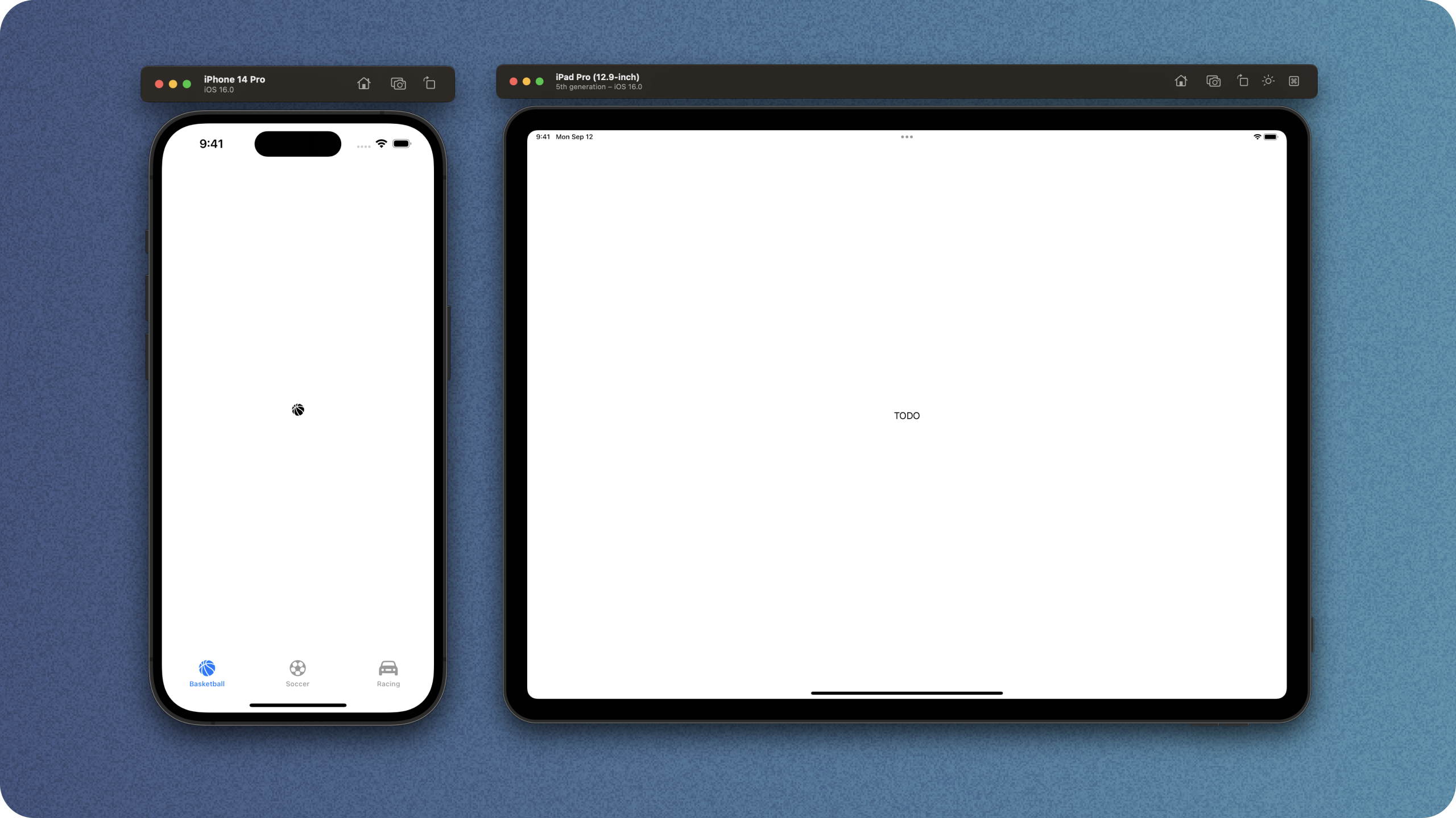
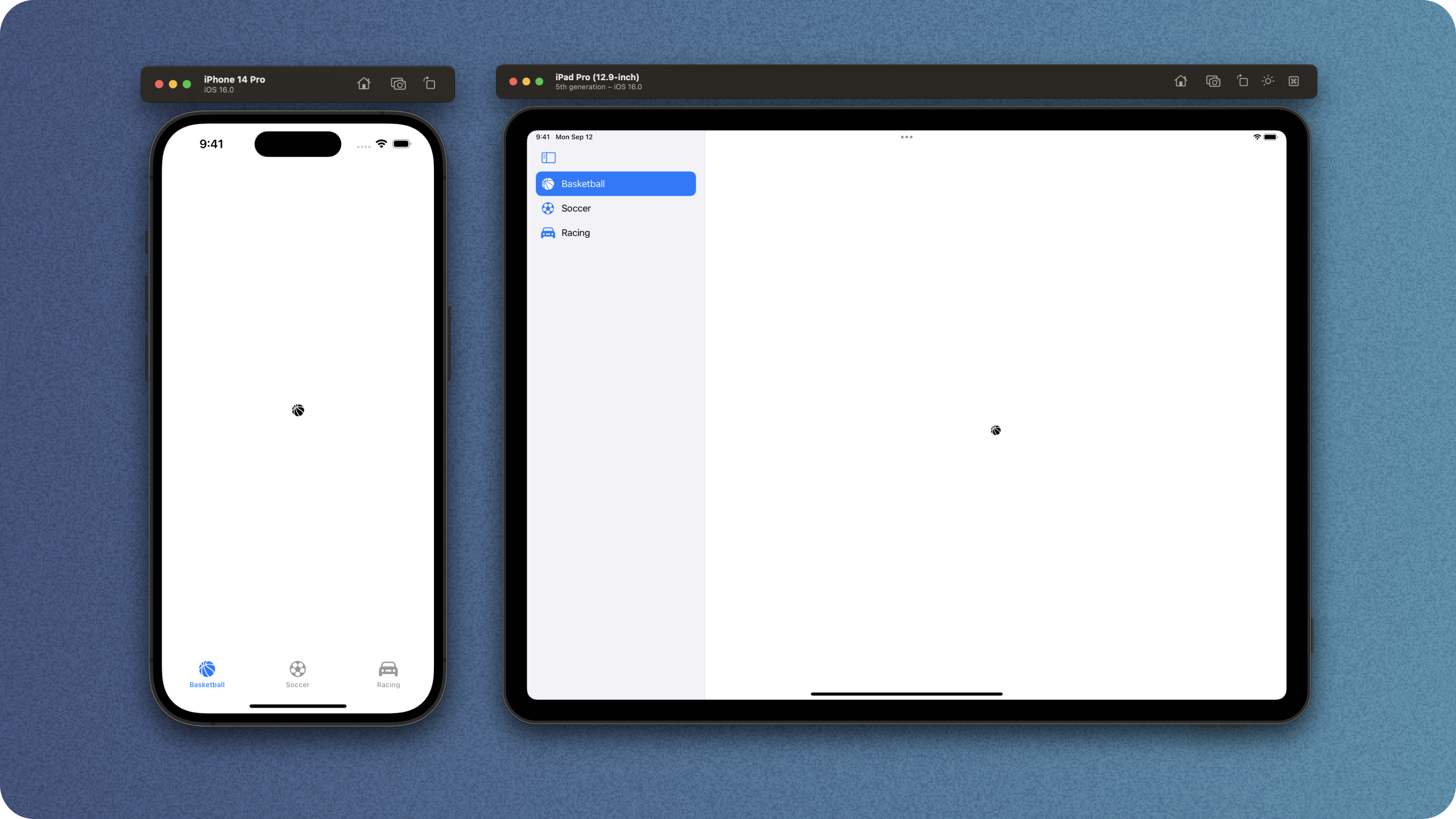
When we run what we have here, we'll see a tab view on an iPhone and a piece of text on the iPad.
The next step is to add a split view, which we can do nicely with NavigationView.
Make a new variable splitView, and put an empty NavigationSplitView inside it.
    var splitView: some View {
        NavigationSplitView {

        } detail: {

        }
    }
var splitView: some View {
NavigationSplitView {
} detail: {
}
}NavigationSplitView gives us explicit control over the columns, so we don't have to worry about any magic going on behind the scenes. If you'd like to know a little more about this, or want to see usage of the new NavigationStack, checkout the dedicated article on iPad Navigation.
Our NavigationSplitView is going to fit right in on the system. To achieve a standard look we can use List with the listStyle(.sidebarListStyle) modifier.
Inside the first closure of our NavigationSplitView, we'll add a List.
We'll also have to make a new sidebarSelection property which is optional, or we can't use the selection state on List. TabView requires it to be non-optional to behave correctly, so we'll have to do something sneaky ourselves later to manage these two properties.
@State var sidebarSelection: Screen? = .basketball

// ...
List(selection: $sidebarSelection) { }
@State var sidebarSelection: Screen? = .basketball

// ...
List(selection: $sidebarSelection) { }
Lets finish off our list with a simple ForEach that iterates over our navigation enum and generates Labels. We don't have to wrap these in Button as SwiftUI will do that for us.
    List(selection: $sidebarSelection) {
        ForEach(Screen.allCases, id: \.self) { screen in
            Label(
                screen.displayText,
                systemImage:  screen.iconName
            )
        }
} List(selection: $sidebarSelection) {
ForEach(Screen.allCases, id: \.self) { screen in
Label(
screen.displayText,
systemImage: screen.iconName
)
}
}Next we'll need to provide the body for our detail closure. This is nice and simple, just switch over the selected screen and return the correct one.
We switch over the selectedScreen, not our sidebarSelection, as we'll make sure our properties are intertwined later.
    switch selectedScreen {
    case .basketball:
        pageOne
    case .soccer:
        pageTwo
    case .racing:
        pageThree
    default:
        EmptyView()
    }
switch selectedScreen {
case .basketball:
pageOne
case .soccer:
pageTwo
case .racing:
pageThree
default:
EmptyView()
}At this point, the splitView variable looks like this.
var splitView: some View {
NavigationSplitView {
List(selection: $selectedScreen) {
ForEach(Screen.allCases, id: \.self) { screen in
Label(
screen.displayText,
systemImage: screen.iconName
)
}
}
} detail: {
    switch selectedScreen {
    case .basketball:
        pageOne
    case .soccer:
        pageTwo
    case .racing:
        pageThree
    default:
        EmptyView()
    }
}
}var splitView: some View {
NavigationSplitView {
List(selection: $selectedScreen) {
ForEach(Screen.allCases, id: \.self) { screen in
Label(
screen.displayText,
systemImage: screen.iconName
)
}
}
} detail: {
switch selectedScreen {
case .basketball:
pageOne
case .soccer:
pageTwo
case .racing:
pageThree
default:
EmptyView()
}
}
}All we have to do in order to use this is to head back to our view body and switch out our todo for this new view.
    var body: some View {
        switch horizontalSizeClass {
        case .regular:
            splitView
        default:
            tabView
        }
    }
var body: some View {
switch horizontalSizeClass {
case .regular:
splitView
default:
tabView
}
}If we run this now, we'll be able to select items in the sidebar, but they won't update the view as we haven't tied up our two variables yet. In order to do this, we'll wrap our top level content in a Group and add an onChange modifier that detects when either property changes and keeps them in sync. Im sure there's fancier ways to handle this, but I don't like to risk strange navigation states.
This is a super useful tool as you don't want a user changing the size of their window to lose their place as a result. If you make sure you maintain your scroll states too, this allows a user to shrink your app way down to the size of an iPhone and stay exactly where they were.
    var body: some View {
        Group {
            switch horizontalSizeClass {
            case .regular:
                splitView
            default:
                tabView
            }
        }
        .onChange(of: siderbarSelection) { newValue in
            selectedScreen = newValue ?? .basketball
        }
        .onChange(of: selectedScreen) { newValue in
            siderbarSelection = newValue
        }
    }
var body: some View {
Group {
switch horizontalSizeClass {
case .regular:
splitView
default:
tabView
}
}
.onChange(of: siderbarSelection) { newValue in
selectedScreen = newValue ?? .basketball
}
.onChange(of: selectedScreen) { newValue in
siderbarSelection = newValue
}
}When we run it this time, we see a tab bar on iPhone and a split view on iPad.
If we use the split features on iPad, we'll see it switching to a tab bar when we're either in popover mode, or 1/3 width mode.

Stage Manager tips
Now we've got that sorted, it's time to see how we can handle stage manager squishing our apps into all sorts of weird sizes.
The key changes are that your views won't always be the same exact sizes you expect ( if you have any hard coded numbers its time for them to go! ) and they can be resized a lot more often.

This is just a small subset of the window sizes, but you can see here just how much more flexible your app will have to be.
Our app handles the navigation side of things pretty well, but our layout is super simple so we haven't really had to worry about re-sizing.
To demonstrate the issue, we'll throw together a quick grid where each row has two items. Our data source will simply be an enum that contains all the default colors in SwiftUI.
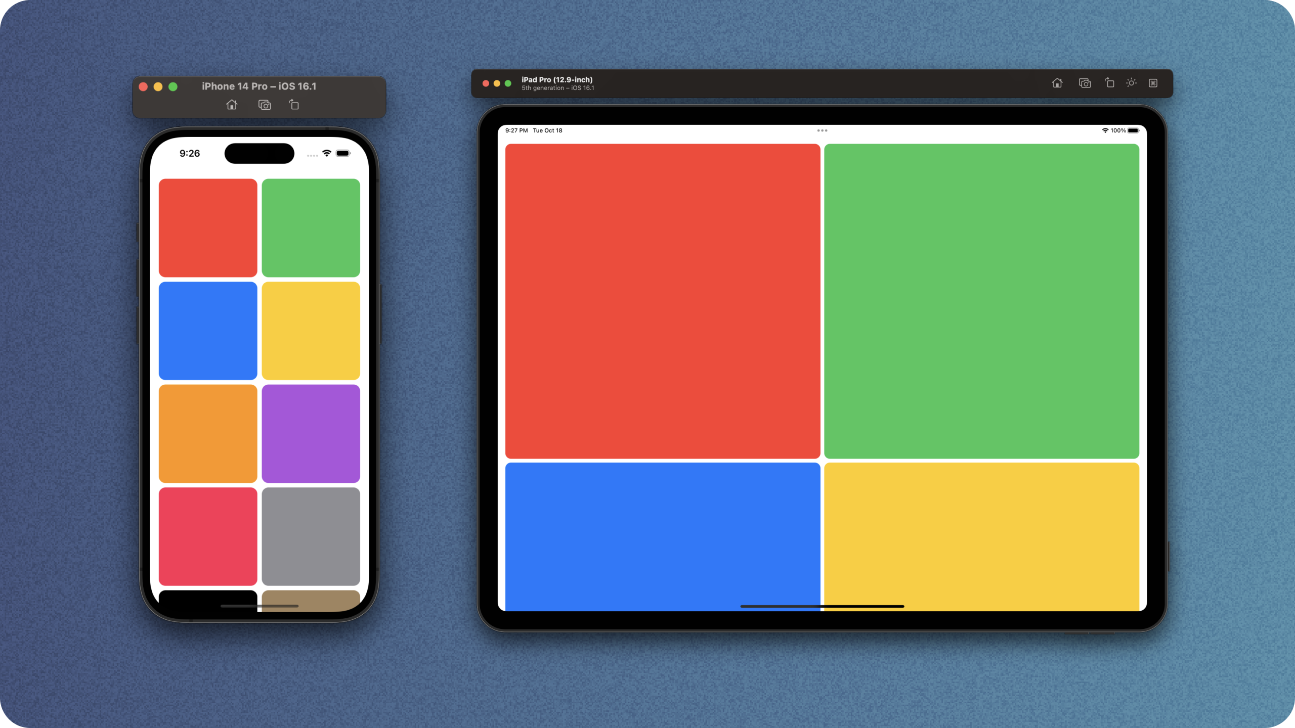
Our initial view follows a fairly standard approach, it shows 2 items, with a minimum width of 100.
struct ColorGrid: View {
    var gridItems: [GridItem] {
        return Array(repeating: GridItem.init(.flexible(minimum: 100, maximum: .infinity)), count: 2)
    }

    var body: some View {
        ScrollView {
            LazyVGrid(columns: gridItems) {
                ForEach(AppColor.allCases, id: \.self) { color in
                    ColorView(color: color)
                }
            }
            .padding()
        }
    }
}

private struct ColorView: View {
    var color: AppColor

    var body: some View {
        RoundedRectangle(cornerRadius: 12)
            .foregroundColor(color.color)
            .aspectRatio(1.0, contentMode: .fit)
    }
}
struct ColorGrid: View {
var gridItems: [GridItem] {
return Array(repeating: GridItem.init(.flexible(minimum: 100, maximum: .infinity)), count: 2)
}
var body: some View {
ScrollView {
LazyVGrid(columns: gridItems) {
ForEach(AppColor.allCases, id: \.self) { color in
ColorView(color: color)
}
}
.padding()
}
}
}
private struct ColorView: View {
var color: AppColor
var body: some View {
RoundedRectangle(cornerRadius: 12)
.foregroundColor(color.color)
.aspectRatio(1.0, contentMode: .fit)
}
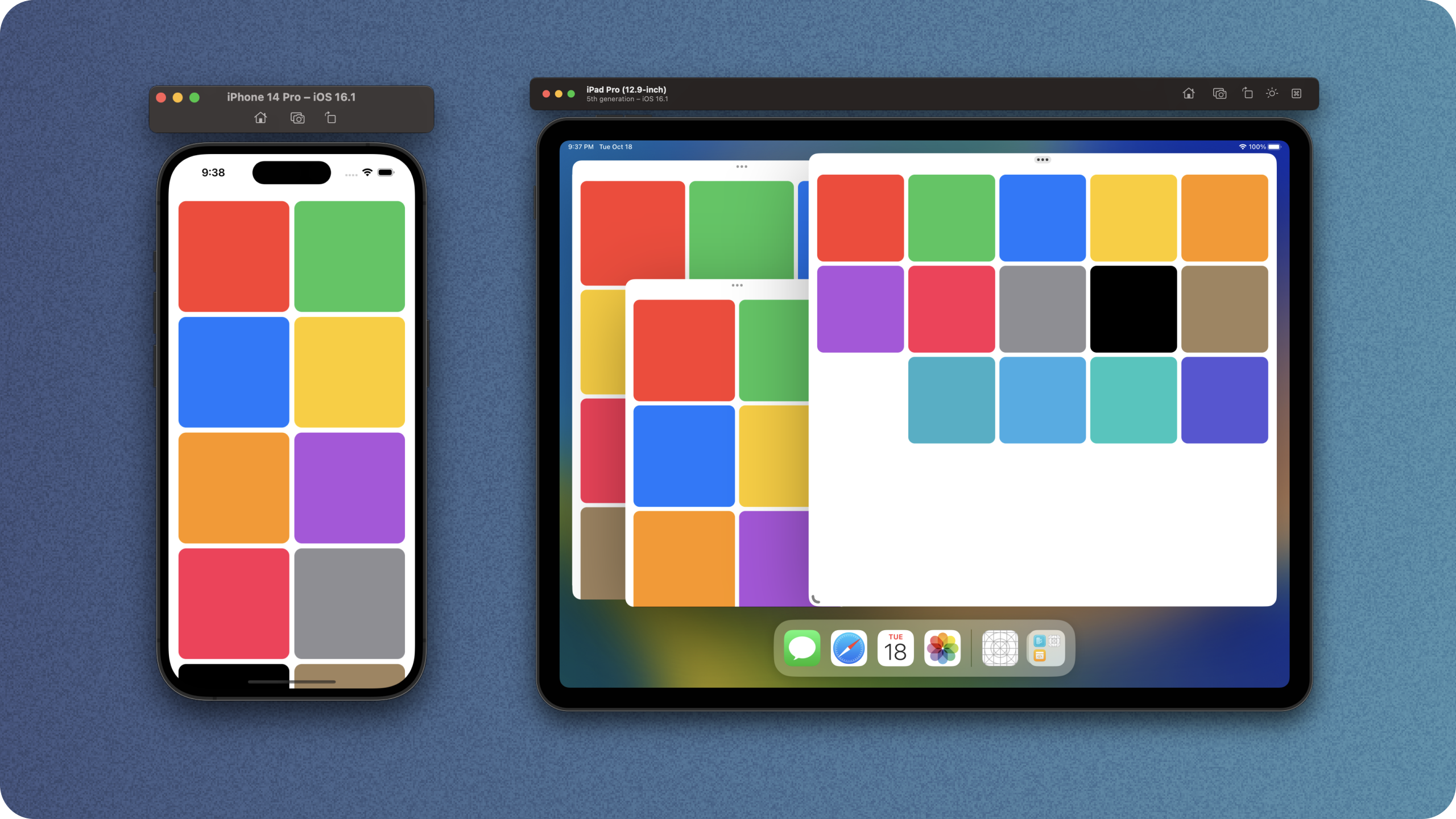
}Running this on iPhone looks great, but on iPad it looks a little silly.
A quick win is to use the horizontal size class to update the amount of items you want, like this.
@Environment(\.horizontalSizeClass) var horizontalSizeClass

var gridItems: [GridItem] {
    return Array(repeating: GridItem.init(.flexible(minimum: 100, maximum: .infinity)), count: horizontalSizeClass == .regular ? 4 : 2)
}@Environment(\.horizontalSizeClass) var horizontalSizeClass
var gridItems: [GridItem] {
return Array(repeating: GridItem.init(.flexible(minimum: 100, maximum: .infinity)), count: horizontalSizeClass == .regular ? 4 : 2)
}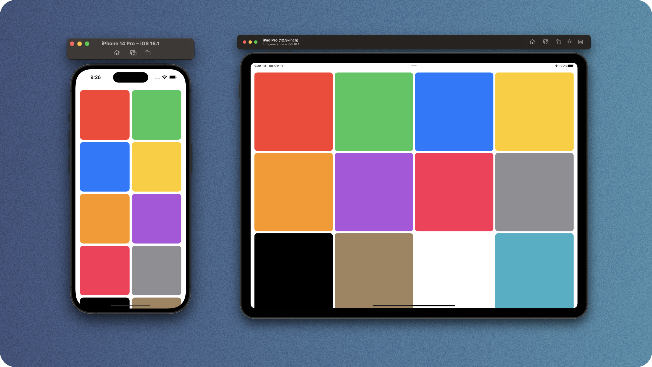
Thats a lot better, and it'll even look great in split view - but what about our new friend stage manager?
You can see that there's a bit of a strange overlap where we're in the compact horizontal size class, but we actually have loads of room.
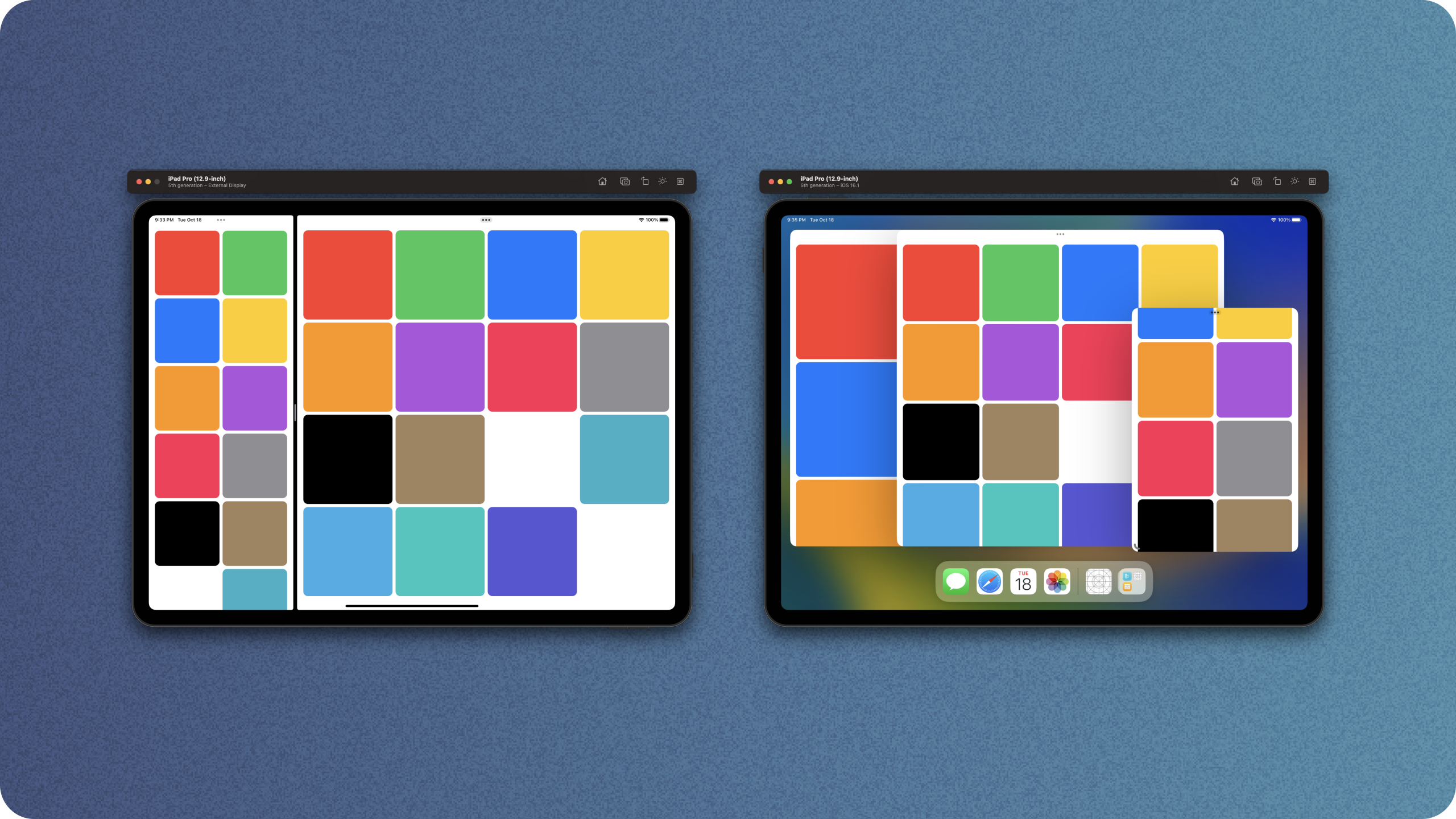
To get around this, lets use adaptive grid items to make a fully flexible layout on iPad, whilst also optimising for any future iPhones.
struct ColorGrid: View {
    var gridItems: [GridItem] {
        return [GridItem.init(.adaptive(minimum: 150))]
    }

    var body: some View {
        ScrollView {
            LazyVGrid(columns: gridItems) {
                ForEach(AppColor.allCases, id: \.self) { color in
                    ColorView(color: color)
                }
            }
            .padding()
        }
    }
}
struct ColorGrid: View {
var gridItems: [GridItem] {
return [GridItem.init(.adaptive(minimum: 150))]
}
var body: some View {
ScrollView {
LazyVGrid(columns: gridItems) {
ForEach(AppColor.allCases, id: \.self) { color in
ColorView(color: color)
}
}
.padding()
}
}
}
Thats much better! Our iPhone looks great, our iPad can make use of all the size it has, and we no longer read the horizontal size class, making this view more re-usable.
Thanks for reading!
You can find my code on github.